An inherited complimentality

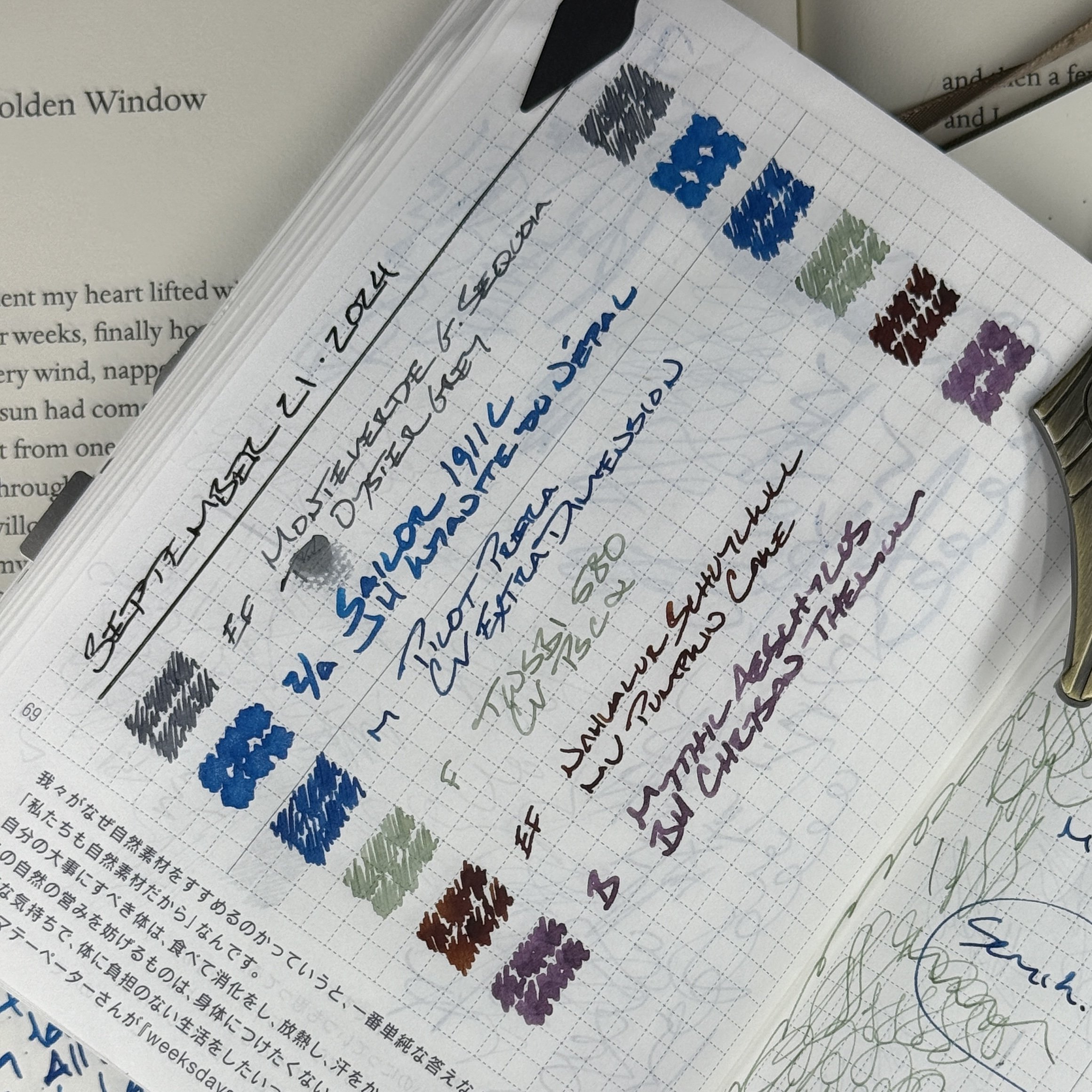
Three pens write on from last week’s currently inked: the Nahvalur Schuylkill, Mythic Aeschylus, and TWSBI 580. All three pens are inked with colors that compliment their respective pens. Not one pairing sports an ink that matches its accompanying pen. A promising theme.
I considered a spectrum while choosing three new pens for this week. One large, one middling, and one small pen. One somber brown-black, one shouty orange, and a greyscale. An EF nib, a M, and a Zoom Architect.

Tiny, Spicy, and Wookie
The week’s three new inks remain monochromatic with two blues (Extra Dimension and Kyanite du Népal) and a new grey ink (Oyster Grey) for driving my task management. A business blue sans shimmer, and a party blue with ample silver glitter. Life is to be lived.
Grey/Black

Monteverde Giant Sequoia Brown (EF, by FP Nibs). Papier Plume Oyster Grey. The Sequoia is home to a randomly drawn feed and my logo-ed nib. The result is a dry (yet consistent) writing experience which keeps Oyster Grey a purplish graphite on the page. Excellent for jotting quick-dry tasks quickly as they come to mind. The daily driver this week.
Blue/Teal

Pilot Prera Slate Gray (M). Colorverse Extra Dimension. Extra Dimension is strongly and unmistakably blue in this Pilot feed. I often ink Dimension in wet feeds, encouraging stormy dark blues and prominent sheen. This pairing, in contrast, is blue first and red-sheen adjacent. The Prera’s diminutive size and smooth round nib lend a utility to this pocket carry combo: pocket notes, scratch notes, meeting notes, and D&D notes.
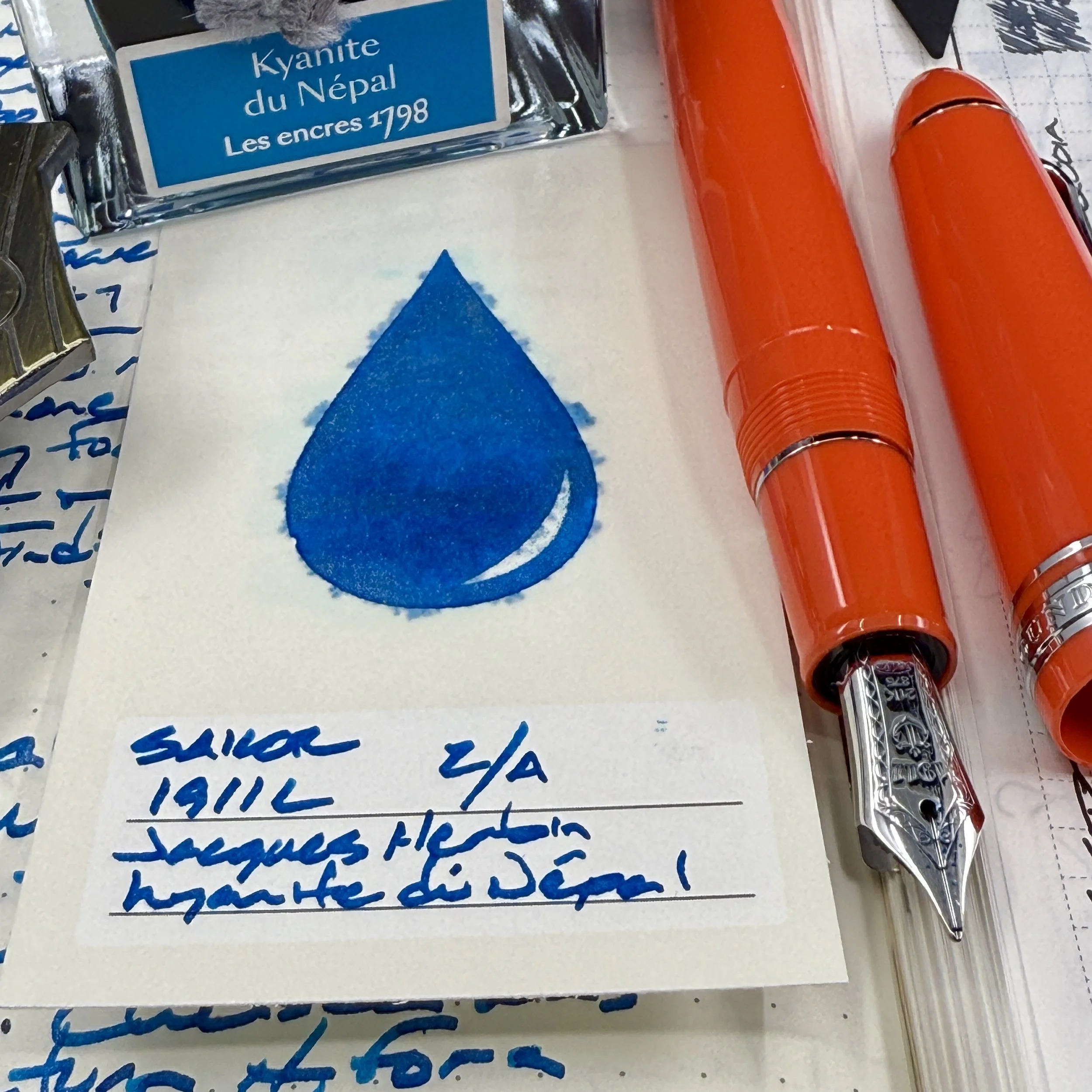
Sailor 1911 Large Tangerine (Z Architect, by Custom Nib Studio). Jacques Herbin 1798 Kyanite du Népal. The Zoom Architect grind spotlights Népal’s pomp. Strong haloing outside nearly every letter. Shading and sheen are frequent. And the silver shimmer adorns my letterforms throughout my writing. A wow factor deserving of me-facing tasks: teaching reflections, journaling, creative writing, and lesson plan outlines.
Earth Tones

TWSBI 580 Smoke RoseGold II (F). Colorverse α Psc. Ultra wet feeds breathe life into dry inks. Psc is a readable light green-grey that leaves a trail of shading across the edges of my words. Margin notes are easily legible. The cool green hue is easy on students’ psyches when marking papers. And the pairing writes a pencil-like feedback. Excellent for longform writing tasks like journaling, creative writing, and teaching reflections.
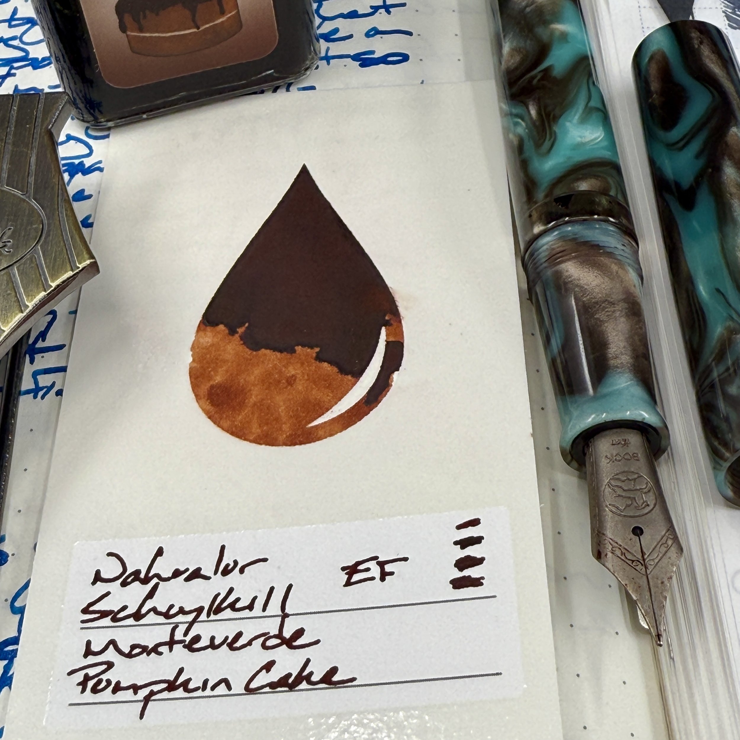
Nahvalur Schuylkill Chromis Teal (EF). Monteverde Sweet Life Pumpkin Cake. The writing lines in this combo have toned up in the fourth week together — the EF nib leaves EF-width lines and remains wet enough to easily keep up with my fastest scrawling tasks. The Schuylkill’s middling-sized section is comfortable for short and medium-duration writing sessions. Tasks like short journal entries, letters, meeting notes, and D&D notes.
Wild Cards

Mythic Aeschylus Black & Red (B). Birmingham Chrysan Themum. The Aeschylus has evolved into my all-purpose pen. It adapts well between narrow-nibbed detail-oriented writing with its easily controlled narrow section, as well as for wide-nibbed longform sessions given the model’s length. Chrysan Themum won my heart in only its second week on my desk. Huskily smoke-pink that I seek out reasons to put to paper. Therefore, this is my “tasks I don’t wanna” pairing: curriculum review, administrative meetings, and parent conferences. Also: journaling.
All in the family
Smudges build character?