A January palette remix
A second life for last week’s palette
The color palette that my friends and family gifted me over the holidays is well-rounded and fun. I have plenty of work-appropriate colors alongside fun, waifish shades like Ink Institute’s Cat at Dusk. Working from home brings a welcome flexibility to my ink choices. I’m taking gleeful advantage of the opportunity.
Last week’s light pen-use translated into a nearly full currently inked at week’s end. I still have a full contingent of writing options on my desk. The result is a new currently inked with only one addition: Sailor Ink Studio 973 in a Monteverde Giant Sequoia. And a blue-black as my backup daily driver. Talk about wild and crazy.
Oh: and new pictures!
Grey/Black
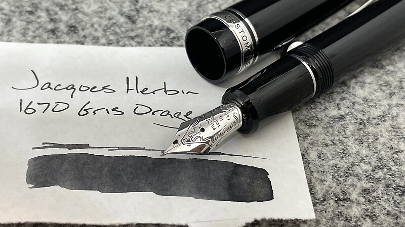
Pilot Custom Heritage 912 (SF). Jacques Herbin 1670 Gris Orage. A winning combination. Wet and dark. The gold shimmer livens routine task management duties. The SF is a tad too broad for some writing, like page numbers and tick boxes. The ink finds its way underneath my stencil. Smeared tick boxes are the price of doing business this week. Daily driver. Task management, reading notes, lesson plans, and scratch notes.
Blue/Teal
Sailor Pro Gear Imperial Black (F). Ink Institute Cat Daily, Cat at Midnight. A lovely blue-black. Well-behaved and wet. Minimal shading only lets the blue through the ink’s darkness in small pockets. My backup daily driver. Notes, task management.
Faber-Castell Ondoro White (F). L’Artisan Pastillier Gris de Payne. The dryness of Gris de Payne keeps the F a borderline EF. This opens the Ondoro up to all sorts of writing tasks outside of my personal journal. A well-rounded pairing I’m quite happy with. Lesson plans, meeting notes, reading notes, marking, and journaling.
TWSBI Vac700R Iris (F-CSI, by Pen Realm). Ink Institute Cat Daily, Cat at Dusk. The combination remains light and dry. The pale color and fun nib make the Vac a great option for slower writing tasks like accents in commonplace reading notes and for offsetting sections of pen pal letters. Letters, reading notes, and one poem in my journal.
TWSBI 580-ALR Prussian Blue (EF/M Predator Hybrid, by Nibgrinder). Rohrer & Klingner Verdigris. The EF side of this grind puts down a lot of ink. A result is that Verdigris’ sheen is prominent, especially on coated paper like Tomoe River. Work monthly, lesson plans, manuscript notes, and some meetings.
Earth Tones
Nakaya Neostandard Heki-tamenuri (B). Taccia Ukiyo-e Sharaku-Koiame. The routine for describing this pen has become: positive adjective. A second, different positive adjective. A statement about this pen’s sentimental importance for me. And an excellent brown-orange ink. The combination of a Platinum B nib and Sharaku-Koiame makes for wonderful marking pen. The lines are noticeable and legible. Marking, lesson plans and journaling.
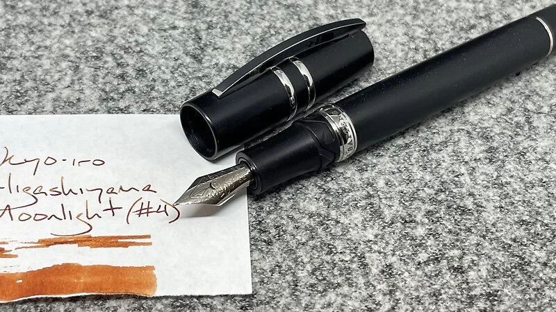
Visconti Homo Sapiens Silver Age (F). Kyo-iro Higashiyama Moonlight (#4). Top notch shading from this combination of a very wet feed and a drier ink. This combo is still a tad too wet for uncoated paper, so I’ll stick to using it with writing I do on coated papers: lesson plans, journaling, two letters, and some outlining.
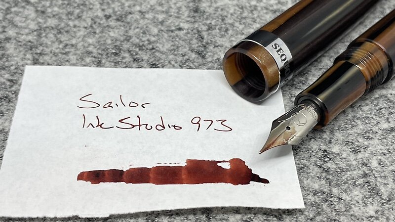
Monteverde Giant Sequoia Brown (F). Sailor Ink Studio 973. The comfortable large size of this pen makes the Giant Sequoia a wonderful choice for longer writing sessions. I drafted a manuscript on critical theory, outlined a paper, and journaled with this combo.
Wild Cards
Sailor Pro Gear Slate (Z Architect, by Custom Nib Studio). Ferris Wheel Press Lady Rose. The Z nib keeps this pale purple-pink ink legible. The EF side of the nib, in contrast, is a bit too light for use outside of sketching or messing around. The lack of multitasking relegates this combo to journaling,
Kaweco Skyline Sport Mint (F). Robert Oster Summer Storm. A dry, narrow combination. The F writes like an EF — a positive for handwriting as small as mine. Kawecos are born to be pocket carried. EDC pocket carry, scratch notes.


