S1:P4 - Bold and beautiful meeting notes headings
An introduction to taking more useful notes during meetings and classes. My system uses headings to make my notes more searchable, and so more usable. — Season 1, Post 4
The benefits of taking notes by hand are well documented (Mueller & Oppenheimer, 2014; Stephens, 2017). Blog posts the internet-over begin with various takes on the assertion that analog notetaking is valuable. This body of writing shares a key ingredient: taking meaningful notes involves converting what you want to remember into a new format (Rintakorpi, 2016).
This means: adaptation renders notes meaningful for you. Adaptation can mean making lists or categories, concept maps, and even sketches.
The key to useful, searchable notes is to arrange what happens in a meeting or class thematically; not chronologically.
I’m sharing one key aspect of the way I take effective handwritten notes during meetings and classes: organizing themes within headings. Searchable headings.
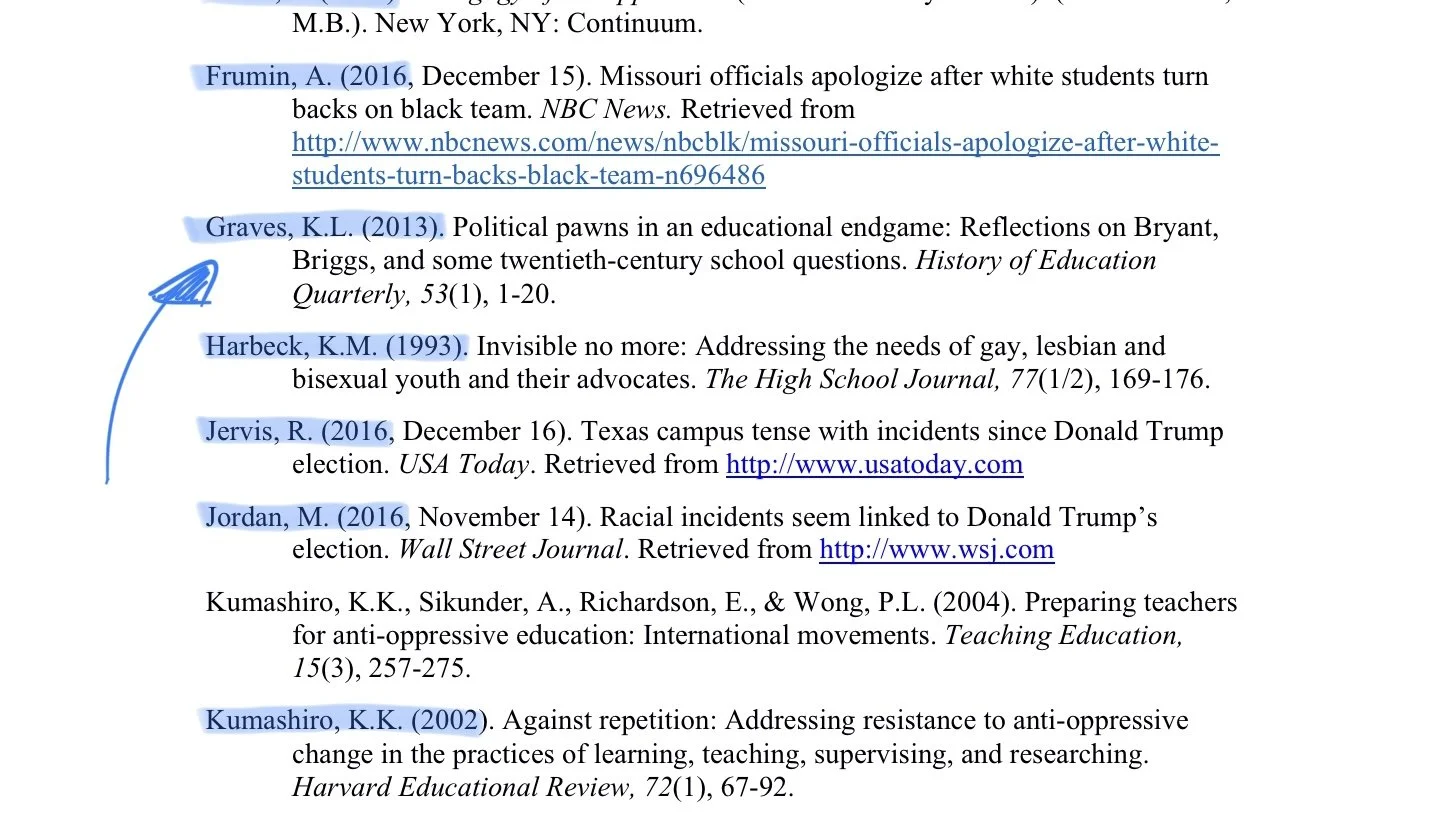
My method draws heavily on how scholars format reference lists. The information scholars most commonly look for are placed furthest left: authors’ names and the years of publication.
Easy to find who wrote it, and when. Boo-ya!
Both the author’s last name and the year of publication are easily seen along the leftmost margin. All other information is indented.
The result is a list that can be quickly scanned for the line with the information you’re interested in. Reference lists are accurately skimmable without needing to fully read every line. Fantastic. That’s exactly what we want for our notes.
Headings are easily my most useful (and most used) tool for rendering meeting and class notes similarly searchable.
Skimming-friendly headings
Bold is beautiful. I rely heavily on being able to write in both a narrow line and a broad line. My preference for fountain pens often leads me to choose either two pens (one EF/F and another B) or a pen that can reverse write.
This said, I’ve also seen similar folks rely on two colors instead of two line widths. This system works either way. Experiment to find what works best for you.
My headings are written in broad lines, and often in unsaturated colors. Bright colors are easiest to locate on the page, but I find unsaturated colors are easier to read; especially when I’m scanning and not reading carefully.
What and where. First is a short dash in the left margin. A short line runs four grid boxes in from the left edge of the page. It sits to the left of any heading on the page – the leftmost mark on the page. Scannable, like last names in a references list.
Left-most dash, for easy skimming
The second is a line all the way across the page to visually separate sections – after the end of the heading itself. Together, these lines make a skimming-friendly separator between topics.
Importantly, these marks can be made quickly. And without a ruler. Crooked it good! Your heading will stand out even more against the page’s cleanly-printed horizontal lines.
A sample heading, sandwiched in-between two horizontal dashes
Two kinds of headings
I use two kinds of headings in my meeting notes: a theme header and a focus header.
Theme headers. Theme headings highlight the general kind of information covered by the detailed notes below the heading. Think of themes as big questions or takeaway lessons. Your headers arrange what’s discussed in your meeting or class into these general themes.
People can be flighty in conversation. Your project leader or professor may jump from one theme into a second theme and then back into the first. Remember: your theme headings should set aside spaces to capture everything related to the theme. Leave yourself space before your next theme heading so you can add more information later should the meeting or class return to this theme in a few minutes.
You can prepare some themes beforehand. Many well-run meetings have agendas. Use a copy of the agenda topics to guide when you need a new topic header. Or, in a pinch, sketch out a shorthand list of agenda topics on a post-it note.
If you’re a student, your teacher or professor has a list of topics for the day. Topics are commonly outlined on the board, on the class website, or in the syllabus. Great educators will welcome you asking for a hotlist of the day’s topics should you struggle to find the topic list.
Plus, asking signals to your teacher that you’re interested in their learning goals for you. You may just make their day. In a positive sense.
I use a wet M or B nib and the exact strategy above for theme headers. Strive to use the fewest words possible in your theme header. Pretend each word costs you $50.
Hot Tip — Theme headers are the perfect information to add to the index of your notebook; if you keep a notebook index.
Focus headers. Focus headings help me to search within a theme section for specific details or action items. If themes are the big questions, focus areas are the answers and examples that get covered.
I use an EF or F nib and a simpler version of the heading strategy above for focus headers. Put simply: focus headers use only the right line.
Two focus headers, with lines scannable down the right side of the page
Recall the research on taking notes from the outset of this post. Your focus headers help you organize what you hear during a meeting or class into the most closely related theme. This is an active process of deciding which theme your notes belong under. Recording exactly what is said is less useful.
And the rightmost lines are easily scanned. They split the page thematically. Quickly. And without a ruler or other distraction.
I recommend also leaving space beneath each focus section. You never know when the meeting or class discussion will wind its way back to this topic. Or when a new task is suggested for you related to the topic.
Headers make notes useful
Quality, research-informed headers ensure your notes are quickly and efficiently searchable.
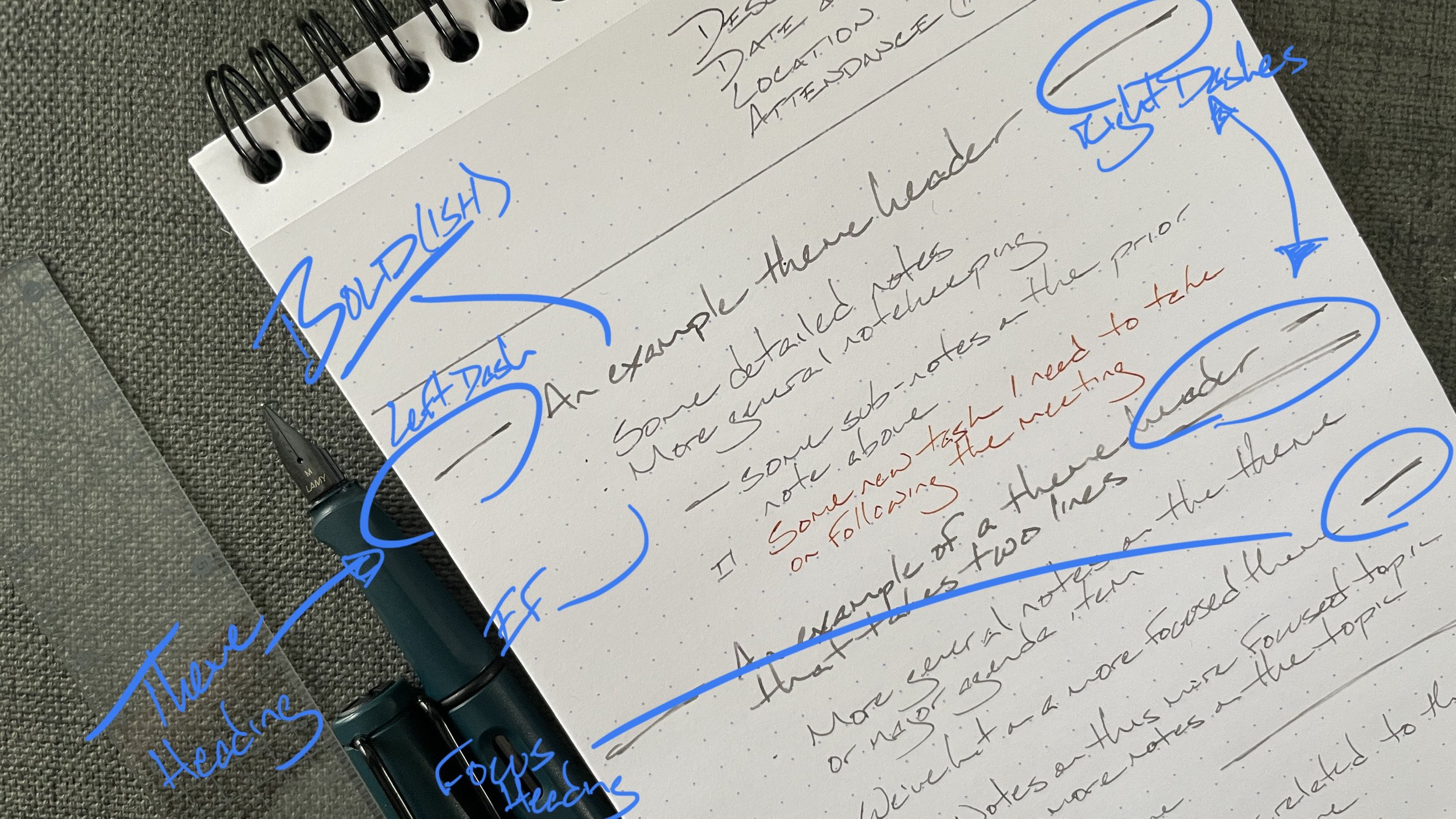
Let’s end with an annotated example of bold and beautiful headings.
Ink color and nib size ensure my headings stand out with even a quick glance at my notes.
Left and right lines make scanning through my notes to find a given topic breezy - no detailed reading needed as yet!
Focus headings are a breadcrumb trail back to the specific detailed notes I need, even weeks after the meeting has happened.
Let your notes be as fabulous as you are.


