Collecting pens as a practice in happiness
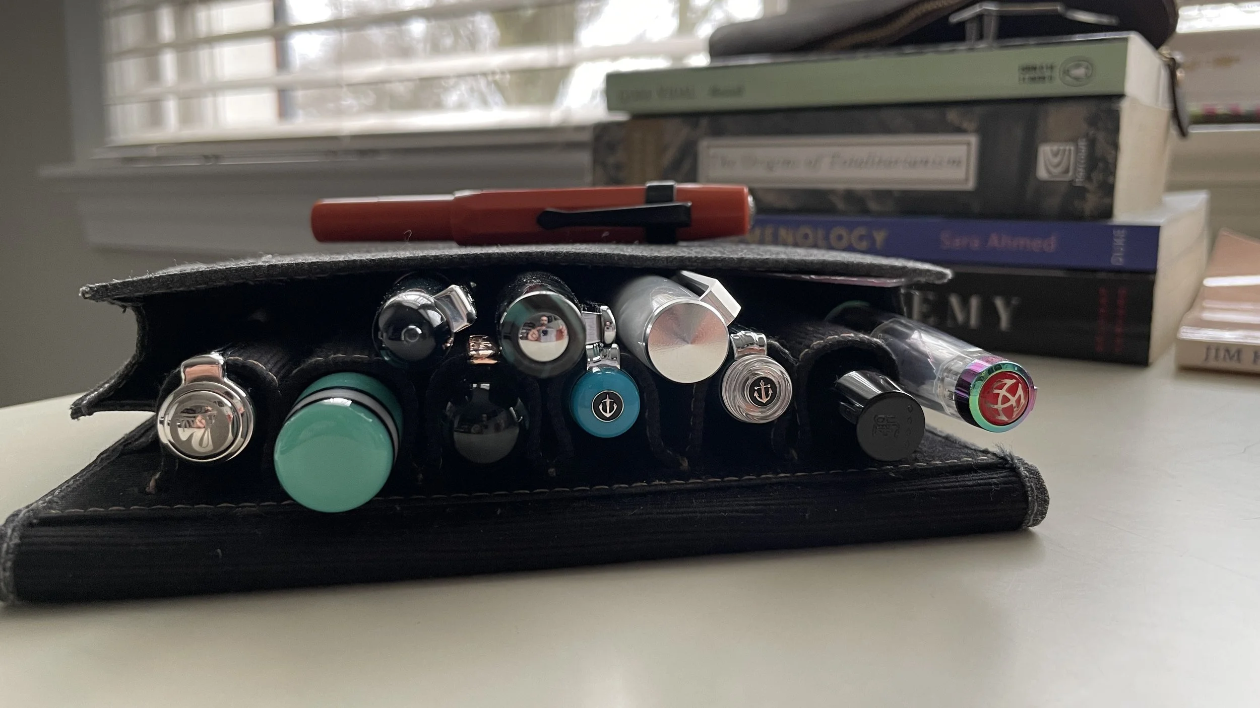
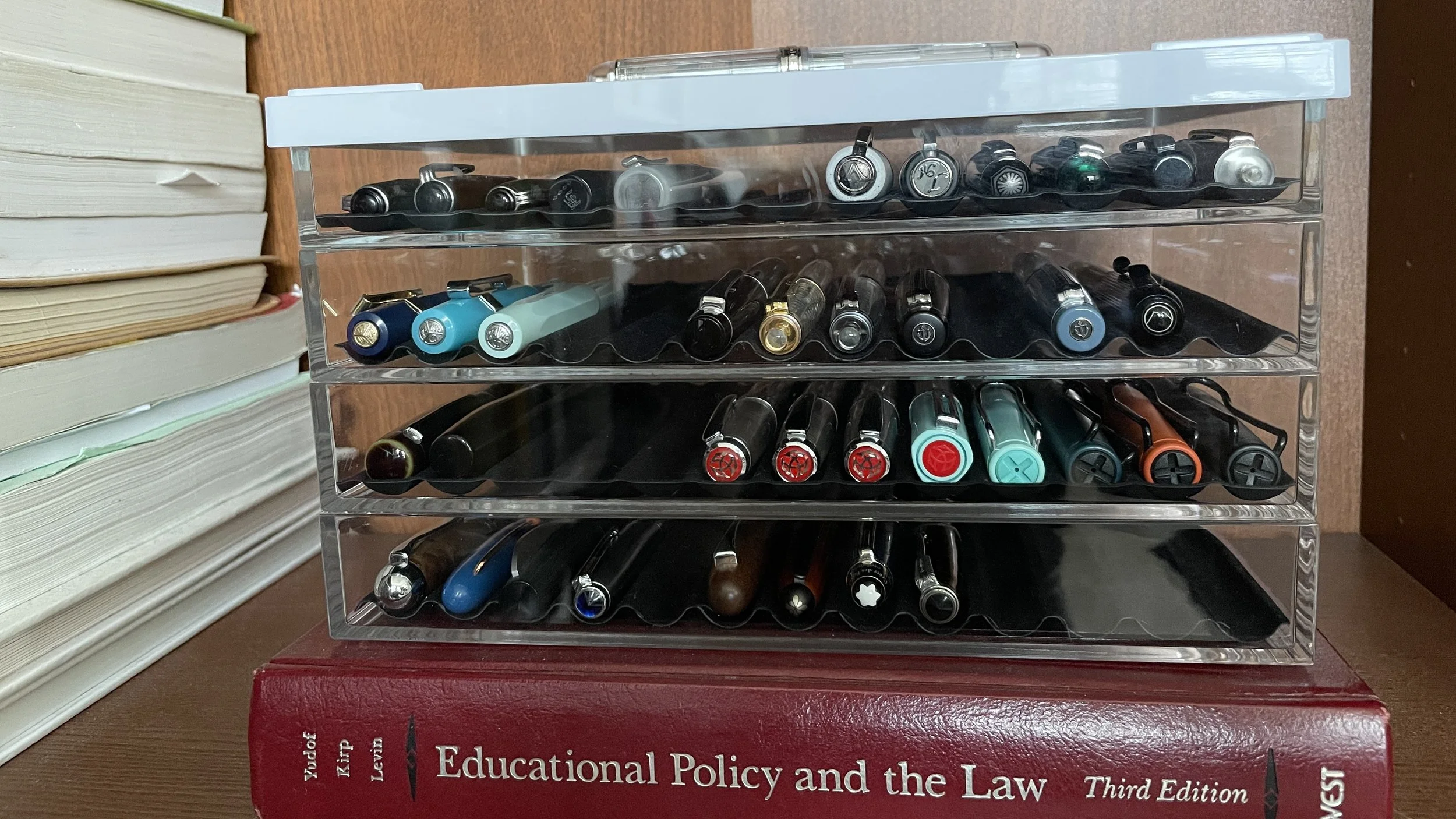
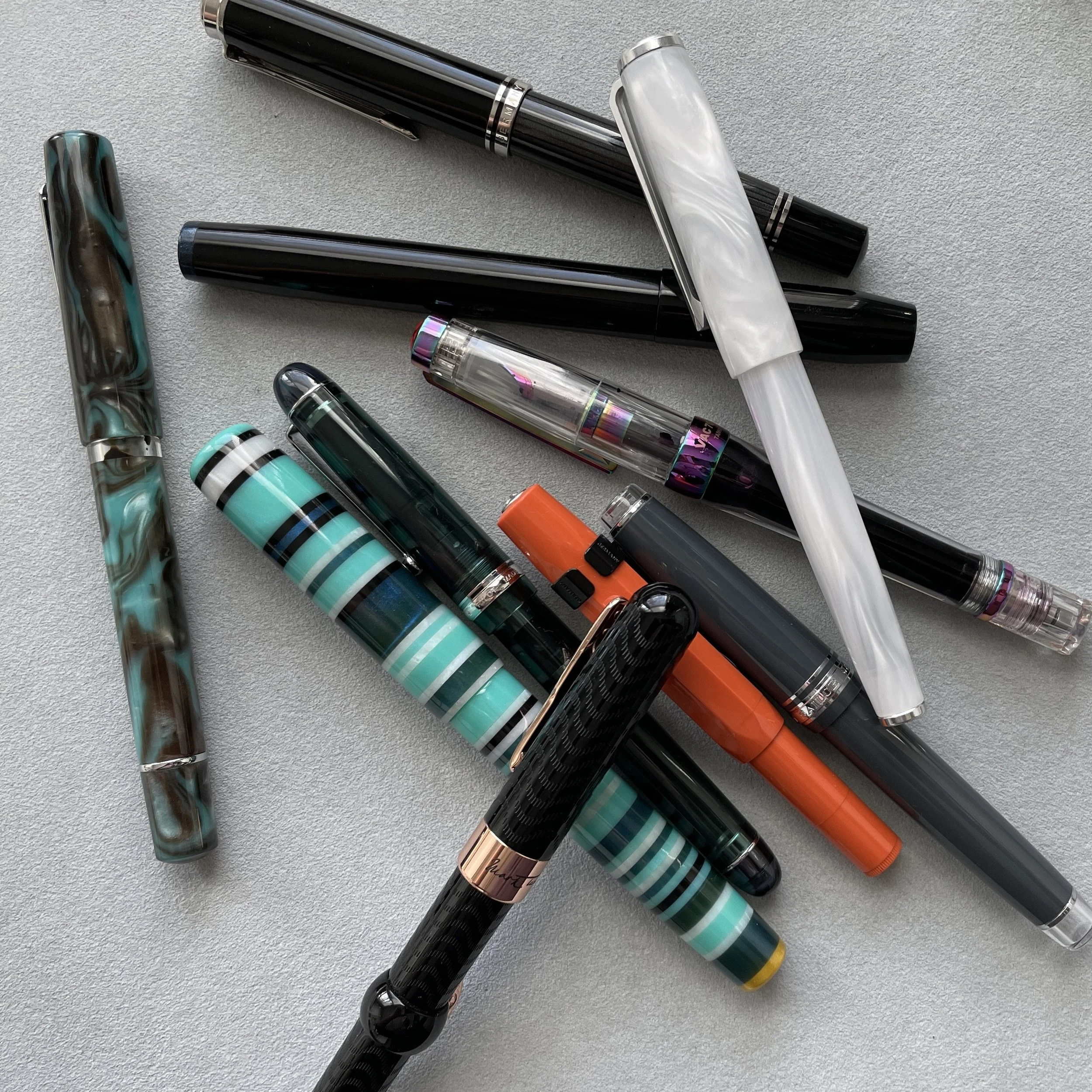
February has been a month for thinking through how to size my pen collection. Am I curating a small perfect-for-me assortment or accumulating sets of models I enjoy? Am I building a collection that can continually surprise me?
I’m considering that these goals may miss the point. Perhaps there is no “right” size to a pen collection. My trays might simply need to include pens that make me smile — and bring joy to my writing.
Further, the goal may be collecting an assortment of pens that draw me back into writing: a joy draw. The ability to see each of my pens often enough that each has the opportunity to draw me in. The “Ooh! I want an excuse to use that!” factor. Magnetic.
Within this frame, my collection “works” so long as I keep coming back to writing. Back to my desk. Writing and enjoying it. Finding joy in putting pen to paper.
And the ability to store each neatly and visibly
The joy draw is a moving target. The colors and textures I’m drawn to in spring may contrast sharply to those that appeal to me in deep winter. As I continue to learn more about my tastes. As new writers are created by small makers and large companies.
Or maybe it’s all three goalsets: curation, rediscovery, and joy draw. Like the legs of a stool. How do you measure when you have enough, or too many, or the right combination of pens?
This week’s Inked Tines update includes my most recent currently inked writing tools.
Toolset
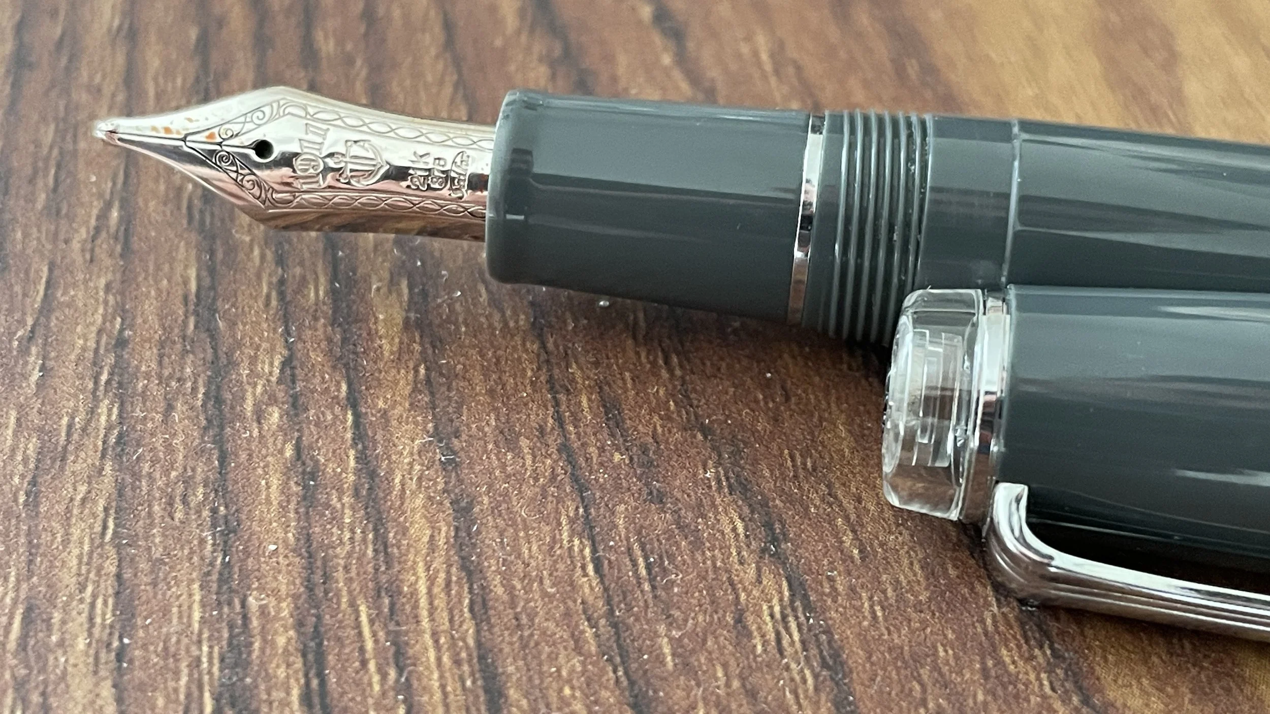
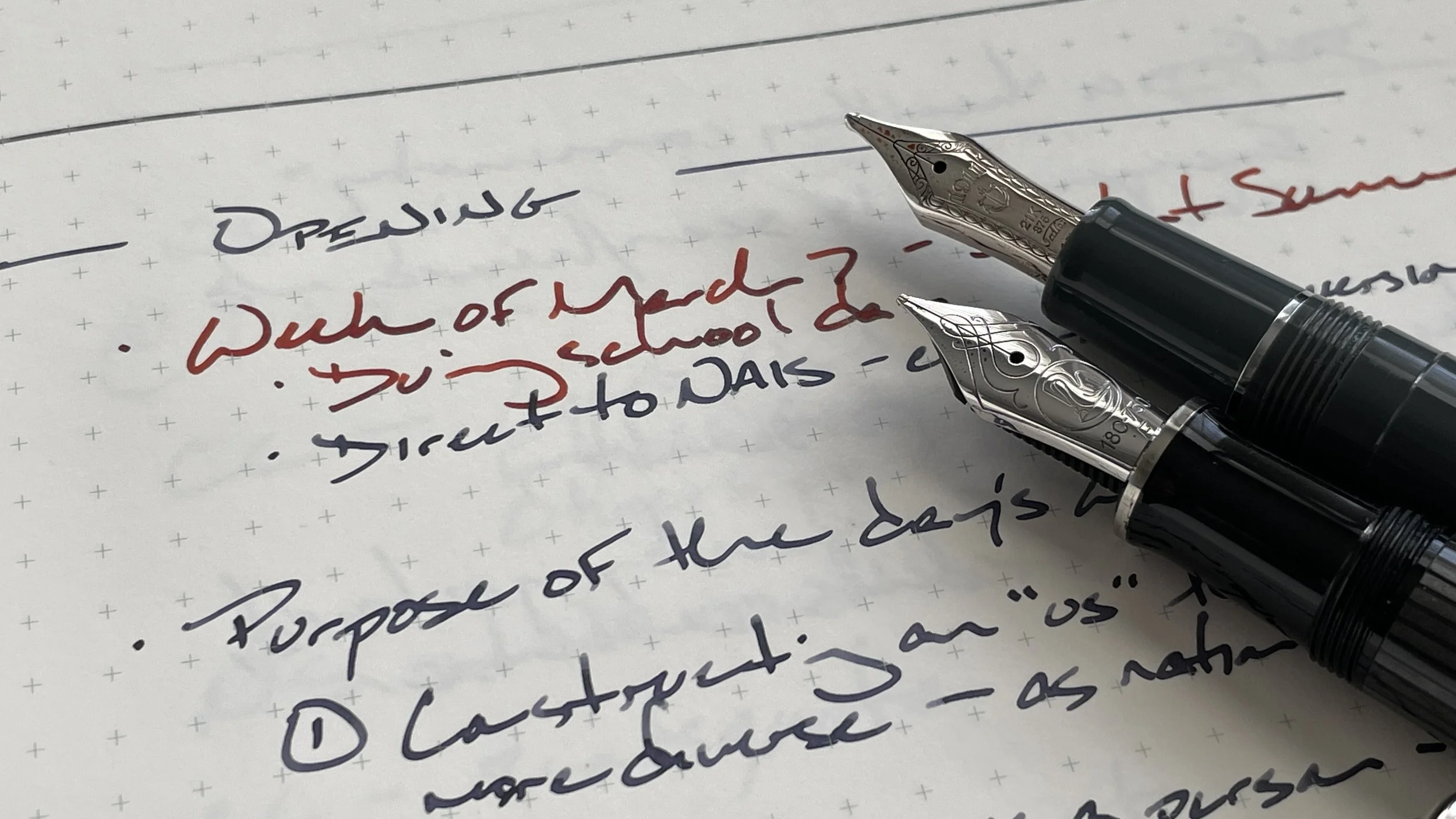
Pens. The Sailor Pro Gear stands out this week. My second-most used combo this week. Especially suited for meetings. The bulbous Zoom nib accommodates the thoughtless writing angles and quick jottings that I lean on during meetings and lessons. Copper produces fun shading that stands out easily against 223 and Melancholic Gray. Resubscribe. Feed.
Narwhal Schuylkill (F) — 1/6 (from a 1/4 fill). A disciplined F line that is wet enough to shade and halo. I reached for this pairing often throughout the week. Lesson plans stood out and were joyful to create. A handful of teaching notes and student pairings for my lessons on the eugenic origins of intelligence. And journaling.
Franklin-Christoph 46 (EF SIG) — 1/4. The EF SIG took well to Melancholic Gray. Infrequent and noticeable shading. Quick to dry. And Melancholic Gray withstood highlighter well enough to remain easily legible. Success as a daily driver, so long as I attended to proper angles while using the sharp SIG nib.
Kaweco Sport (EF) — 1/2. Dry pairing, but quick to dry. A double-edged sword. Wrote consistently every time I uncapped it. Solid pocket carry combo. Unpleasant for longer writing sessions. Pocket notes, scratch notes.
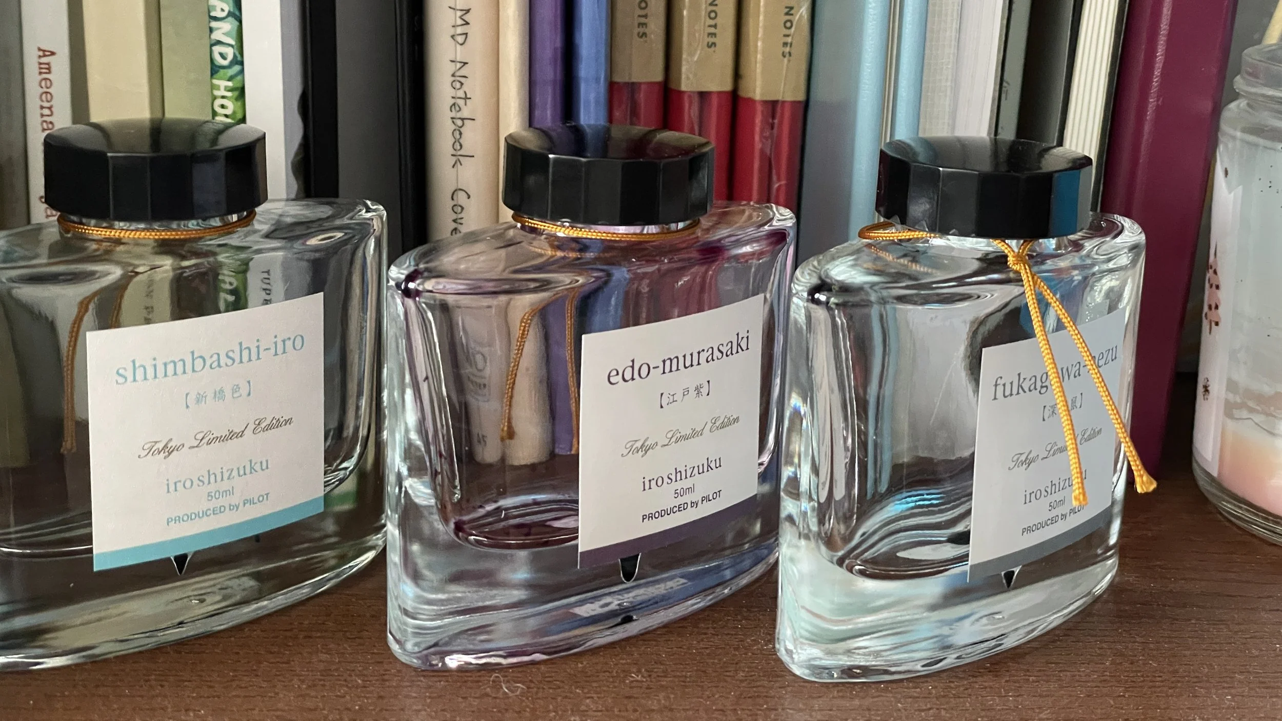
Karas Kustoms (EF) — 1/2. The Bock EF produces a river of ink. An asset with Shimbashi, which is at its most beautiful when haloing. The pale, icy blue proved a great, reliable accent writer. Rendered lesson plan outlines, meeting notes, and reading notes easily skimmable.
Pelikan m805 (F CSI) — 1/2. The wet Pelikan feed and ribbony F CSI nib bring out the best of 223. Purple undertones and iridescent shading. Deep grey at the beginnings and ends of words. The steel grey colorway fits right in without distraction during meetings with parents. And fun for longer writing tasks like teaching reflections, journaling, and reading notes.
Loft Highworth (EF) — 4/5. Wet line that maintains a European EF line width. The round nib and girth section make for comfortable long writing sessions. But Peridot feather and bleeds on Stalogy paper. This pair will be emptied and revisited when my journal is no longer a Stalogy notebook.
Pilot Custom 74 (EF) — Full. The pen is lovely to hold and write with. It made me smile to see The Pen Addict show the 74 love this week. The combo is a dry and inconsistent writer on both Stalogy and CAL paper. Even short, scratch notes proved too dry for comfort.
TWSBI Vac700R (F CSI) — Full. Completely full to my eye. Despite heavy use mid-week. Wet, disciplined F line-widths. Subtle shading from Edo-Murasaki. Just bright enough of a purple to function as an accent combo. Comfortable enough for longform writing tasks. Solid. And still full.
Conklin Mark Twain (F CI) — ?? Did not see much use this week amidst the deluge of new writing options.
Notebooks. Work bujo. Musubi Cosmo Air Light 83 (A5). A wild and imbalanced week. I helped design and deliver lessons on implicit bias and microaggressions for my colleagues on Tuesday. It was refreshing to teach pedagogy for teachers again.
15 new pages, all told. Next week begins on page 136.
The first four pages house lesson plans and teaching notes for Tuesday’s two workshops. Two more pages of notes follow. Taken during our keynote addresses. I tapped the Pelikan for detailed notes and the Sailor Pro Gear for accent work.
A pair made in … Germany and Japan
And all pre-weekly. The remainder are a potpourri of lesson plans and meeting notes.
Journal. Stalogy Editor 1/2 Year (A6). 10 new pages this week. Four new entries. They represent a healthy mix of two short recollections and two longform reflections.
And only four signatures left
I tapped the Narwhal (Birmingham’s Stormwater Runoff) and Loft Highworth (Lamy’s Peridot) for the week’s first longform entry. Both produce narrow lines. Runoff offered healthy amounts of shading.
Thursday night’s entry was written entirely with my newly arrived Sailor Pro Gear. Gasp.
Written dry. Interesting story. All of this week’s 11 pens remain inked. The Sailor Pro Gear barely. I was able to spread the writing love enough throughout the week that no single pairing was used continually.
Even my daily driving duties were split between the Franklin-Christoph and Pelikan.
Weekend survivors
Newly inked. Ah, but I rolled into this week with ten inked pens, I hear you say. My new Sailor arrived from Yoseka Stationery on Wednesday evening. Ten became eleven straight off.
In fact, my friends from last Saturday’s pen gathering suggested using the Gygax method to ink my new addition. I listed six inks for the Sailor’s inaugural inking.
Four skewed matchy-matchy. Akkerman’s Koninginne Blue-Black on a 1. Robert Oster’s Bondi Blue on a 2. Lennon Tool Bar’s Yong Quon on a 4. And Waterman Myusterious Blue on a 5.
One was complimentary: Pilot’s Yu-Yake on a 3. Smack in the middle.
And a 6 would allow M to declare any ink he could think of, that I own. I appreciate a wild card.
So sorry, M. Bondi Blue it is.
The collection
Incoming / new orders. Oh happy day. My pen collection is a celebration of unsaturated blues and green, black, and orange.
The new Sailor Cocktail series includes Blue Train. A shock of sky and robin’s egg blues. With a clear rear finial. I’m a sucker for a clear finial.
I chose a MF nib. The line width is comparable to a European F. With a great extra: the nib smoothly reverse writes as a true Japanese EF. I dig a multitasker nib.
Yoseka delivered my pen in a day. Lovingly and carefully wrapped.
Photo credit: my partner. Featuring: Rumi.
Outgoing / trades or sales. I brought four pens to give away at last weekend’s Great Decanting. I prefer unused pens find their ways to loving, appreciative homes. Three tripped the light fantastic.
M spied my two Faber-Castell Looms — one blue (F), one orange (M). He believes his wife would enjoy using them. Happy-happy.
I suggested the Pilot Prera for S. Half-print half-script handwriting can be hit-or-miss with cursive nib grinds. It made me happy to see S take warmly to the stock Pilot CM nib in my Prera. Wahoo.
Currently reading and listening
Fiction. I thoroughly enjoyed out another 120 iPhone-sized pages of Mossflower. I sit at the very end of Chapter 27.
Subterfuge and counter-subterfuge.
There are three storylines weaving into and across one another’s paths. The woodland revolution against Queen Tsarmina’s regime is in full swing. Children are hostages. Spies are embedded in both sides. All while Martin is off hunting for experienced military leaders.
I’m surprised by how nuanced Jacques’ storytelling is. Dark. And messy. Loving it.
Nonfiction. I continued revisiting Nell Irvin Painter’s eye-opening history of whiteness in American history. Two more short chapters now have margin notes and reading notes. 18 pages read — but read closely.
One chapter follows the increasingly violent eugenic fearmongering of folks like Madison Grant. The second follows the ascendancy of Lapouge. Terrifying, fascinating, and crucial.
Both chapters made copious use of my Blackwing 602, a grey Mildliner, and a purple Mildliner. My annotating tools of choice.
Music. I binged deeply on Nathaniel Rateliff this week. In particular, his most recent album, The Future. It’s a record that continually feels as if it’s about the blow up. But barely, begrudgingly retains a contained energy.
For those who enjoy well-crafted, soulful arrangements. And who are fine with tasteful yelling in the vocals.
The end isn’t always the end :)


