Leaning into a balance of broad and narrow nibs
This week is the first of two weeks off from work. My pen usage is going to be focused on personal projects: journaling, outlining posts, drafting essays, and restarting my Hobonichi Weeks. Personal projects are homed almost exclusively on my preferred papers: Stalogy, Cosmo Air Light, and Rhodia. I suppose the Hobo Weeks is Tomoe River, too. I also get more flexibility with nib sizes and dry times.
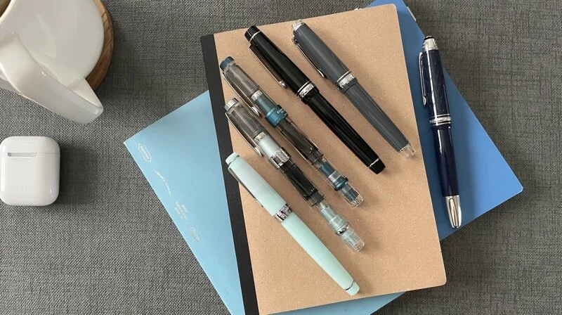
Three notebooks this week
Two pens ran empty in the lead-up to this post. That brings this week’s crew down to a healthy six. Further, I’m happy with the current slate of inks: one dark grey and one light grey, one each of blue and earth tone, and two dusty purples.
Lastly, I rather like last week’s balance of broad and narrow nibs. I can write small for detailed notes and wide for longer-form writing tasks. Greys remain split between EF and a broader M. Purples are similar with one EF and a B.
So no changes needed. Let’s adapt these combinations for my own projects.
Grey/Black
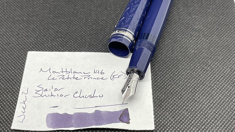
Montblanc 146 Le Petit Prince and Fox (EF). Sailor Shikiori Chushu. An excellent combination of feed and ink for a black-adjacent accent color. The wetness of the MB’s plastic feed brings out the darkest aspects of Chushu. Outlining, journaling, personal bujo, reading notes (author’s argument).
TWSBI 580-AL Turquoise (EF/M Predator Hybrid, by Nibgrinder). Diamine Earl Grey. Earl Grey is a bright, cool grey with the EF side of this multitasker nib. This is my daily driver for the week. The M for emphasizing important tasks and events. The EF for everything else. Daily driver. Task management, personal bujo, manuscript editing.
Blue/Teal
Sailor Pro Gear Graphite Lighthouse (Z). Jacques Herbin Kyanite du Népal. A wet combination. Brings out the darker blue hues and sheen of Kyanite. A bit too broad for notetaking, especially with the small writing I use when taking reading notes. However, this combo adds fun to larger writing like journaling. Journaling, outlining, letter writing.
Earth Tones
Pilot Custom Heritage 912 (SF). J. Herbin Orange Indien. Pilot’s SF gives me control over when and where Indien shades to it’s red-orange. Journaling is more fun with excellent shading – even if the shading is only across letters. The bright orange makes excellent accent notes. Journaling, reading notes (accents), manuscript marking.
Wild Cards
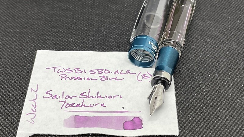
TWSBI 580-ALR Prussian Blue (B). Sailor Shikiori Yozakura. A B nib brings out the best of Yozakura: near-black shading. The contrast between a dusty purple-pink and that dark shading makes me smile. This will be a heavy-use journaling pen. The behaved B nib opens this combo up to accent reading notes, too. Journaling, reading notes (accents).
Delike New Moon 2 Green (EF). Monteverde Rose Noir. Welcome back, young Delike. This combo’s narrow EF lines will make the Delike a useful manuscript revising pen. Rose Noir contrasts black well without distracting too much from what is already printed on the page. And the EF suits writing in-between lines. Manuscript revision, reading notes (accents), personal bujo, journaling.


