The color-matched and the complimentary
There are generally three options when matching inks to pens. Find an ink that matches to your pen’s color, choose an ink that compliments your pen’s color, or go wild.
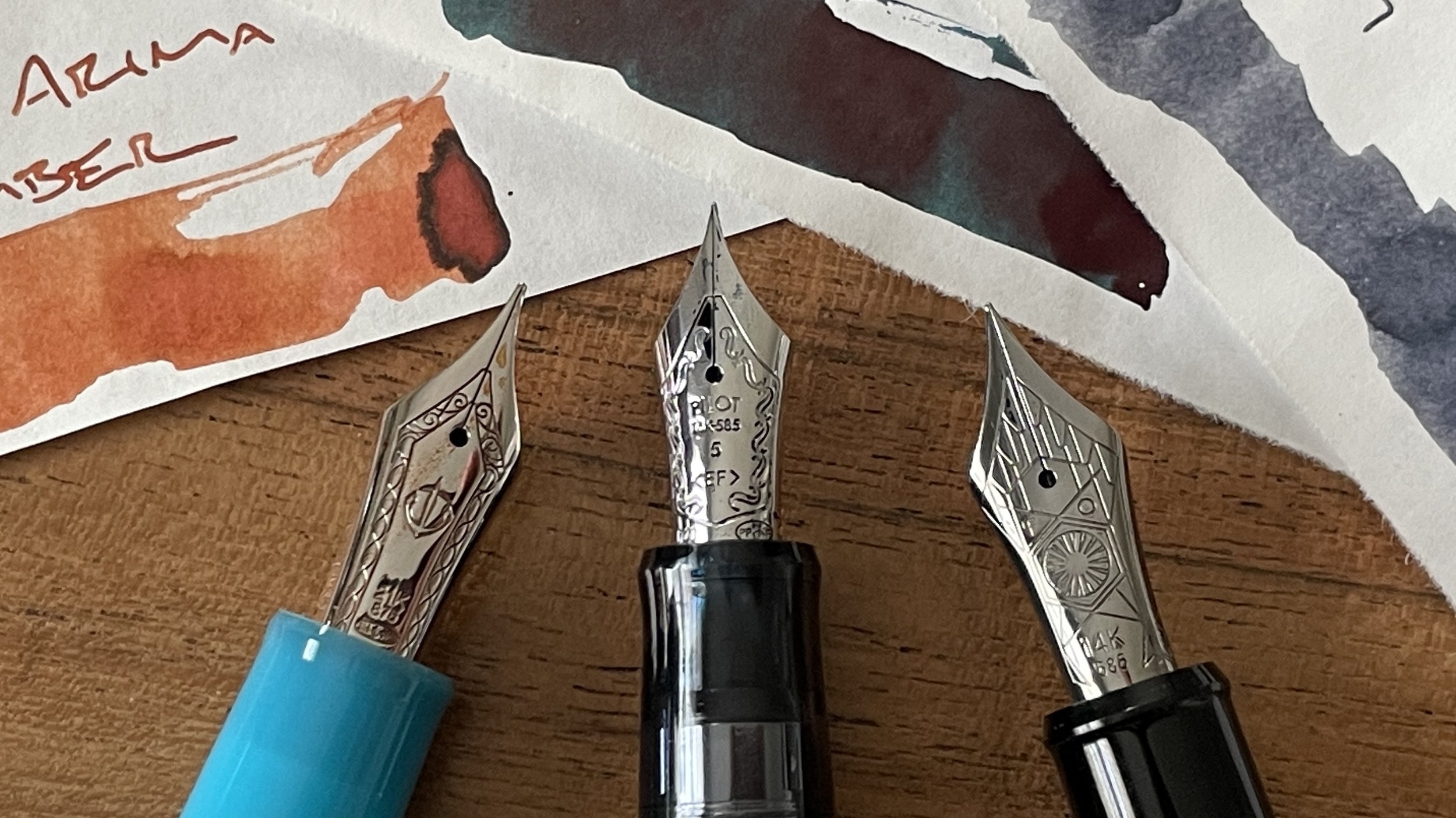
Three new pen and ink combinations join the party — one from each of the Japanese “big three” manufacturers. A Pilot Custom 74, a Platinum 3776, and a quick-return of my new Sailor Pro Gear.
Two pairings are matchy-matchy. The Pilot has a lovely dark green. And the Platinum has my all-time favorite grey ink: Diamine Earl Grey. I chose a complimentary orange for the Sailor as my palette needed an accent color. Sweet mix.
I also split this week’s nib sizes 4-3: four round nibs and three italics. It’s our final week before spring break. Craziness is expected. Round nibs offer the forgiving writing options I’ll want should meetings pop out at me while outside of my classroom.
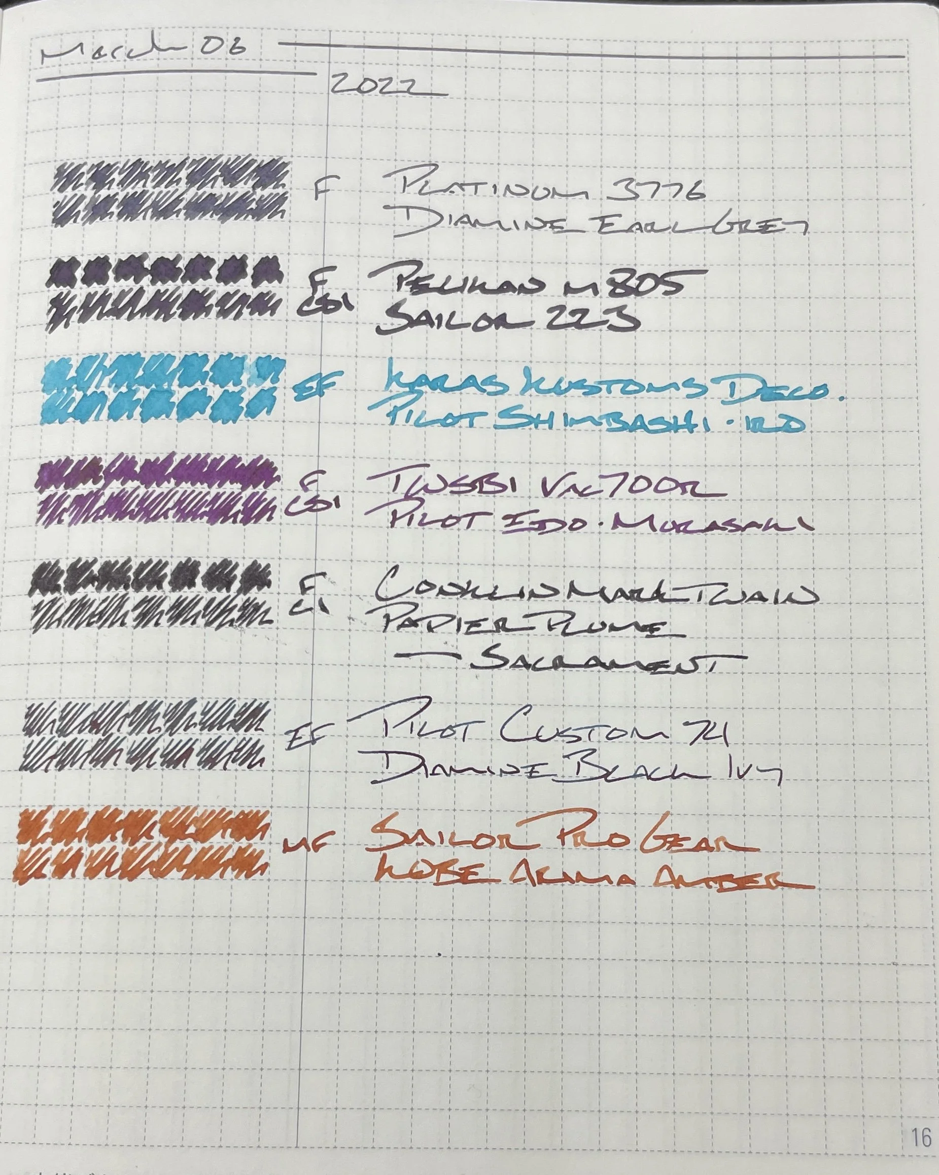
All seven nibs are F or EF. I am preparing new lectures for two classes this week. One is my research class. I change my lessons on how to write and present analytic findings every year to suit each class’ strengths. Second is a series of lessons on pre-Stonewall history for my elective students.
I prefer narrow line widths for detailed notes. I write small. Also: I prefer to have all of my notes within a two-page spread. That way I avoid flipping pages during lessons.
Grey/Black
Platinum 3776 Star Wars Kylo Ren (F). Diamine Earl Grey. One of my favorite nibs. The narrow Japanese-width F line is comfortable and clean with my small handwriting. Earl Grey dries quickly and shades noticeably. Combined: this is an excellent daily driver. Task management, lesson plans, lecture notes, homework calendar, and scratch notes.
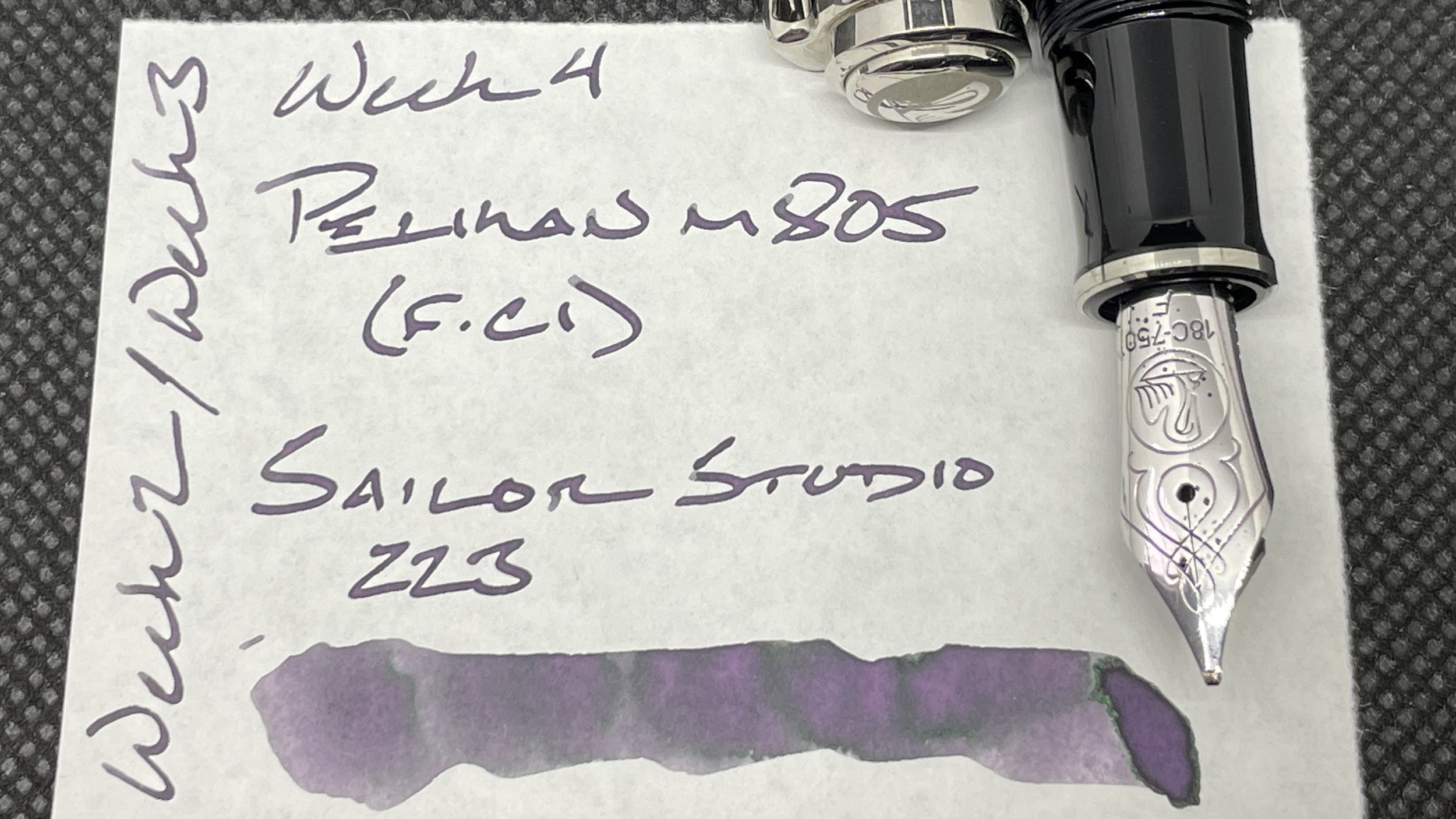
Pelikan m805 Stresemann Anthracite (F CSI, by Custom Nib Studio). Sailor Ink Studio 223. I’ve come to enjoy having a wide-lined grey ink. 223 lends fun purple shading to an already-exciting cursive italic grind. Excellent pairing for headings and emphasizing important tasks in my weekly and Hobonichi. Also: meeting notes, discussion notes, some lesson plans, reading notes, and journaling.
Blue/Teal
Karas Kustoms Decograph Winter Wonderland (EF). Pilot Iroshizuku Shimbashi-iro. Continuing on as my pocket carry for the week. The round EF nib forgives writing at odd angles — which is a common occurrence with my pocket A6 Stalogy. Shimbashi is also a bright blue. An excellent accent color against grey and dark purple inks. Lesson plans, reading notes, pocket notes, meeting notes, journaling.
Earth Tones
Pilot Custom 74 Forest Green (EF). Diamine Black Ivy. A wet ink like Black Ivy lends a smooth feel to the needle-like Pilot EF nib. Ivy’s sheen also offers the facade of shading. Sheen helps keep notes readable at odd angles and from a distance. This pair is well-suited for lecture notes and lesson plans because of Ivy. As well as detailed notes and backup-pocket notes due to the narrow EF nib. And some journaling.
Sailor Pro Gear Blue Train (H-MF). KOBE Arima Amber. A second accenting combo this week. Arima Amber’s burnt orange color and strong shading helps it to pop off of the page. Especially against the week’s otherwise subdued color palette. The round nib is well-suited to quick-writing tasks like meeting notes and initial teaching reflections (where my writing speeds is slower than my thinking speed). Also: journaling, lesson plans and lecture notes.
Wild Cards
Conklin Mark Twain Rose Gold (F CI, by Mike Masuyama). Papier Plume Bootlegger’s Sacrament. A murky purple ink and a narrow italic ink. This pair has mostly sat in my penvelope the past two weeks as the lack of a round nib or accent ink color limit my use-case options. This week, the Conklin is my thinking pen. Sketching out lesson ideas, noting tasks in my Hobonichi, and scratch notes. And journaling — because this pen is entertainingly odd looking.
TWSBI Vac700R Iris (F CSI, by Pen Realm). Pilot Iroshizuku Edo-Murasaki. Murasaki lends a mid-range purple to the week’s color palette. Barely bright enough to serve as a suitable accent color in lesson plans, lecture notes, meeting notes, and reading notes. The italic nib and rainbow colorway make this a go-to combo for journaling, too.


