I outsourced my currently inked this week
I habitually gravitate towards the same inks and pens over time. It’s often subconscious. Taking comfort in the familiar — in the colors and writing experiences that I know I enjoy.
A quick glance at my most recent currently inked kits highlights that I’m presently in just such a repetition of inks and pen choices.
Time to shake things up. I asked my partner to select three pens for this week’s kit. And I asked my good pen friend to select three inks from his own collection. No requests and no exceptions. How serious.
My partner chose two Franklin-Christoph 03’s and Sailor’s cool Slate Blue Pro Gear. Two EF nibs and a M SIG. They selected more than one of the same model pen in the same week. Bold.
My friend chose a grey ink, a dark brown-black ink, and a pink-red ink. He managed to cover the whole spectrum of color families, from quiet grey to loud-and-proud grapefruit. Equal opportunity inker.
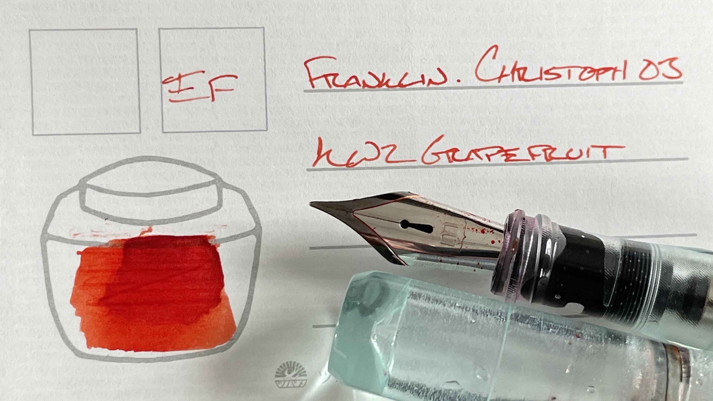
KWZ’s Grapefruit, in particular, lays far outside of my color palette. A bright, saturated pink-orange that sears through notes made by any other pen-and-ink pairing in this week’s currently inked. Fruit-inspired success.
Grey/Black
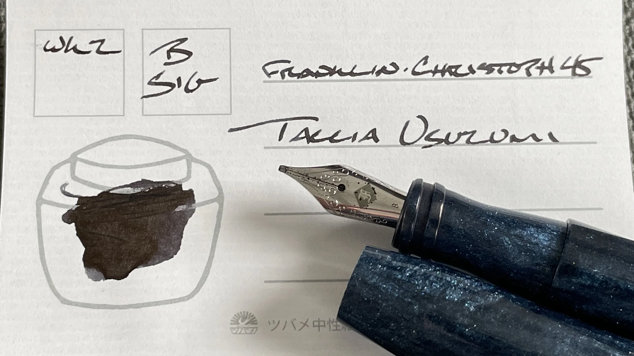
Franklin-Christoph 45 Blue Diamondcast (B SIG, by Franklin-Christoph). Taccia Ukiyo-e Usuzumi. The broad lines from this SIG grind easily distinguish writing by this combo from lines made by the Pro Gear (below). Bold black notes make for professional meeting notes (for slow-moving meetings). The SIG grind creates prominent line variation, which keeps my writing whimsical — a welcome addition for longform writing like journaling and manuscript drafting.
Sailor Pro Gear Slate Blue (EF). Diamine Earl Grey. I was elated when my friend suggested Earl Grey as an ink option. Earl Grey is my all-time favorite grey ink. An ink I am currently out of. I paired it with a narrow Sailor EF to ensure a reliable, disciplined line for my daily driver. Task management, lesson plans, meeting notes, and reading notes.
Blue/Teal
Nahvalur Nautilus Caldera Sea (BBG, by J. J. Lax Pen Company). Colorverse Warped Passages. The Nautilus’ size makes it a go-to option for long writing sessions. Then again, I find myself subconsciously reaching for this pairing every day. Warped Passages is a pop of color that manages to remain subdued enough to float under the radar during meetings. My meeting accents, journaling, teaching reflection and manuscript drafting combo.
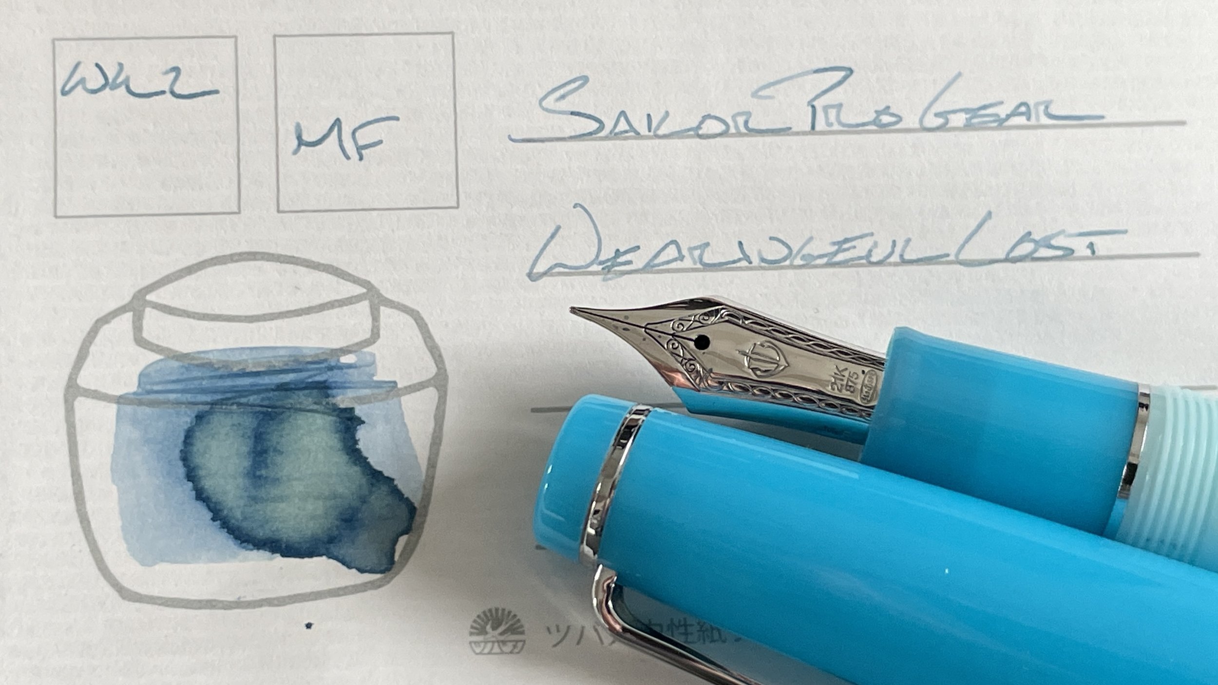
Sailor Pro Gear Blue Train (MF). Wearingeul Demian Lost. This pair has found its stride going into their second week. Strong shading dries quickly in every single letter while I write. The Sailor MF nib now produces consistent ink flow — with a noticeable pencil-like drag on the page. I enjoy the tactile feedback of running a nib over paper. Teaching letters, reading notes, lesson plans, and scratch notes.
Earth Tones
Franklin-Christoph 03 Antique Glass (EF). KWZ Grapefruit. I struggled with how best to use Grapefruit this week. I only had an EF nib remaining in the triplet of pens my partner chose for this week’s currently inked. So, a searing peachy-red was destined for use in this Franklin-Christoph 03. Grapefruit is bright enough that I worry it will draw attention during meetings with parents — and that it will raise my students’ anxieties about being marked down during student meetings. Grapefruit’s brightness suits marking tasks for future migration as the bright color demands attention. It’s also excellent for highlighting crucial items in lecture notes, lesson plans, and in the Hobonichi planner.
Franklin-Christoph 03 Ghost (M SIG, by Franklin-Christoph). Jacques Herbin 1670 Shogun. Shogun seems at home in this M SIG nib. Consistent ink flow bordering on truly wet. The result is near-black lines with shimmer that emerges patiently. I plan to carry this pair in blazer pockets, from one meeting to another. The wide M lines easily stand out against the very fine EF lines from my Sailor Pro Gear. I also expect a healthy volume of drafting work, which lends itself well to a medium-sized pen such as the 03. Nice.
Wild Cards
Pilot Prera Slate Gray (M). Sailor Shikiori Harahara. This pair continues on as my pocket carry this week. The M nib is no-nonsense: fluid writing, even at odd angles. Excellent attributes for writing in a pocket notebook I’m holding in only one hand. Harahara’s purple tones work well as modest accents, too: in lesson plans, teaching reflections, journal entries, and meeting notes. Meeting notes because of the Prera’s excellent uncapping feel.


