Sight-tested and doctor-approved
I can see. In color and high definition. Because I have two working eyes once again. I am not yet fully recovered — reading for longer than bouts of 10-15 minutes still leads to discomfort. However, I am sight-tested and doctor-approved to return to writing, reading and thinking. So long as I take my time. Pro. Gress.
A palette of subtle ink colors seems a fitting celebration of returned eyesight. Gradient shading, shimmer inks without their shimmers, and infrequent sheens dominate. And three teal inks. Unsaturated blues and teals are where my heart lives.
Four sheening inks this week in four different colors. Enchanted Ocean and November Rain send up noticeable pink and red. Yama-Budo and Benitsuchi offer stingy gold or black sheen, respectively. Fun, readable, and subtle. Like good fiction.
Catch-up workweeks fluctuate between careful, small notes at my desk and large, hasty scribblings while touching base with colleagues and students. I need options well-suited to both extremes. Extremes.
My approach is a constellation of seven nibs: three F, two M, and two B. The Zoom and Architect also moonlight in EF on their reverse sides. Detailed notes, marginalia, and large jottings all accounted for. Progress indeed.
Grey/Black
Sailor Pro Gear Imperial Black (F). Diamine Sparkling Shadows. My daily driver this week sports a soft-writing H-F Sailor nib and a moderately dry Sparkling Shadows — sans shimmer. Combined, this pair offers a bouncy writing experience and a brief drying time. Perfect for precise letters and quickly jotting tasks. Task management, meeting notes, reading notes, scratch notes.
Blue/Teal
Pilot Custom Heritage 912 (SF). Diamine Enchanted Ocean. Enchanted Ocean likes this Pilot feed — wet and sheeny. A lovely deep teal stands out at the very ends of letters. The dark color and narrow SF lines relegate this pair to an alternate in my weekly progress tracking and detailed notes during meetings. The fun SF opens the pair to journaling and margin notes at home. Cool.
Sailor Pro Gear Blue Train (Z). Kyo-no-oto Hisoku. Hisoku is one of my all-time favorite inks. The Sailor Zoom nib draws a M-width line out of Hisoku’s dryness — and fun shading. Add the forgiving round Z nib and this pair becomes a go-to combination for longform reflections. Journaling, lesson plans, reading notes and meeting notes.
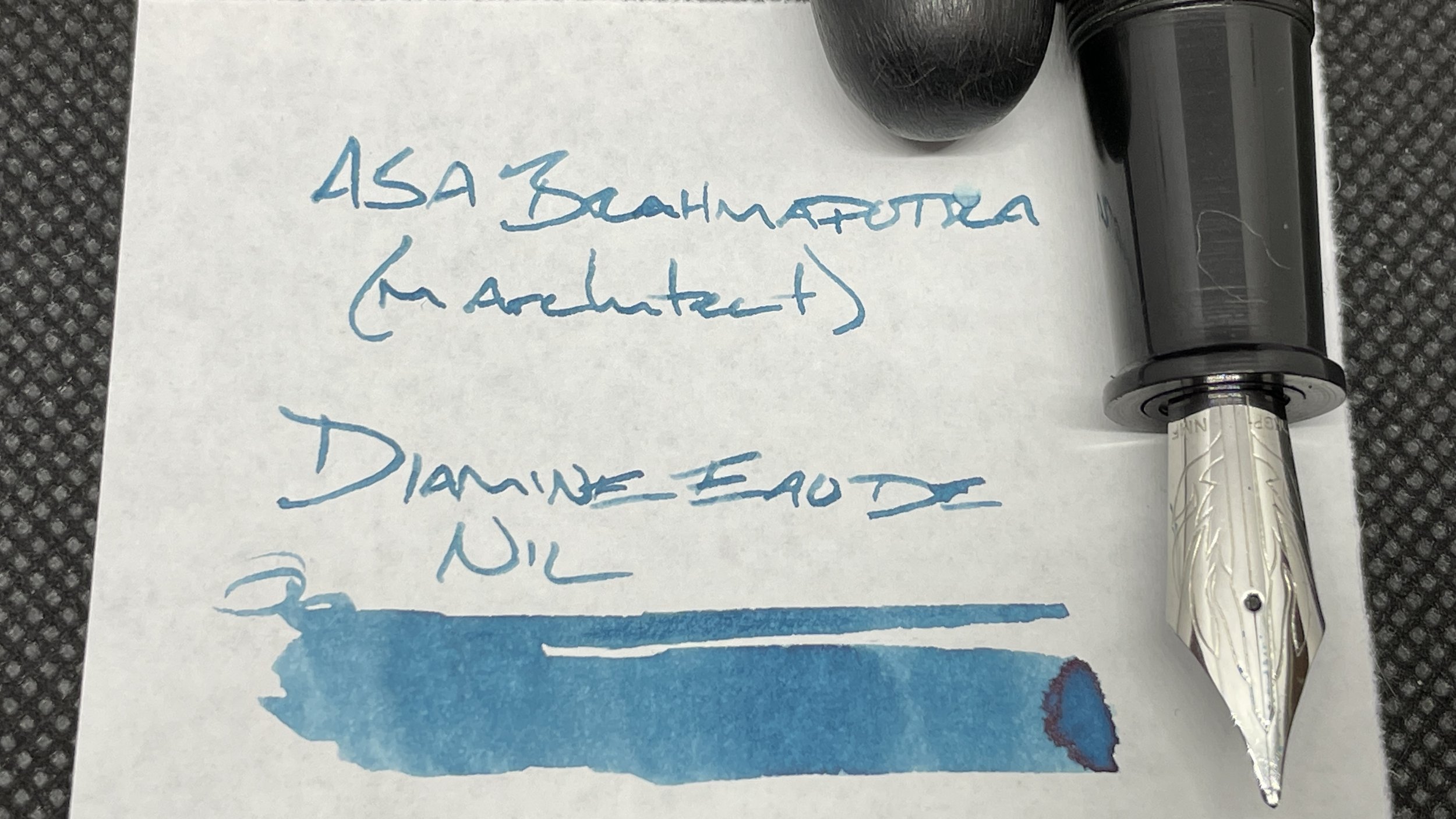
ASA Brahmaputra Matte Black (M Architect, by Kaigelu). Diamine Eau de Nil. The ASA is huge. Chuckling to myself as I uncap the pen huge. The size may prove distracting during meetings. So this pair is inked for personal writing and forms of work writing that I produce alone: lesson plans, lecture outlines, record-keeping my research students’ final grades. And journaling. Laughter is the best medicine, after medicine.
Earth Tones
TWSBI 580-AL Turquoise (B). Diamine November Rain. A turn-on-the-wipers wet combination. 99% red/pink sheen. The B nib ensures that even November Rain’s darkest lines are easily skimmable on the page against my F Sparkling Shadows. So: accent work (reading notes, lesson plans, lecture notes). And journaling.
Lamy Safari Terra (C). Taccia Ukiyo-e Hokusai Benitsuchi. An ink sample from my father-in-law’s collection. He is a connoisseur of brown inks and was absolutely correct about Benitsuchi: just a touch of orange-brown and excellent shading. I would buy season tickets if Lamy’s cursive nib were a sports team. Together, this pairing suits mid-length writing (as the Lamy feed struggles to keep up) and short accent notes, the likes of which I take during meetings.
Wild Cards
Kaweco Sport Iridescent Pearl (EF). Pilot Iroshizuku Yama-budo. I swapped this black EF nib over from my Fox Sport. It’s an appealing addition. Further, the dry EF nib makes for quick-drying pocket notes. Together: this pair is my pocket carry. The dry combo also makes this pair well-suited for marking students’ papers on their wild card printer papers.


