Checking in with that fanciest of Hobonichi planners

I feel an urge to check in with what’s working and what’s proved challenging to use in my Hobonichi Day-Free planner when the calendar turns to July. July is halfway through the year and so a window into how half my year has gone. With plenty of time left to re-leverage my Hobonichi Day-Free to better serve my day-to-day adventures.
What’s working. Hobonichi’s Favorites list (in the back of the book) is my reading tracker. Each of the 40 cells in this section houses the author’s name, book title, publication year, and a five-star rating. I also list the date I complete each book. Filling up the Favorites pages gives me extra motivation to finish my currently reading pile.

29 books so far … the tracker is working!
The monthly calendar pages are also proving useful. I list tasks in each day’s cell. The small size of the day-boxes constrains me to amounts of tasks that I can actually complete within each day.
I’ve also taken to using the left-side column as a bill calendar. Utilities like power and rent, subscriptions like streaming and music and news all live in a vertical list underneath the pre-printed month.
Leftmost is a column listing the due dates for each bill. A blank 3.4 mm box is a tracker highlighting which is paid. And the remainder of the left margin is space to shorthand what each bill is for. Comforting over-tracking.


I’m also a fan of sticking a folder onto the inside of the notebook’s rear cover. The folder keeps my currently inked swatches. Easy access.
Next week: how habit tracking and blank notes pages can use some re-imagining.
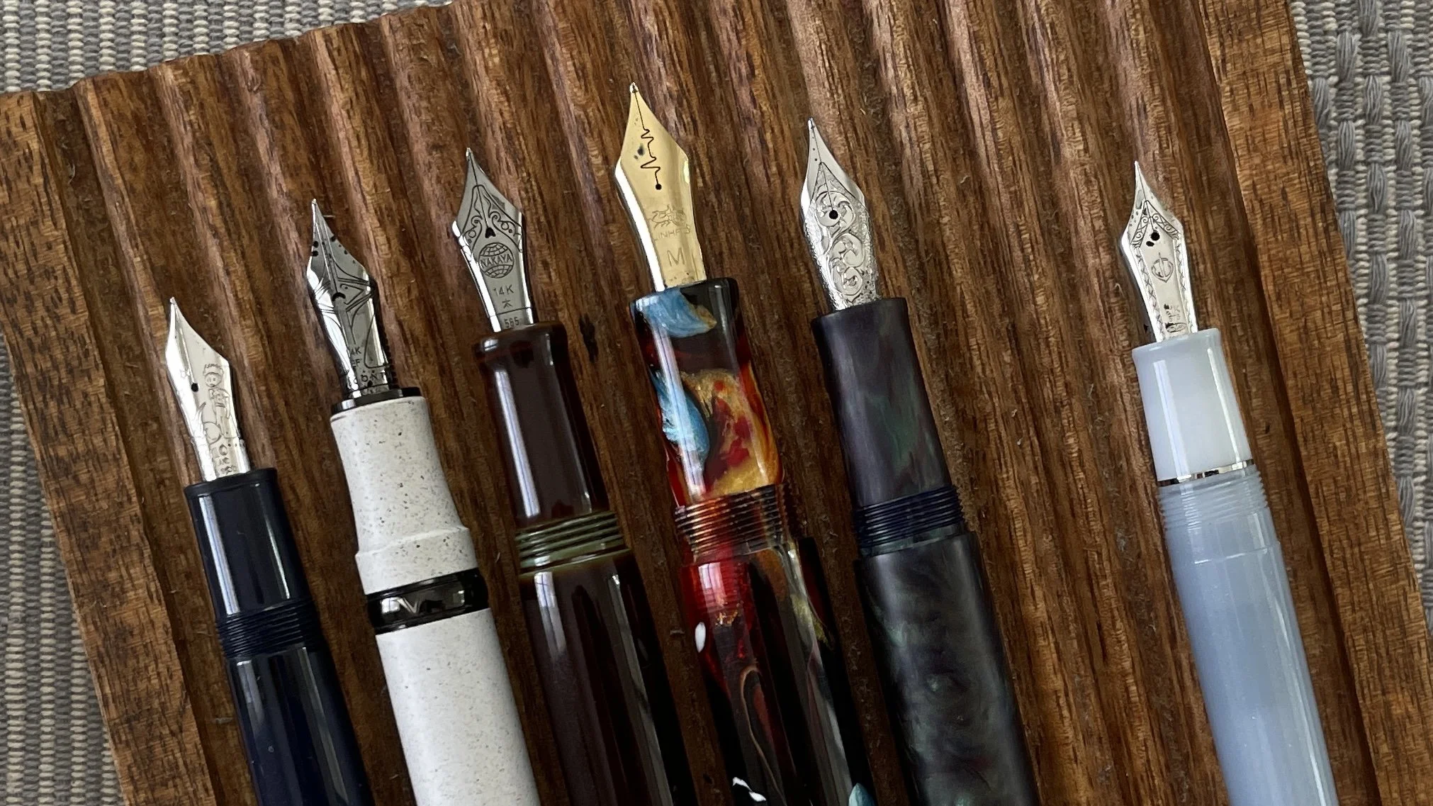
This week’s Inked Tines update includes last week’s currently inked writing tools.
Toolset
Pens. The Carolina Charlotte was a standout last week. The engraved M nib brought life to my creative writing. Ming Kong Que Blue is a favorite bright blue. The Able Snail nib and feed starts wet and runs to moderate flow after an A5 sized. Suitable for medium length writing sessions. Journaling, reading notes, and D&D notes. 1/2.

Sailor Pro Gear (F) — 2/3. The 21 karat F nib is firm enough to write consistent lines and just soft enough to comfortably accommodate a distractedly heavy hand. Sohayanotsuruki shades moderately. Task management, reading notes, and pocket notes.
Relic Pens Large (M) — 4/5. The newest nib in my collection. A wet combination paired with Akkerman’s Koninginne Nacht-Blauw. Longform writing and reading notes.
Nakaya Neostandard (M Naginata-togi) — 3/4. Sea Glass is a readable whispy green. The M line width is legible in a 5 mm grid and the reverse EF is similarly readable in the Hobonichi’s 3.4 mm grid. Reading notes, event tracking, and creative writing.
Visconti Homo Sapiens (EF) — ?? The Homo Sapiens’ weight and size are comfortable in short and medium writing sessions. Ebicha is a deep maroon that notes best alongside bright or unsaturated ink colors. Reading notes, creative writing, and scratch notes.
Montblanc 146 (EF) — 4/5. A frequent go-to for journaling and reading notes. Sakuranezumi is dry and so narrows the EF lines to crisp, narrow letterforms. A keeper.
Notebooks. Work bujo. JetPens Kanso Noto (A5). I spent the week in curriculum prep. Six pages of reading note outlines now live, colorfully, in the fantastic Kanso Noto. Pages 79 to 84.
More specifically, I pulled specific historical examples out of the history textbook I aim to use next year. This writing, for me, happens in two waves: listing examples within each chapter and then highlighting those examples that show conceptual themes.

My reading notes process may warrant its own post.
I used a stainless steel Midori index tab to mark the page starting my reading notes. Midori’s metal tabs are a key ingredient in keeping my notes searchable. Easily opening my work bullet journal right to the page I need to reference lowers the proverbial bar to getting started. Easy access also catalyzes finding relevant information without following distractions on my computer. A necessary component when I’m designing instructional tools for a lesson or an assessment — work that lives digitally.
I color coded each chapter’s significant examples by historical theme. On the page below, the Montblanc (and its EF nib) laid out examples of how masculinity shifted over the course of the US Civil War. The EF lines left plenty of space for small letterforms to remain easily legible. Both the heading and three examples I want to highlight for my students are written in Sakuranezumi’s somber purple.

Grey, purple, blue, and maroon inks doing the dance of intellectual nerdery.
The conceptual thread itself is the heading, written on its own line. Each example is bulleted and indented underneath the heading. No explanations. Just the name of a figure or event is enough. I add a running column of page numbers down the left side of each bullet to ease looking up each example.
Every pen met the Kanso Noto over the course of the week. An exercise in spreading the inky love around my pen tray.
Journal. Semikolon Fango (A5). I sat down twice to journal over the course of last week, on Monday and Wednesday mornings. The two entries mirror one another: each is one page long, and each contains two paragraphs. Like for like.

Short and sweet
I chose the Montblanc for Monday night’s journaling session. I anticipated a long entry as it was an exercise in processing our air conditioning unit failing in the throws of a heat wave, and the ensuing repair work. The Montblanc’s EF nib would help me fit a wealth of complaining onto each line. And Sakuranezumi’s muted hue matched my grumpy outlook at the time.
Wednesday’s entry is a cheerier affair, written in the cool air of a fully conditioned home. I tapped the week’s cheeriest ink color for assistance: Ming Kong Que Blue. The entry was a second cathartic recounting of my emotional journey that day. The M nib ensured hints of red sheen spotted my scribbling.

Just enough sheen to remember it’s possible.
Written dry. All six pens write eagerly on. Full fills take multiple weeks to write empty.
Newly inked. Stability is a benefit of a currently inked palette that meets my current needs. I had a pen-and-ink pairing to suit my interest throughout the week. Rousing success.
A shiny, rousing success, indeed …
The collection
Incoming / new orders. Family came out to visit last weekend. We took the opportunity to visit Fahrney’s downtown — a surprisingly large, old-school American fountain pen shop. I picked up two new inks during Fahrney’s July 4th sale: Sailor Ink Studio 340 and Visconti Old Vineyard with Peasant Woman. Double wahoo.
Sailor’s Ink Studio lineup is extensive. 340 is a murky, moody light blue. A bridge between the moody dark blues and popping light blues already in my collection.
I also encountered Visconti’s 30 ml bottles for the first time. Until last weekend, I had only seen Visconti’s large, decorative bottles in person. Champagne flute dimensions with a narrow bottom and large topside. 60 ml is an intimidating amount of ink. Intimidating in a beautiful bottle.
The 30 ml square bottles feel more accessible (read: finishable). I chose the Van Gogh series’ grey ink for my first foray into the land of Visconti inks. The purple grey in my initial swatch and the Van Gogh series’ artistic historical theme suggest I chose well.

Trans-peasant appreciation
Outgoing / trades or sales. My pen storage has once again reached full capacity. The deliberations on pens to send outward into the broader pen enthusiast community are nigh.

A full house again. Have mercy.
Currently reading and listening
Fiction. I greeted the beginning of my summer break with a Boox Go Color 7. An e-ink device to cut down on my screen time while reading fiction. Put simply: the Boox facilitates me reading while my phone rests in another room.
I finished John Scalzi’s The Ghost Brigades last week. All read on the Boox tablet.
Nonfiction. I finished my close reading for the final three chapters of Bronski’s excellent A Queer History of the United States. My second run through this award-winning history.

Evidence of a close shave
Zebra’s Neutral Mildliner set carried me through all three chapters. I rotated Mildliners, tagging in a new accent highlight color for each chapter. Chapter 8 was pink. Chapter 9 was green. Chapter 10 was a taupe brown. Small changes for novelty’s sake.

The fresh-maker … or is that phrase trademarked?
Music. The Decemberists released a new record recently. As it Was, So It Will Be Again is mellow, with straightforward instrumental arrangements. Easy vocals that tell stories if one listens attentively. Perfect accompaniment for deep reading.
Below is a live set from their current press tour. Kid friendly and stationery nerd approved.