Back to basics with round nibs

This week’s currently inked returns to basics. I have a pen and ink combination for fast writing while seated and for jotting notes while standing. All balanced against options for slower writing tasks at my desk.
This said, our whole faculty meets in an auditorium. Stadium seats result cradling notebooks in your lap. Challenging angles for writing comfortably.
Round nibs are well-suited to fast writing tasks — and at odd angles. The rounded tipping writes smoothly, even when the nib is mistakenly rotated.

A tine too far
An italic nib, rotated like in the picture above, runs the risk of the squared corners snagging on paper fibers. An especially crisp nib grind may even be unable to sustain capillary action (or: the ink flowing onto your paper).
Five of this week’s seven inked pens sport rounded nibs. One EF, two F, and two M nibs. Three separate line widths afford me option of small and large letters — all at forgiving angles to the page.
This week’s playset is also equipped with two ink choices in each accent color family. A murky Rikyu-cha against the popping Orange Indian. The subdued Verdigris against the subtly sparkly Enchanted Ocean. And the dusky Rose Noir against the mid-toned Pop Art Purple.
All bases covered.
Grey/Black

TWSBI 580-AL Lava (EF). Colorverse Matter. Daily driver. My primary task management and meeting notes combo. Matter’s mid-grey opens even dark colors up as accent inks. The round EF nib is just stingy enough to encourage Matter to dry quickly. Task management, meeting notes.
Blue/Teal

TWSBI 580-AL Silver (M Predator Hybrid, by Nib Grinder). Rohrer & Klingner Verdigris. The M width line of the Predator grind is the clearest accent against an EF Matter. The hooked EF side works quite well for pocket notes — the line is so narrow even Verdigris dries quickly enough to allow me to re-pocket my A6 notebook without smearing onto cross-pages. Pocket carry alternate. Scratch notes, meeting notes, lesson plan outlines, journaling.

KACO Green Edge (F, by Faber-Castell). Diamine Enchanted Ocean. The slight sparkle of Enchanted Ocean offers a fun writing option in the project management pages of my work bullet journal. The black snap cap is stoic enough for parent partnership meetings. Meeting notes, lesson plan outlines, journaling.
Earth Tones

Kaweco Skyline Sport Mint (M). Sailor Shikiori Rikyu-Cha. Rikyu-cha’s color changing properties make it a fast favorite for methodical writing like journaling and lesson plan outlines. The Sport’s compact build screams for a pocket carry. I plan to take on both kinds of writing with this pair. Pocket carry. Scratch notes, journaling, lesson plan outlines.

Franklin-Christoph 31 Smoke & Ice (M SIG, by Franklin-Christoph). J. Herbin Orange Indien. Orange Indian is a shock of color against this week’s more muted tones. The generous M SIG brings out Indien’s shading. Meetings where I can write with a table are tolerable. The SIG is a challenging writer for me at unhappy “lap angles.” Some meeting notes, lesson plan outlines, note annotations, journaling.
Wild Cards
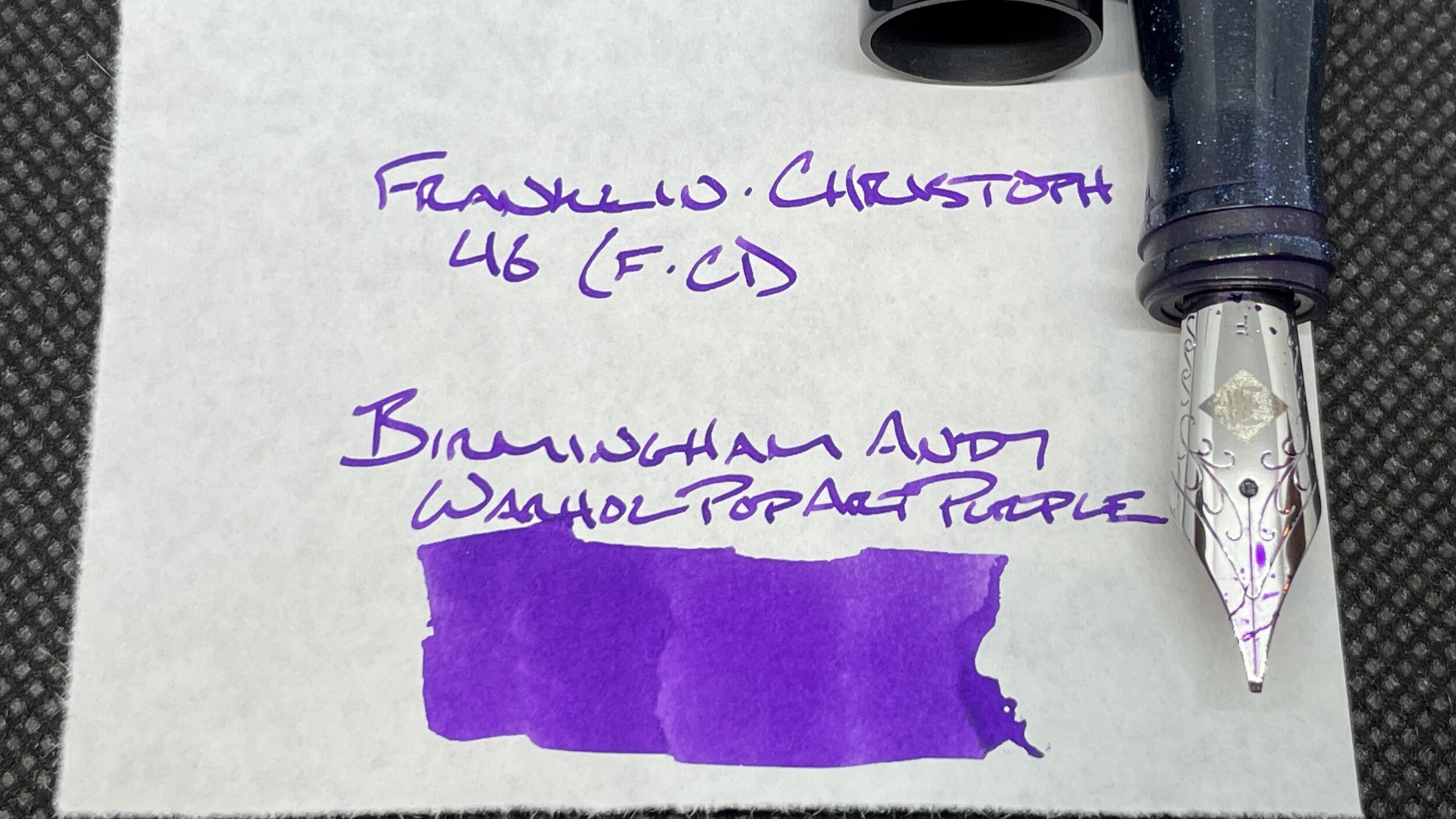
Franklin-Christoph 46 Diamondcast Blue (F CI, by Mike Masuyama). Birmingham Andy Warhol Pop Art Purple. Pop Art is a wet ink in this CI nib. The wetness feathers on Stalogy paper. So, this combo is slated for use as in lesson plan outlines, seated work bullet journal tasks and journaling — each of which take place on CAL paper.

Faber-Castell Ondoro White (M). Monteverde Rose Noir. The hexagonal Ondoro brings me joy. I have no rational explanation. Paired with one of my favorite inks, this pen will be a popular accent note taker and journaler. The M line width stands out against Matter enough to suit annotating notes, too. Meeting notes, lesson plan outlines, journaling.
