A little sun, a little shade
Rolling into a new school year is a tide of highs and lows. I’m eager to teach and work with my students again. As much as I will miss getting to spend daytimes with my partner. Sun and shade. Bright and dark.
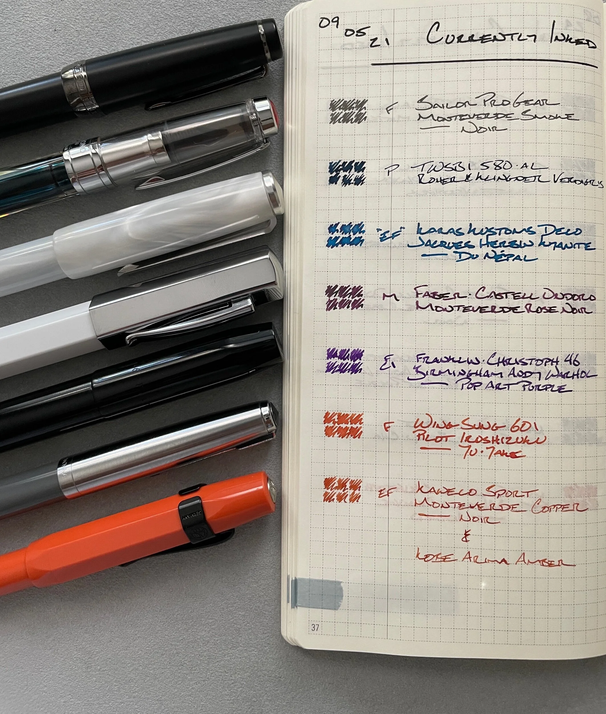
This week, I’m leaning into the contrast between light and dark. I chose one bright ink and one dark ink color for each color family. For a total for seven pairings — because grey.
Verdigris’ murky blue-black offsets Kyanite’s shimmery swagger. Arima Amber’s even keel mid-brown centers Yu-Yake’s in-your-face red-undertoned orange. Although, I did make a quick ink change from Amber to Copper Noir.
Pop Art Purple and Rose Noir are holdovers from last week. They fit this week’s theme just as well. And I dig both pen and ink pairings. Joy is a solid justification.
All four new pens have survived long dry spells. The Sailor and Wing Sung, in particular, haven’t made rotation since last January (eight months ago) and September (eleven) , respectively. The Decograph: six months. The Sport: three.
If it’s back in the game for me, it’s back in the game for these four.
The result is the addition of three bright colors to my weekly palette. A currently inked I’m excited to dig into. And excitement makes writing fun for me. Bring on the school year.
Grey/Black
Sailor Pro Gear Imperial Black (H-F). Monteverde Smoke Noir. A wet feed combined with a light grey results in a mid-grey. No shading, but dries from a black to grey – fun. The Sailor is comfortable in the hand and writes every time. Perfect for task management, scratch notes, and meeting notes.
Blue/Teal
TWSBI 580-AL Silver (M Predator Hybrid, by Nibgrinder). Rohrer & Klingner Verdigris. A firehose of a pen and ink combination. Even my Stalogy pocket notebook is ink friendly this year. Wet is workable given my paper options, even while pocket carrying. The M makes for lovely journaling. The EF is suited to detailed notes and lesson plans. Too dark for accenting.
Karas Kustoms Decograph Winter Wonderland (EF). Jacques Herbin 1798 Kyanite du Népal. The EF nib lays down a M line – a boon for a shimmer ink like Népal. Bright and easily legible pairing. Great for accent notes, lesson plans, and meeting notes. Journaling, too, given the generous ink flow and wide line width.
Earth Tones
Kaweco Skyline Sport Fox (EF). KOBE Arima Amber Monteverde Copper Noir. A dry combination. The stingy EF nib and Copper Noir’s middling wetness do yield a quick-dry option that writes well on even absorbent copy paper. My primary pocket carry this week. My orientation-running combo because I make notes on copy paper throughout the day and will rarely be behind my desk.
A quick note here: Arima Amber was my go-to choice. But it proved too light in the Kaweco’s dry feed. So I swapped for the darker Copper Noir in the converter. This color should grow darker through the coming week as Copper invades the feed where Amber currently sits. My first time mixing inks like this.
Wing Sung 601 Battleship Grey (F). Pilot Iroshizuku Yu-Yake. A popping orange that shades noticeably out of the F nib. Goldilocks zone of wetness/dryness. Excellent combination for accenting meeting notes and lesson plans, highlighting my weekly task list, and journaling.
Wild Cards
Faber-Castell Ondoro White (M). Monteverde Rose Noir. Rose has settled into the Ondoro’s feed. The result: strong shading and rare sheen. Shading covers for Rose Noir’s dark tone to make this a solid pair for accent notes — especially against Smoke’s lack of shading. Accent meeting notes, lesson plans, journaling, and some letters.
Franklin-Christoph 46 Diamondcast Blue (F CI, by Masuyama). Birmingham Andy Warhol Pop Art Purple. Warhol pops off the page. A slight bit of shimmer from a prior ink adds a fun, and rare, additional flair – it’s not a bug, it’s a feature. I’m putting this combo to all the same uses as the Ondoro. With the added caveat that the crisp italic grind makes this a “while seated” pairing.


