Three small corrections to keep balanced


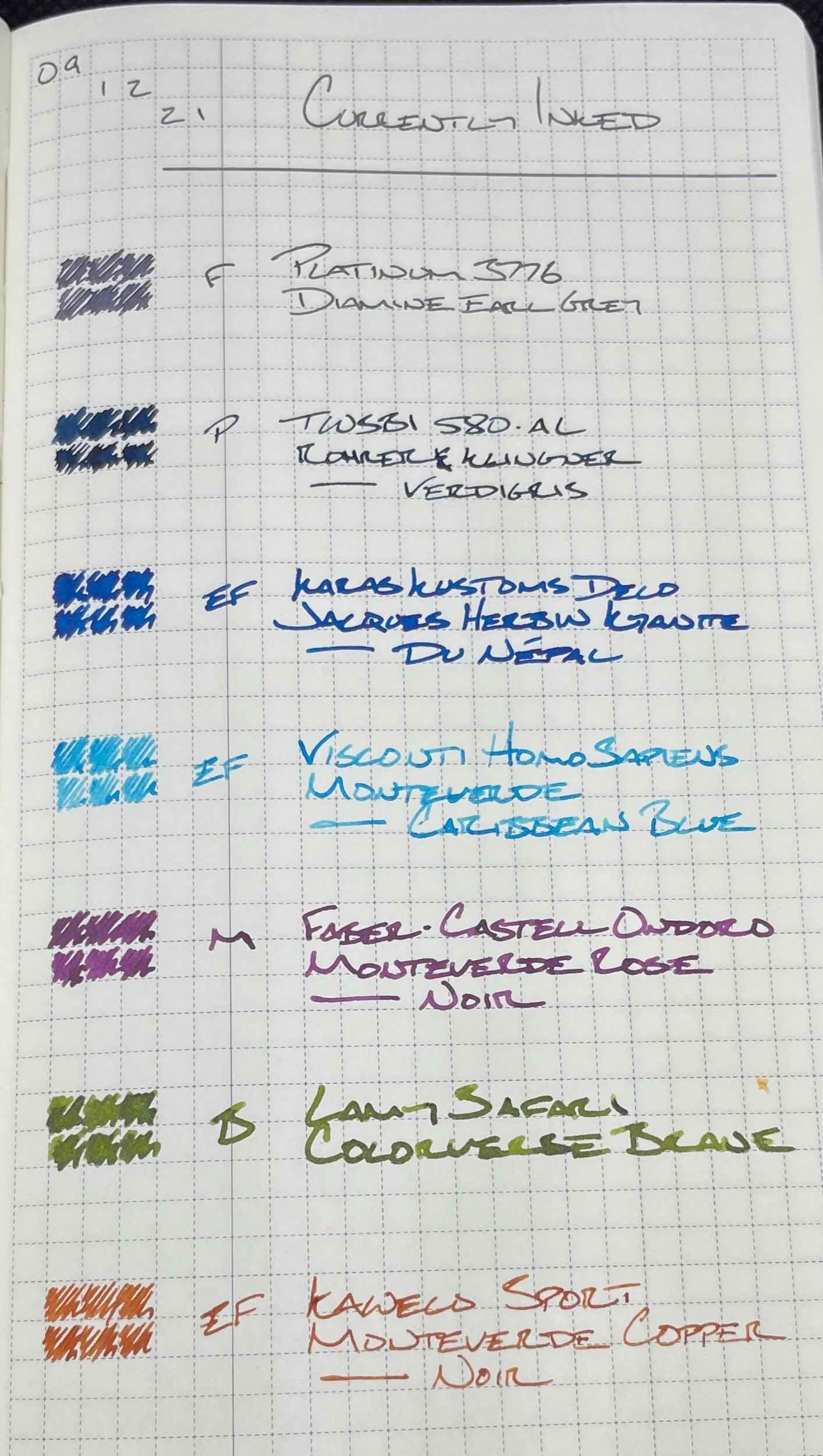
Last week’s collection of pens and inks collaborated well together. Having a bright accent and a dark accent (in a wider nib) proved useful — and fun. A working system is worth keeping. So I am keeping last week’s pens mostly intact — with three tweaks.
The empty Franklin-Christoph 46 swaps out for another bright wild card color. The Visconti Homo Sapiens is out of the tray. The EF nib balance the M-width lines from the Karas and TWSBI. The Blizzard is inked with searing Caribbean Blue.
The near-empty Sailor re-trays for another Japanese F nib. Their 3776’s disciplined F line suits work as my daily driver. And Diamine’s Earl Grey offers a comfortable favorite grey hue.
Lastly, I missed having a green ink last week. To compensate, I reached for Colorverse’ Brane to replace Yu-Yake. It’s green and green shimmer. Double-green. All in a B nib to contrast the Kaweco’s hairline EF.
The trio of substitutions recreate what made last week’s currently inked so successful. A fantastic cadre of seven pens.
Grey/Black

Platinum 3776 Star Wars Kylo Ren (F). Diamine Earl Grey. A heart-filled thematic pairing. I love Star Wars. The “galaxy far, far away” was my first fictional world. And my favorite grey ink. Combined with a narrow F nib: perfect daily driver. Task management, scratch notes, meeting notes, lesson plans, reading notes.
Blue/Teal

Karas Kustoms Decograph Winter Wonderland (EF). Jacques Herbin 1798 Kyanite du Népal. Surprisingly lovely combo. The wet and broad EF lays down a wide line — which makes journaling exciting. Kyanite’s silver shimmer adds readability at odd angles to the page. So: also well-suited to lesson plans, accent meeting notes, and reading notes.

TWSBI 580-AL Silver (M Predator Hybrid, by Nibgrinder). Rohrer & Klingner Verdigris. Mr. Bacas’ grind lends versatility to a sturdy pen. Combined, this combo is a trustworthy pocket pen, and a fun journaling pen, and an accenting pen. Narrow lines and a wet M line — all in one nib. Lesson plans, meeting notes, journaling, and scratch notes.

Visconti Homo Sapiens Blizzard (EF). Monteverde Caribbean Blue. The characteristically wet Visconti feed ensures Carribbean Blue sheens noticeably. Their magnetic cap closure suits quick writing. The result is an excellent accenting combo. Meeting notes, reading notes, lesson plans, marking.
Earth Tones

Kaweco Skyline Sport Fox (EF). Monteverde Copper Noir. Pocket carry. A dry ink, narrow nib, and stingy feed comprise a great workplace writer. My go-to for writing on school-provided paper. Also, a quick drying combo for pocket notes that dry quick enough to avoid smearing on Stalogy’s paper. Pocket notes, scratch notes, marking, lesson plans, journaling.
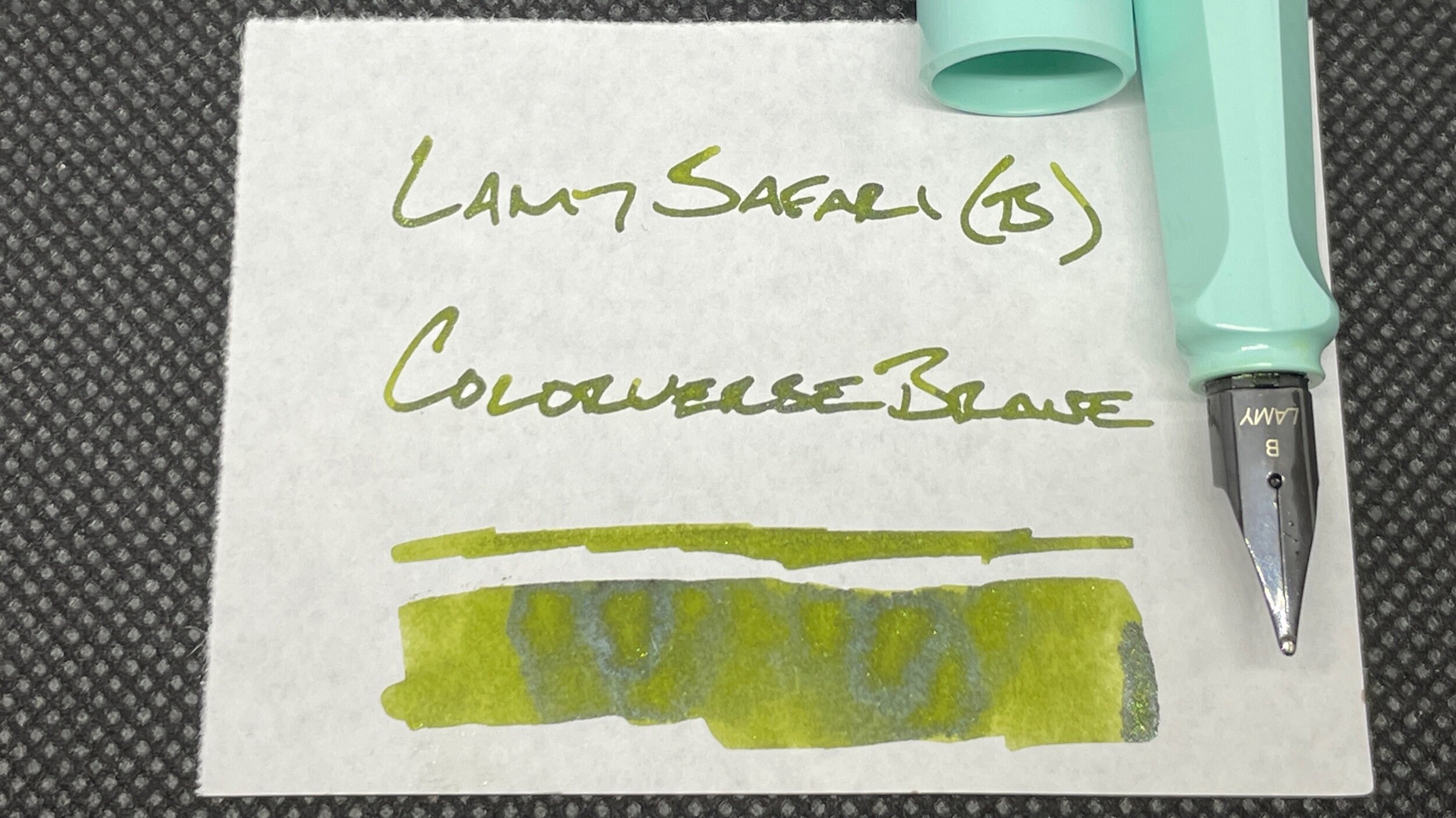
Lamy Safari Blue Macaron (B). Colorverse Brane. Surprised by how well shimmer inks work for lesson plans. The glitter helps me to read notes from a lecture feet away. Huzzah. And the green offsets Earl Grey for accenting meeting notes. Lesson plans, meeting notes, journaling.
Wild Cards

Faber-Castell Ondoro White (M). Monteverde Rose Noir. To work as an accent color, the pair needs a broader nib width. The M line brings fun shading out of Rose Noir. The round nib and snap cap both suit quick writing. This is my go-to meeting pen for accent notes. Meeting notes, journaling, lesson plans.