A different kind of triple double
Taking in that new currently inked smell
A fresh start this week. A slate swept clean so seven new pen-and-ink pairings can travel with me between campus and home. The school year has begun afresh.
I sought to craft a septet offering at least two narrow writing lines, any least two middling writing lines, and at least two wide line widths. A triple double. A different kind of triple double.
The Gravitas and Platinum offer a collective duo of medium line widths, the Gravitas as a dry writer and the Platinum as one wet pairing. My wild cards this week sport wide B and BB nibs, each with heavily shimmered inks: Deck the Halls and Early Spring. The Nahvalur and Pilot combine to offer narrower line widths, easily suitable to maintaining legibility across small letterforms.
Triple double achieved.
Grey/Black
Pilot Custom 743 Deep Red (F). Pennonia Viharfelhő. The 743’s size is a happy fit with my hand. Wide enough to hold comfortably over long, slow writing sessions and yet slim enough to feel controlled when scratching out quick, diminutive letterforms. Viharfelhő shades prominently, even in a disciplined Pilot F. Task management, meeting notes, reading notes, and curriculum planning. Driving my writing on the daily.
Blue/Teal
Gravitas Ultemate Vac Acrylic (M Imperial, by Pen Realm). Kyo-no-oto Aonibi. Aonibi hits a sweet spot for me as a strongly blue blue-grey. Aonibi’s dry experience skews the Gravitas’ M line widths to easily-readable Japanese-width lines. Excellent accompaniment for detailed reading notes, lesson plan outlines, and lecture notes.
Earth Tones
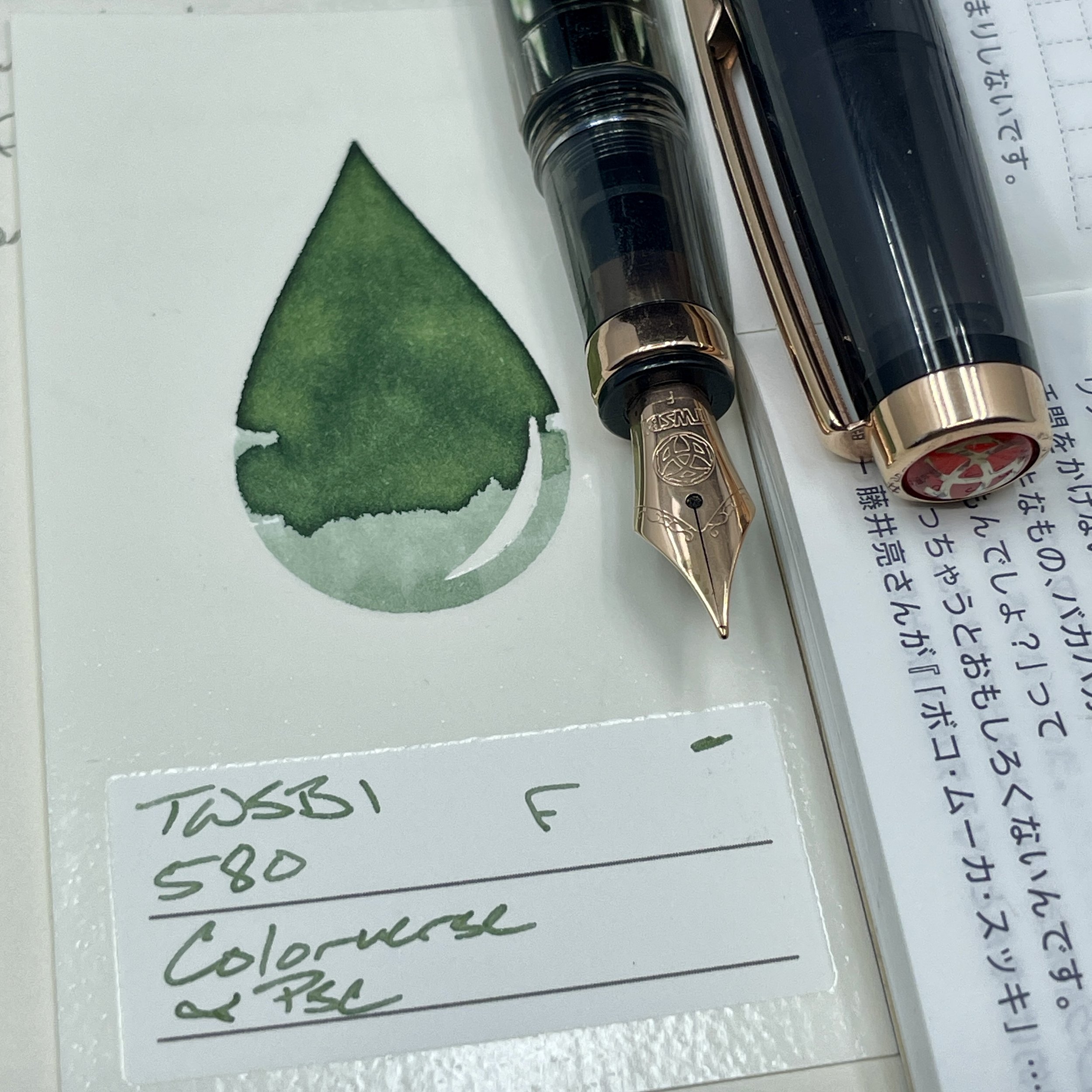
TWSBI 580 Smoke RoseGold II (F). Colorverse Project α Psc. Pairing a known dry ink with a known firehose nib and feed produces stellar shading and an enjoyable soft feedback. Psc is a pasty mint green that easily stands out against the dark-hued inks in this week’s palette. Accent notes will be a particular strength for this combo, especially in the margins of manuscript drafts. The 580 is also well-sized for comfortable longform writing sessions like journaling, teaching reflections, and D&D notes.
Platinum Century 3776 Laurel Green (M). Dominant Industry Autumn Forest. The Laurel Green is overdue for my rotation as it was last inked in Fall of 2022. Oof. The M nib may find challenge in managing Autumn Forest’s ample shimmer but has already shown facility for throwing off frequent shading. The muted green color will carry meeting notes, lesson plan outlines, reading notes, and journaling sessions with ready readablity. Strong plan.
Nahvalur Schuylkill Chromis Teal (EF). Monteverde Sweet Life Pumpkin Cake. Heavy tuning has the EF nib writing like a dream. A swapped feed lends havy inkflow to the pairing, bringing out halos and pools of black sheen across Cake’s brown-orange letters. A darkness well-at-home in advisor meetings, curriculum planning sessions, and throughout lesson plan outlines. Also: journaling.
Wild Cards
Esterbrook Estie Raven (B). Diamine Deck the Halls. Deck the Halls runs a wet, dark purple-black in the Raven’s feed. The result is near-black writing that shines up with pink shimmer as my writing dries. A fun play between business and party. Another welcome ink mullet pairing. Excellent for bringing subtle whimsy to teaching notes, curriculum planning, drafting my own writing, and journaling. Most excellent.
Kaweco Skyline Sport Mint (BB). Dominant Industry Early Spring. The Sport is one of the oldest pens in my collection, hearkening back to the heady days of 2018. The stamping has worn off. The plastic has taken on stains from ink and various pocket substances. Personality aplenty. The BB nib lays as much ink on the page as can be expected, darkening the whisper-light Early Spring to a shimmery pink. The light coloring relagates this pairing to personal writing: journaling, D&D notes, and commonplace notes.


