Smoothing out the crispy edges

Four of this week’s nibs rock their writing with crisp, edgy tippings. A 1.1 mm stub nib and an architect grind require proper writing angles for enjoyable ink flow. Both Montblanc’s EF nib and Dan Smith’s lovely CI grind also have narrow preferred writing angles.
Lubricated inks can take a bit of the edge off — so to speak. I’ve chosen a cadre of my wetter inks to bring my quartet of crispy nibs to heel. Balance is the way.

Lubricated rectangles
Additionally, I added four new pen and ink pairings to my currently inked this week: two EF, one F, and one 1.1 mm stub. I expect a wild week of impromptu meetings before my youngest students’ first papers come due. A line width for every occasion.
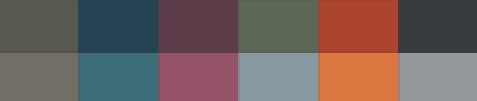
Grey/Black

Montblanc 146 Le Petit Prince & Fox (EF). Bungukan Kobayashi Sohayanotsuruki. A wet ink that dries quickly is a great choice for nibs with picky edges. My 146’s EF nib sports square, precise tipping. Sohayanotsuruki lubricates those edges. My daily driver pairing for the week. Task management, meeting notes, reading notes, scratch notes, and lesson plans.

Visconti Homo Sapiens Silver Age (F CI, by Nibsmith). Troublemaker Petrichor. Petrichor shifts from a phosphorescent green to a silver-grey — a shift that is especially noticeable with generous volumes of ink on the page. The Visconti can certainly accommodate. The crisp F-CI nib — with its soft palladium nib — makes for a careful, methodical writer. A combo that will simultaneously slow me down, forcing me to think carefully about my words, and keep my writing exciting to watch. Thought-heavy tasks: analytic journaling, teaching reflections, lesson plan designs, and student comments.
Blue/Teal

Sailor Pro Gear Slate Blue (Z Architect, by Custom Nib Studio). Diamine Aurora Borealis. The wide architect grind on this Sailor nib slops ink on the page, leaving fun splatter patterns at the ends of letters. Borealis’ fun shading and infrequent sheen add to the fun quotient. My dedicated heading maker, as well as meeting notes (with the EF reverse side of this nib for detailed accent notes). Also: longform journaling and pocket notes.

Loft Highworth Teal Ocean (EF, mnml). Taccia Ukiyo-e Sabimidori. Pairing Sabimidori with an EF nib is an outlier. Disciplined EF lines limit Sabimidori to more subtle color variances — which pop up infrequently at the beginnings and ends of words. A muted, and yet still exciting, combination suited to detailed accent notes, scratch notes, and brainstorms.
Earth Tones

Monteverde Rodeo Drive Polaris (1.1 mm). Taccia Ukiyo-e Sharaku-Koiame. Koiame is the second Ukiyo-e series ink in my rotation this week. Koiame’s modest flow keeps this 1.1 mm stub nib to slightly-wide B lines. Perfect for skimmable headings, highlighting new tasks that arise during meetings, and for journaling. Reading notes, too.
Wild Cards

Majohn A1 Matte Black Clipless (EF). Ferris Wheel Press Candy Marsala. Oooh. Aaah. I enjoy a new pen’s first full week in rotation. The EF nib has been tuned to a disciplined EF line with moderate flow. Candy Marsala shows off both its earthy browns and red hues in this narrow nib size. With slight haloing. And the click mechanism makes the A1 a safe options for roaming my classroom to record homework grades. Marking student papers, reading notes, margin notes, manuscript editing, and scratch notes.
