Living dangerously; grey shimmery danger


I anticipate a week of slow writing and long writing sessions. Windows of time to maintain feeds and floss tines. Space to think and tinker and reflect. A good week ahead.
The kind of good that accommodates attention-intensive pen-and-ink pairings. I’m opting in on using a moderately dry ink with high shimmer for the week’s daily driving — a bold choice in any week. And bolder all the more when relied upon for driving my teaching, lesson planning, and task management. Living dangerously, indeed.
Notably, a respectable 50% of the week’s pens are equipped with architect nib grinds: the Pilot 92’s FM, the Sailor’s Z, and the Esterbrook’s B. Architect grinds require concentration from me to write at proper angles. This is a stellar week for slowing down and thinking about the mechanics of my writing alongside my pedagogical maneuverings.
Dangerously glittery. A-yep.
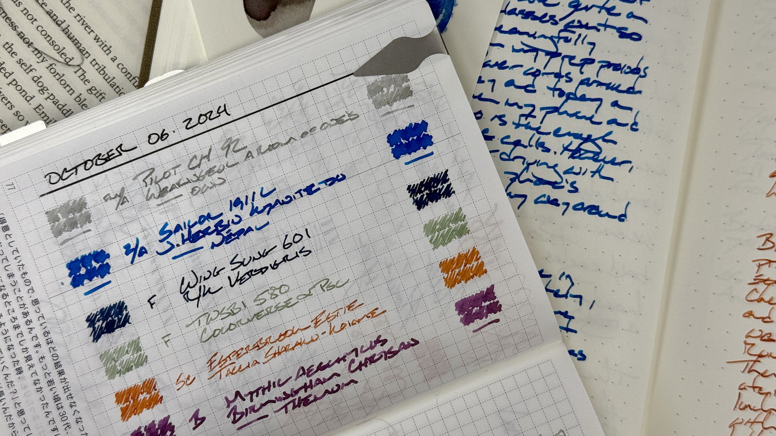
Grey/Black

Pilot Custom Heritage 92 Transparent Blue (FM Architect, by All in the Nib). Wearingeul Virginia Woolf A Room of One’s Own. Shimmer inks are an exceedingly rare choice for my daily driving combo. In particular, I have a strong preference for no-nonsense grey inks when planning my task management. One’s Own comes recommended to me as a low-labor shimmer ink. Pink shimmery flair for my lesson plans, scratch notes, and meeting notes. Unsold and adventurous.
Blue/Teal
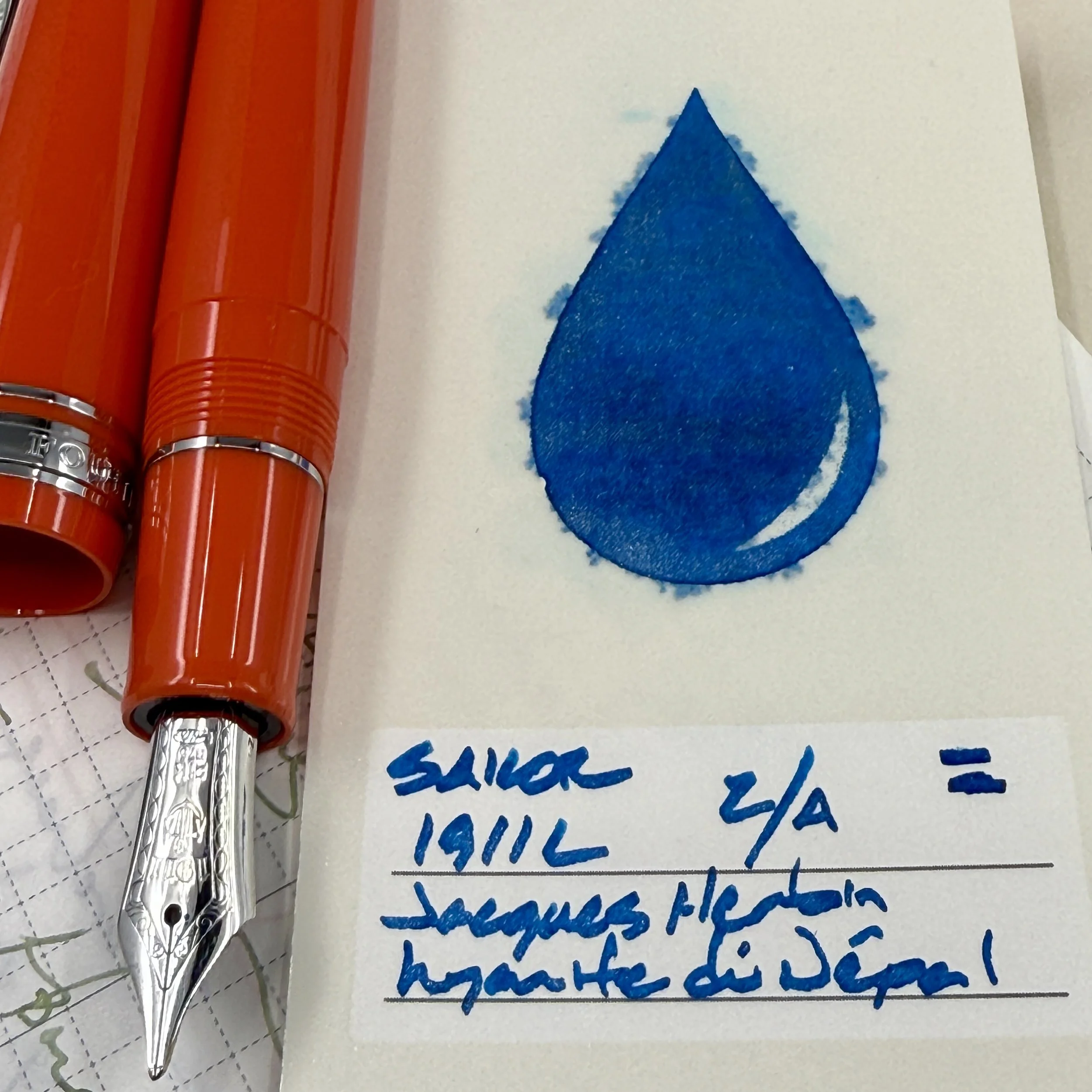
Sailor 1911L Tangerine (Z Architect, by Custom Nib Studio). Jacques Herbin 1798 Kyanite du Népal. Kyanite and Gena’s exceptional Z Architect are well matched. Wet enough to sheen periodically, to carry silver shimmer without clogs, and to shade on even absorbent copy paper. Proud wide lines make teaching notes easily legible for me and for students seated across a small table. And the line variation brings whimsy to creative writing, teaching reflections, and journal entries.

Wing Sung 601 Battleship Gray (F). Rohrer & Klingner Verdigris. The 601 found its ay back into my pen case. The 601’s slip cap and tight clip make this pen an excellent choice for pocket notes — and for checking student homework during class meetings. Verdigris is a gritty teal, easily legible from afar and muted enough for meetings with parents and the squirreliest of students. Also, detailed writing tasks like lesson plans, and reading notes.
Earth Tones

TWSBI 580 Smoke RoseGold II (F). Colorverse α Psc. The calendar year’s longest-inked pairing at seven concurrent active weeks. Psc writes a dry-to-moderate line, shading at the very tips of my letterforms. Fun over short and medium length writing sessions. Quick-drying for smear-free notetaking during rapidly moving meetings and brainstorms.

Esterbrook Estie Back to the Land Quirky Leaf (B Scribe, by J.J. Lax Pen Co.). Taccia Ukiyo-e Sharaku-Koiame. The third and most forgiving of this week’s architect nibs. Lax’s Scribe reminds me of Lamy’s excellent cursive nib — both make for strong opening forays into the world of nib grinds. The pear-shaped nature of the Scribe’s nib shape lends this pair to moderately-paced writing tasks like teaching reflections, lesson planning, and analytic journaling. Boo-ya.
Wild Cards

Mythic Aeschylus Black & Red (B). Birmingham Chrysan Themum. The Jowo B leaves wide, shaded lines that rapidly fill up the lines in my notebooks. Chrysan’s purple-pink hue is easily legible against both dark ink colors like Verdigris and One’s Own’s whisper-light grey. A great counter-point combo for work-related writing — and a fun page-filler for personal creative writing. All inside a pen sized comfortably for medium-length writing sessions. Easy.