What does one do with blank planner pages?

This post builds on two prior reflections into how I’ve used my Hobonichi planner so far this calendar year: aspects that are working well and ways my habit tracking can be improved.
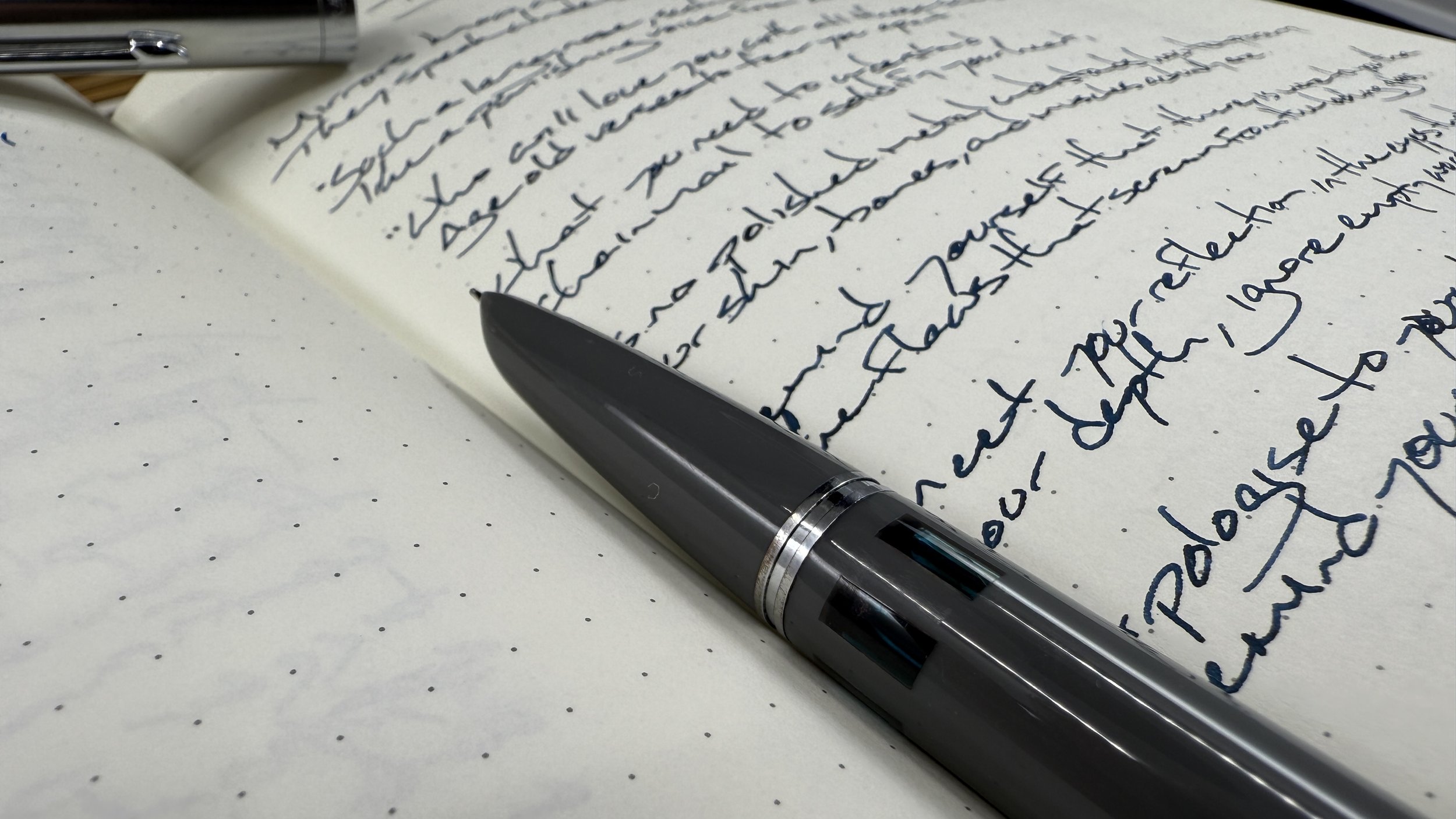
I have a gross amount of underused, blank notes pages in the rear of my Hobonichi Day-Free planner. The book ships with 171 pages of thoughtfully designed 3.7mm baby-grids. We’re roughly 83% through 2024. And, as of this post, I have used 80 utility pages — or 47% of my fanciest notebook. Under. Used?
What might constructive uses for the remaining blank planner pages look like over the course of November and December? Let’s crack knuckles and think this through.

We can also sub scribbling for cracking
Current uses. I primarily house my currently inked palettes on these open-ended pages. I use them for testing nibs and inks during pen group gatherings. And I also use them for notetaking during phone calls.
These three uses use far fewer pages than my Day-Free has to offer. Then again, perhaps successfully using my Hobonichi shouldn’t be conflated with using every single page. “Success” could also be measured by routinely returning to the pages as needed. The rear notes grids are worthwhile so long as they continue to provide the potential for recording the ephemeral and important. In which case, those pages are ample.

Ample, I tell you
And yet, I suspect there is a middle ground between using every single page and using less than half in a given calendar year. I could embrace the Hobonichi as a space for gratitude tracking, or a brief morning page style priority brainstorm, or handwriting practice. Or some other use? More thinking to come.
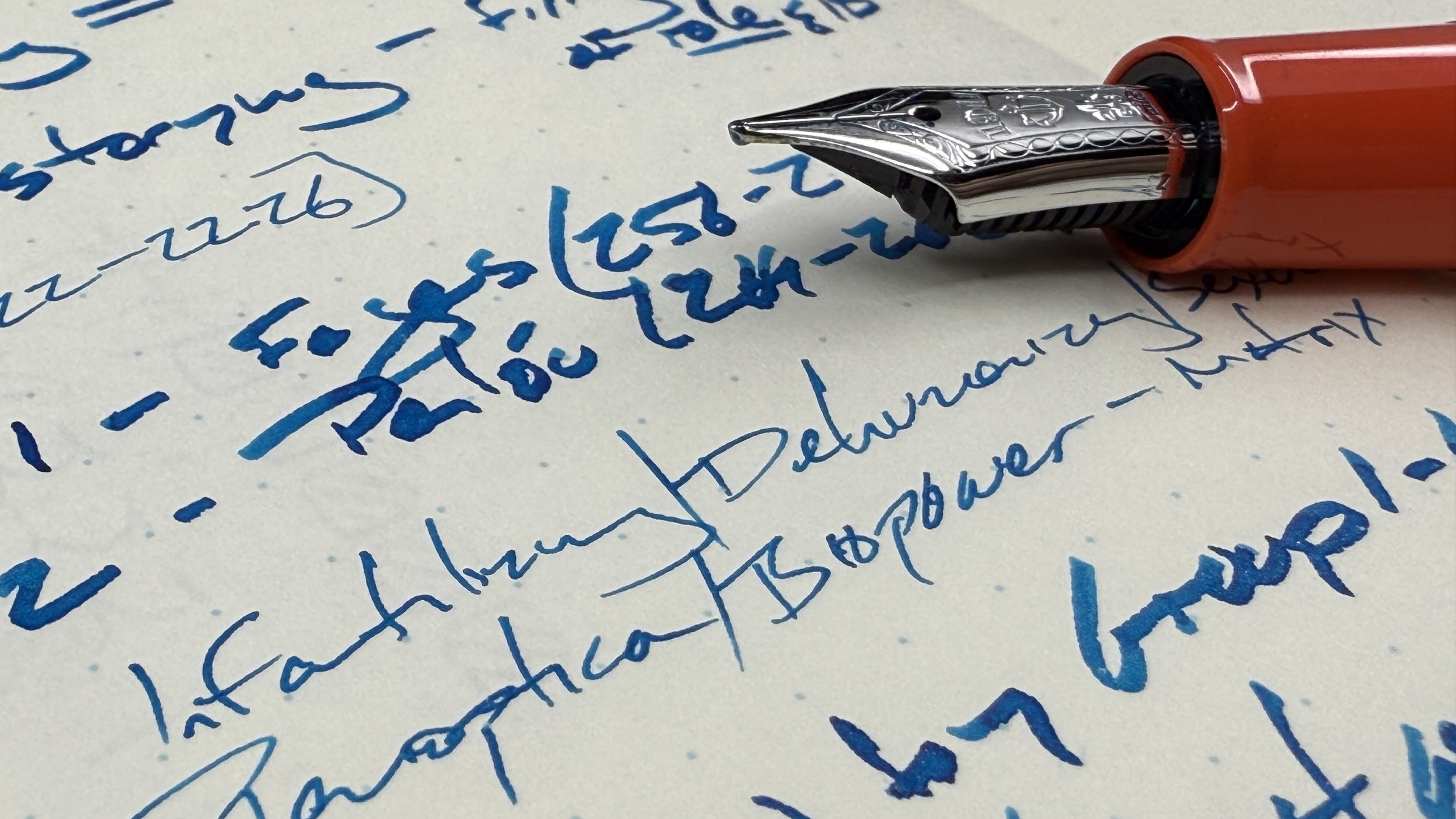
This week’s Inked Tines update includes last week’s currently inked writing tools.
Toolset
Pens. The Wing Sung 601 is a sturdy slim fountain pen. The F nib proved last week’s standout combo, bringing out Verdigris’ dark blues and unsaturated greens in even measure. A welcome novelty for an otherwise moody ink. The 601’s grey coloring suited many scenes, from stiff administrative meetings to loose paper feedback one-on-ones with students. The friction-fit cap gave me a rapidly deployed writer while tutoring students scholar-to-scholar. Simply worked.
Mythic Aeschylus (B) — Empty. Wide and bold lines that suited slow-moving writing tasks like lesson brainstorming and analytic journaling.
Esterbrook Estie (Scribe) — Empty. A dry pairing that ensured I could feel the texture of each notebook’s paper. Enjoyable to the last letterform. Lesson plans, meeting notes, journaling, and D&D notes.
TWSBI 580 (F) — 1/6. Psc’s unsaturated green stood out legibly against every other ink this week, from One’s Own’s light grey to Verdigris’ moody teal. An accompaniment apprentice.
Sailor 1911L (Z Architect) — 1/4. Consistent ink flow is a boon, particularly while inked with high-shimmer ink. Hassle-free writing with fun pops of red sheen. Journaling, lesson plans, creative writing.
Pilot Custom Heritage 92 (FM Architect) — 1/3. Daily driver. A dry pairing that prevented smearing throughout the week. Pink shimmer was a sleeper hit in my meeting notes, lesson plans, and scratch notes.
Notebooks. Work bujo. Midori MD Grid (A5). The week began on page 56, with a cloud of scribbled notes made while building out lesson webpages in my school’s LMS, Canvas. Two pages of weeklong tasklists, five pages of lesson plan outlines, and three pages of meeting notes brought me through page 66 by the end of Friday’s classes. Ten new pages. Rockin’.
All six of the week’s initial pen-and-ink combinations contributed to lesson planning. The whole penvelope came together. Cool tones for my Queer History course’s lessons and warm tones for my world history course. An easy theme to aid in finding the right lesson outline at the right time.
The Sailor, with its multitasker Zoom nib grind, provided both headings and detailed lecture notes. I like blending wide and narrow lines. Small details — like the minutes I wish to play out of a video — stand out in narrow lines against the outlines otherwise shouty broad letters. I also scribbled two lists of concepts to steer students towards during an activity with the Sailor’s hairline reverse writing. Thank you, Custom Nib Studio.
I also tracked the timing of each activity in grey ink. Easy, unobstrisive time tracking. Students often need far more (and sometimes far less) time than I anticipate prior to delivering the lesson the first time. So I scribble the “true timing” to the left of each activity.
All widths welcome
Journal. Semikolon Fango (A5). Pen touched paper thrice this past week. Three entries, each concluded with a transcribed poem. Twelve pages in all — including two mostly empty pages saving my pen-and-ink combinations for the week’s first two entries. Present and posterity.
Kyanite du Népal is a longtime favorite ink of mine. The Sailor’s Z Architect brings out a balance between blue shading and red sheen. Great ink keeps me anchored to my notebooks. And Népal is an ironclad ink anchor paired with a generous nib.

Shine on, you fancy-pants ribbony stains
Written dry. Two of the week’s largest pens ran ragged this week: the Esterbrook Estie and the Mythic Aeschylus. Both emptied while reflecting on how my lessons went.
Newly inked. My planned sextet lasted but one calendar day intact.
I inked my latest acquisition within 20 minutes of the Sailor King of Pen’s Monday delivery. The King of Pen raised my currently inked from six to seven writers. A number low enough to still allow me even spread across all of my currently inked pens.
The collection
Incoming / new orders. The newest addition to my collection is Sailor’s King of Pen Demonstrator. The delivery arrived on Monday afternoon. I checked the nib with a loupe and spent a few minutes oo-ing and awe-ing.
And then I hunted a much-desired ink for my much-desired new pen. Colorverse’s New Horizons Arrokoth is a muted brown. It’s also a moderate-to-wet fluid. A forgiving pairing to break in the new B nib.

The clear King of Pen is the Emperor’s New Clothes of a colorway
I am also the unskilled (yet eager) owner of my first-ever date stamp. This is my first foray into the world of using stamps. My intention is to date the margins of journal entries so I can flip through filled books to quickly find specific entries. A plan in progress.
Outgoing / trades or sales. No pens or inks made their ways on to new homes last week. But I did pull a Sailor Pro Gear aside to sell in the near future, alongside a TWSBI. Changes are afoot.

Tremble for your time in this case may be limited …
Currently reading and listening
Fiction. I’ve taken up a new project: re-listening to Brandon Sanderson’s Stormlight Archive. The goal is to rejoin the forthcoming latest book in the series with my memory of past events refreshed.
Libby is my app of choice for the task — taking over from Apple’s Books. The audio player’s functionality seems similar across the two apps.
I do miss the ability to stop the story and scribble thoughts into the margins. Then again, perhaps this is an opportunity to convert a pocket notebook to the task of housing those thoughts. Potential.
Nonfiction. Taking pencil and highlighter to primary sources is one of the most fun aspects of preparing to teach history.
My trusted Mitsubishi 9852 EW pencil has Benjamin Buttoned itself to a nub by way of its journey across the margins of Deborah Miranda’s excellent 2010 essay on the ways early French and Spanish explorers crushed the Native American third gender folk they found in esteemed positions throughout the First Nations they encountered.
I used color to conceptually arrange my highlighting. Green for usages of weapons against two-spirit folks. Taupe for efforts to give new Spanish names to this third gendered identity. Pink for punishments given to those who continued to wear the clothes associated with this third gender. And brown for the ways the esteemed responsibilities of two-spirit folk were replaced with Catholic religious practices and Spanish authorities.
Using different colors empowers me to skim the article efficiently when organizing my teaching notes within the same categories. Easily skimmed.

Thank you, fun Zebra Mildliner colors.
Music. I took on my first listen of the latest Chillhop Essentials mix this week, weeks after the playlist publically dropped. Fashionably late.
The first track features Molly McPhaul and is, by far, my favorite song on the playlist. The intricate guitar work breathes life into the song, and brings energy to my writing sessions. One of the best lo-fi tracks I’ve heard in months. Definitely worth a listen, if only for McPhaul’s opening track.