A somber fall-themed color palette
Somber, muted hues dominate my currently inked this week. The palette, as a whole, feels like fall to me. The combination of which brings a smile to my face. And that, I suspect, is the measure of a successful currently inked.
My nib choices heavily favor F and EF line widths. Two F and one EF. Plus two M pairings that produce svelt M lines: the Nakaya’s Naginata-Togi and Lamy’s Cursive nib. Both pens are inked with dry writing liquids to accentuate the narrowness of their line widths.
Svelt lines are desirable this week. I anticipate detailed notetaking, paper marking, and brainstorming will consume most of my writing time. Narrow lines work great for such detailed tasks.
Somber beauty tailored to the kinds of writing I plan to take on this week. Entertainingly contradictory.
Grey/Black
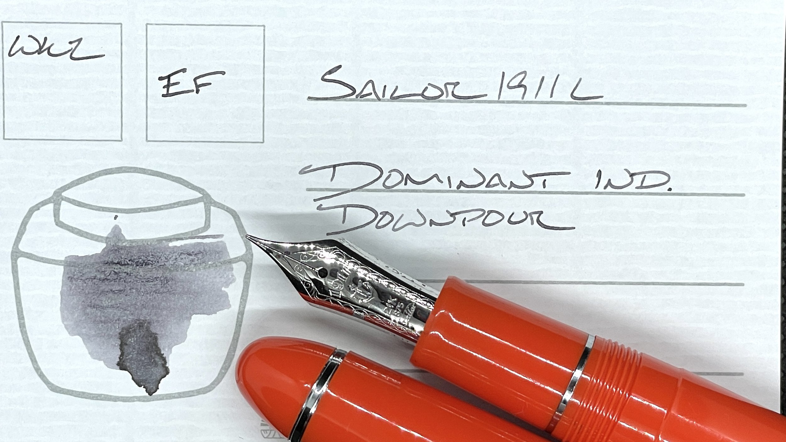
Sailor 1911L Tangerine (EF). Dominant Industry Downpour. The Sailor EF returns as my daily driver for a second week. Put simply: I adore the hairline thin EF lines this nib produces. Downpour lends a stormy mid-toned grey that dries quickly in this narrow nib size. And shades. All in a bright and happy tangerine colorway. Contradiction embodied. Task management, meeting notes, reading notes, scratch notes, and lesson plans.
Blue/Teal
Sailor Pro Gear Graphite Lighthouse (MF). Diamine Enchanted Ocean. Enchanted Ocean sheens moderately in broad nib sizes. Sailor’s MF minimizes Ocean’s sheen to the beginnings and ends of words. The result is skimmable writing while seated. This pairing works well to accent reference notes. And journaling.
Earth Tones
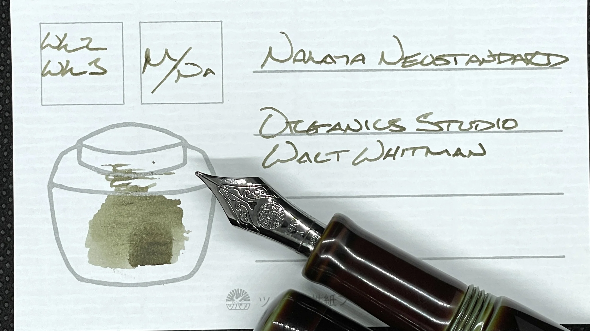
Nakaya Neostandard Heki-tamenuri (M Naginata-Togi, by Tokyo Station Pens). Organics Studio Walt Whitman Leaves of Grass Dark Green. The Nakaya, inked with Walt Whitman, is a combo I actively search for excuses to write with. Whitman’s prominent shading and the Naginata-togi grind collaborate to create fun writing that I have full control over. Low angled writing yields strong shading and darker lines. Vertical writing yields the opposite. Accent meeting notes, reading notes, and lesson plan outlines. And journaling.
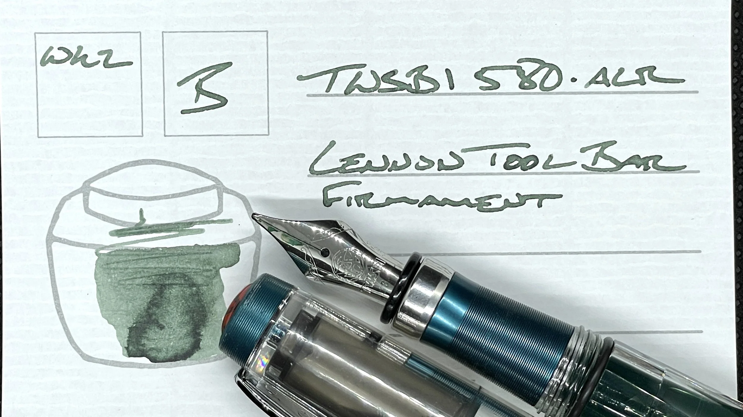
TWSBI 580-ALR Prussian Blue (B). Lennon Tool Bar Atmospheric Firmament. Firmament’s strong haloing and light shading turn mundane writing tasks into fun affairs. This is my “make boring more exciting” pen-and-ink pairing. Teaching reflections, analytic journaling, brainstorming, and lesson plans.
Lamy Safari Blue Macaron (Cv). Robert Oster Toffee. I will continue to shout my opinion that Lamy created a wonderfully forgiving nib grind in their cursive nib. Toffee’s honey and caramel shaded lines are at home as accent notes along paper margins and within meeting notes. Additionally, the line width also accommodates longer writing tasks like journaling and teaching reflections. In addition to lesson plans.
Wild Cards
TWSBI 580 Smoke RoseGold II (F). Ferris Wheel Press Lady Rose. The inaugural inking for my new rosy TWSBI. I chose Lady Rose as a counterpoint to Toffee’s strong presence on the page. Lady Rose’s whispy pink leaps off the page as negative space. Equally skimmable while seated and focused. Just look for the gaps in darker writing. Journaling, accent meeting notes, lesson plans, and scratch notes.


