Saying goodbye to a favorite ink

Aonibi has a central space in my inky heart. It was one of my first “now I get what this fountain pen ink obsession is all about” additions. Excellent shading for whimsy while scribbling. And dry — which both prevents smearing on most papers and narrows line widths. Narrow lines are warm hugs for those who write with tiny letterforms.
I emptied my Aonibi bottle this week. Another reminder that my most-loved stationery will get used. Saying goodbye to an old favorite is healthy.

Oh, Aonibi. My final fill of an old friend.
The week’s nib choices over-represent sharply ground nibs: six ground nibs to one round. Line variation features prominently. Grinds that require conscious, intentional writing angles — and so deliberate writing speeds. The week’s writing involves a tide of drafting manuscripts (creative and academic). Carefully considering my word choices and sentence structures are an intended outcome. A nib selection to suit the writing I see on my planner’s horizon.
Grey/Black

Nahvalur Nautilus Primary Macchiato (Mini Cutlass, by All in the Nib). Teranishi Guitar Antique Black. Antique Black is a black ink with insistent brown undertones. I opted for a similarly dark-brown pen in the Nautilus. Further, Antique Black writes wetly enough as to keep the sharp, miniature cutlass grind singing along the page. Diminutive and precise lettering. Near-black ink that send up personality. An arithmetic that adds up to this week’s task management combination. Bwa. Bwahaha.
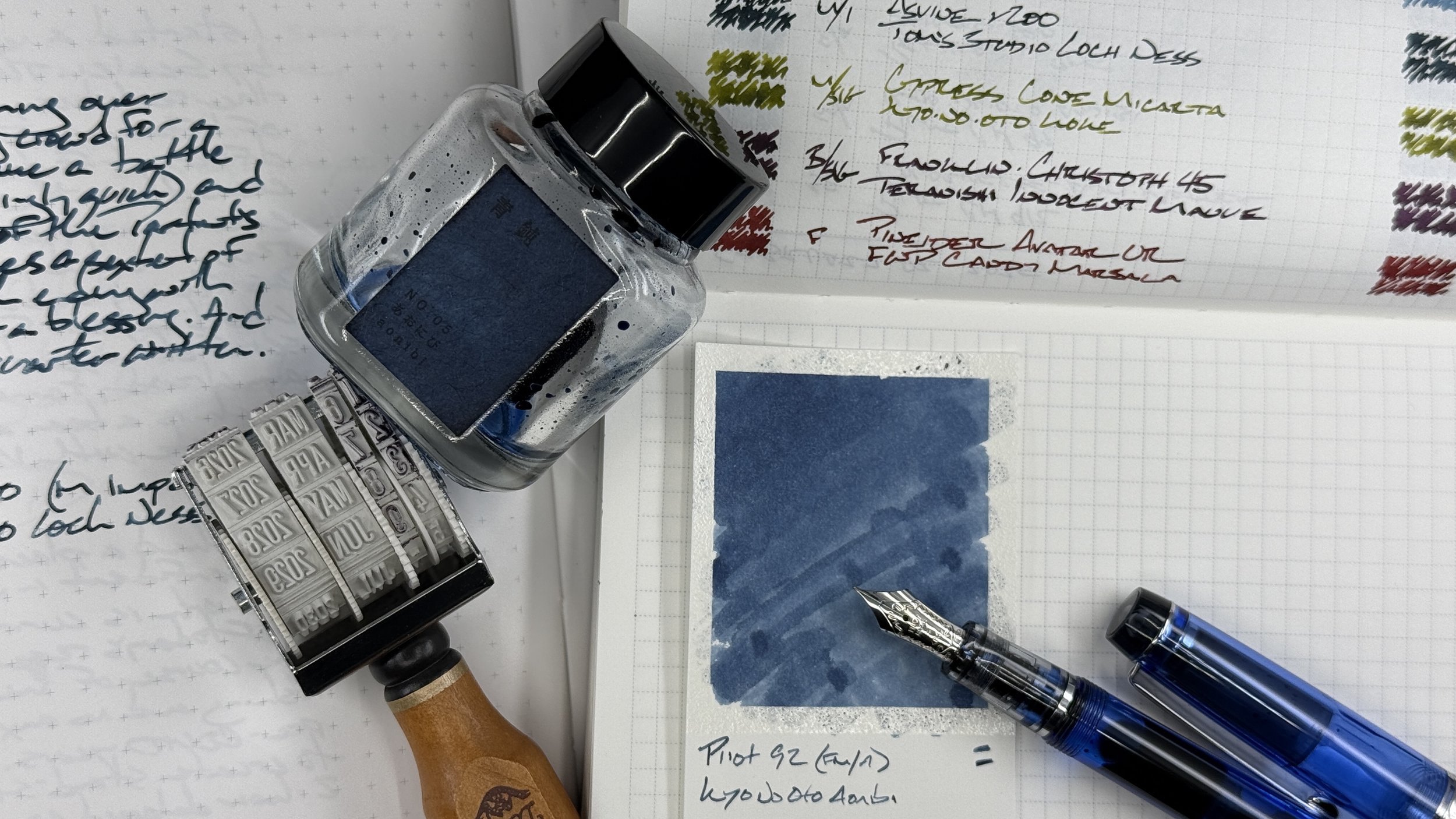
Blue/Teal

Pilot Custom Heritage 92 Translucent Blue (FM Architect, by All in the Nib). Kyo-no-oto Aonibi. Damien’s architect grind charts a middle path of prominent shading and quick-drying denim blue. Excellent for use on copy paper and ink friendly paper alike. The FM line width accommodates both detailed notetaking and the shading keeps longform creative writing exciting. Lesson plan outlines, meeting notes, marking student work, storyline drafts, and journaling. All the things.

Pelikan m805 Stresemann Anthracite (F CI, by Custom Nib Studio). Sailor Ink Studio 340. This Pelikan feed is a wonderful, generous writing partner. Paired with 340, as it is, the feed breathes steely-grey life into the combination. Moderate shading and flowy ribbons of line variation contrast the straight-laced colorway of the pen itself. A pairing that works seriously without mourning the process — a go-to for revision and editing the week’s drafts. Add on meeting notes, teaching reflections, and journaling.

Asvine v200 Titanium (M Imperial, by Pen Realm). Tom’s Studio Loch Ness Mystical Green-Blue. The Imperial grind is a true multitasker nib. A well-rounded stub on one side allows for rapid scrawling. The reverse side offers sharper relief. The combination of quick and slow writing makes the Asvine my chosen pocket-carry for the week — and my in-meeting pairing. And the pen’s large size suits longform writing tasks with aplumb: journaling, teaching reflections, and analytic reflections.
Earth Tones

Cypress Cone Micarta (M SIG, by Franklin-Christoph). Kyo-no-oto Koke. A combination that matches earthy micarta with Koke’s grass-green hue. The M SIG nib is the most forgiving of all my collection’s SIG grinds, which allows for moderately paced writing speeds. An excellent option for fast-moving meetings, for slower scenes in the week’s D&D session, and for recording reading notes. The Cypress’ size also stays comfortable in my hand across long writing sessions.
Wild Cards

Pineider Avatar UR Stone (F). Ferris Wheel Press Candy Marsala. I enjoy pairing saturating ink colors with muted pens. The Avatar has the best magnetic seal of any magnet-capped pen I’ve owned. The Avatar is also light, which lends it to careful, precise writing tasks like margin notes, annotations, and session notes during D&D. Strong design for high nerdery.

Franklin-Christoph 45 Blue Diamondcast (B SIG, by Franklin-Christoph). Teranishi Guitar Innocent Mauve. A tiny pen with a loud statement of a B nib. A fun contrast. The SIG nib throws off shouty gradient shading throughout my letterforms. A pairing comprising fun size contrasts, shiny pen coloring, murky ink coloring, and shady writing. For writing that needs whimsy: an experimental lesson plan, journaling, NPC-specific story notes, and letter writing.
All in the family
Recently gifted stickers have found their way onto the week’s currently inked spread. Ink scribble stickers that represent a more inclusive minimalism borne of my partner’s kind-hearted attempts to convert me towards their maximalist preference. The things we do for love.
