Some weeks it takes two daily drivers


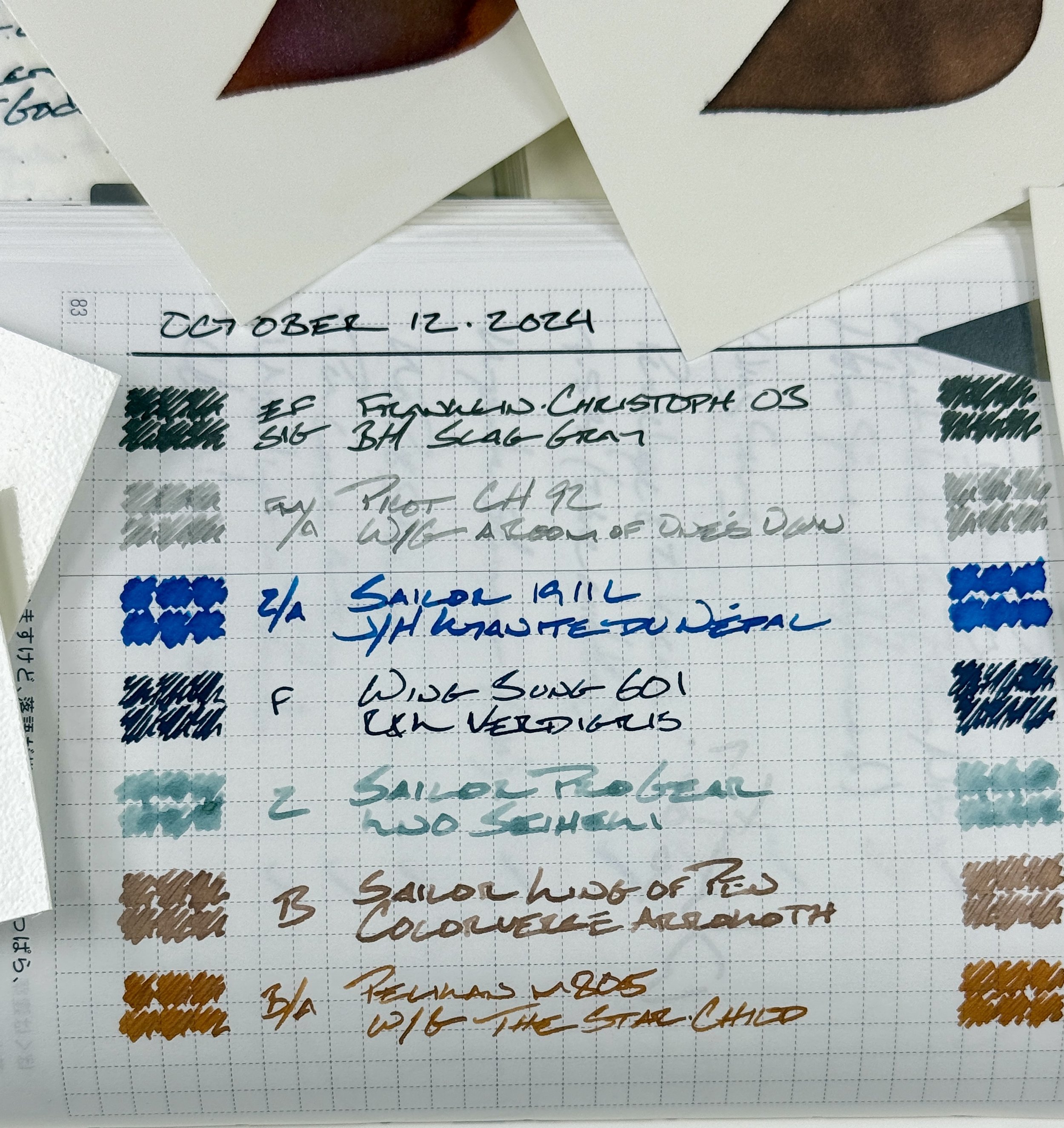
I’m splitting daily driving duties between two pens this week. The Franklin-Christoph 03’s EF SIG makes a careful, dark line. The Pilot 92’s FM Architect leaves light grey lines (with pink-purple shimmer). The 92’s clip gives me a note taker away from my desk while the 03’s sleek clip less form makes for a sleek penrested companion.
Five of the week’s seven pairings are equipped with ground nibs. Four architects and a SIG. Thoughtful slow writing central.
Four of seven inks have shimmer or pigment particulates, too. Paired with wet feeds, all four take advantage of getting to write on coated paper throughout the week. A little extra.
Grey/Black
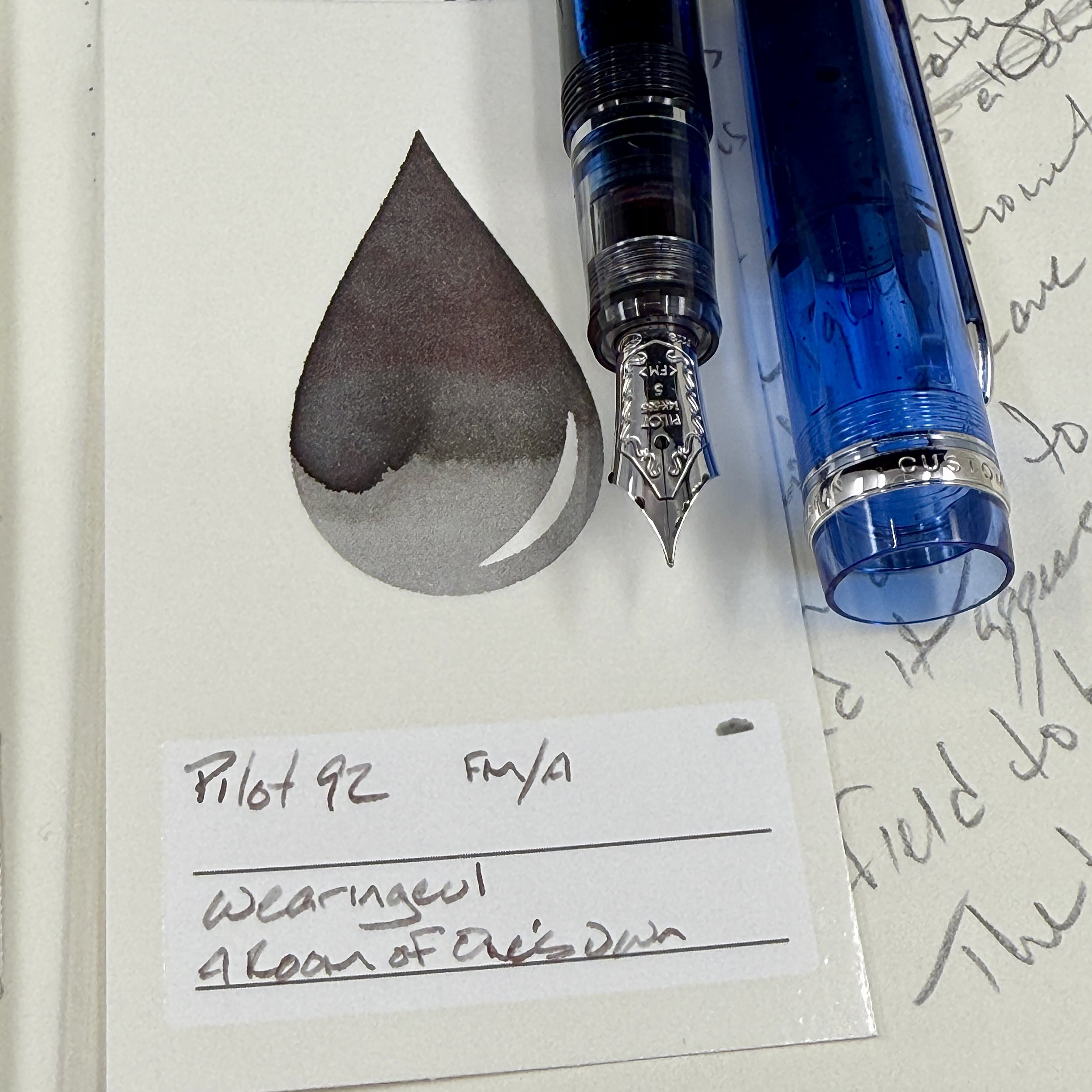
Pilot Custom Heritage 92 Transparent Blue (FM Architect, by All in the Nib). Wearingeul Virginia Woolf A Room of One’s Own. The Pilot’s clip allows me to carry the light writer with me between classes, through the hallway, and even out-and-about during off days. The crisp FM architect grind does require concentration to ensure a reliable writing experience, which fits well with thoughtful writing sessions: tracking tasks, making notes in moderately paste or slow, moving meetings, and through my own reading notes.

Franklin-Christoph 03 Antique Glass (EF SIG, by Franklin-Christoph). Birmingham Slag Gray. Slag’s dark hue ensures layout structures like separator lines and headings are clearly legible on the page. The disciplined EF nib also accommodates rapid-fire writing sessions: fast moving meetings, phone calls, and while brainstorming tasks for large projects.
Blue/Teal

Sailor 1911L Tangerine (Z Architect, by Custom Nib Studio). Jacques Herbin 1798 Kyanite du Népal. The combination of a wet feed, a well lubricated ink with punctuations of red sheen, and fun shimmer makes the Sailor, without a doubt, my most whimsical pairing this week. Creative tasks — and boring tasks that could use a spark of energy — are outlets for this pairing: journaling, manuscript, drafting, and teaching reflections all come to mind.

Wing Sung 601 Battleship Gray (F). Rohrer & Klingner Verdigris. My students groan when they see me reach for this silver capped pen-and-ink pairing. The quick release slip cap and easily read dark teal Verdigris make this combo well suited to quickly recording my students’ homework completion – in addition to other detailed scribbling like reading notes, common place notes, lesson plan outlines.

Sailor Pro Gear Slate Blue (Z Architect, by Custom Nib Studio). Kyo-no-oto Seiheki. Seiheki’s first tour inside a pen is a pairing with my excellent extra-wide zoom architect. The result is powerful shading in a gentle blue letterforms. The wide lines suggest this pairing is well suited for long form writing, like journaling and writing letters. I also like Seiheki’s light hue as an easily legible contrast to this week’s two gray inks. An excellent counterpoint in lecture notes and lesson outlines.
Earth Tones

Sailor King of Pen Demonstrator (B). Colorverse New Horizons Arrokoth. My go-to marking combo for the week is a wide-sectioned King of Pen. The round B nib and dusty brown ink make for anxiety-safe feedback on a batch of student papers currently sitting on my desk. The wide B lines also fill up lines in my journal quickly, lending a sense of accomplishment while I reflect on my day(s). Lesson plans and lecture notes, too.

Pelikan m805 Stresemann Anthracite (B Architect, by Custom Nib Studio). Wearingeul Oscar Wilde’s The Star-Child. Burnished orange ink with purple-pink shimmer is a party. Black and silver-stripes on the Pelikan is a serious look. Together: a contradictory pairing. Orange is a comfortable color for editing my own manuscripts. And the reverse EF lines suit margin notes. Also: journaling and lecture notes.
Wild Cards
Womp.