Workably weird to end the school year


The final week of meetings and celebrations to end the school year is upon me. Meetings galore, 96 more papers (one for each student), and a triplet of banquets in honor of our graduating class. So let’s get weird.
Well, mildly weird. Workably weird.
I reached for four new pens and inks that I haven’t put together before. Four round nibs allow me to write comfortably at the odd angles I see while a notebook is perched in my lap.
Three of this week’s six nib options are F or EF. I expect detailed notes will dominate my handwriting. Narrow nib widths allow me to pack legible letter forms into small grids and narrow margins. Small and forgiving.
I also have two ground nibs for while I grade or journal seated at a desk. Both inks are easily visible against the KACO’s Melancholic Gray. Toffee due to its relative bright coloring. Rikyu-cha due to its dark brown hue in the generous TWSBI feed.
Only two pairings match: the KACO and Franklin-Christoph 45. The rest are wilder combinations of pen colorways and inks. The 3776, for instance, is one wild pair of colors: green and purple. Like a toddler that dressed itself.

A cool toddler
Grey/Black

KACO Green Edge Black (F, by Faber-Castell). Bungubox Melancholic Gray.The week’s task management combo. A disciplined round F nib is excellent for detailed notetaking. The KACO’s near-silent snap cap also makes quick scratch notes easy-peasy. Task management, meeting notes, final grades and student email tracker, reading notes, and scratch notes. Workhorse.
Blue/Teal

Franklin-Christoph 45 ‘20 Diamondcast (F). Colorverse Extra Dimension. Extra Dimension is a tad dry in this F nib/feed combo. As such, it’s tailor-made for writing reliably on students’ printer papers. And the slight sheen will show easily against grey meeting notes. Meeting notes, marking papers, journaling, reading notes.
Earth Tones

TWSBI 580-AL Lava (1.1 mm Stub). Sailor Shikiori Rikyu-cha. This pair is wet enough to feather and bleed through absorbent papers. So, a great combo for headings on coated papers. And for long-form writing on coated papers. The wide 1.1 mm line is so wet as to bring out Rikyu-cha’s sheen — which I didn’t know it had until last week. As such, the dark, wild lines stand out easily against Melancholic Gray’s narrow light grey. Accent work and journaling.

Franklin-Christoph 31 Smoke & Ice (M SIG, by Franklin-Christoph). Robert Oster Toffee. Toffee is the brightest color in this week’s muted palette. The ribbony M-width lines are true to size — affording both detailed notes (with careful attention to my writing angle) and larger letters in long-form writings. An all-case accent writer: reading notes, marking papers, journaling and meeting notes (while seated at a desk).
Wild Cards

Platinum 3776 Laurel Green (B). Diamine Harmony. I appreciate an ink that halos. I tuned this B nib so that it is wet enough that Harmony halos noticeably dark purple exterior lines. So cool. Harmony still manages to dry quickly — which makes this pairing excellent for headings during meetings and for use in my end-of-year tracker lists. Also: journaling and reading notes.
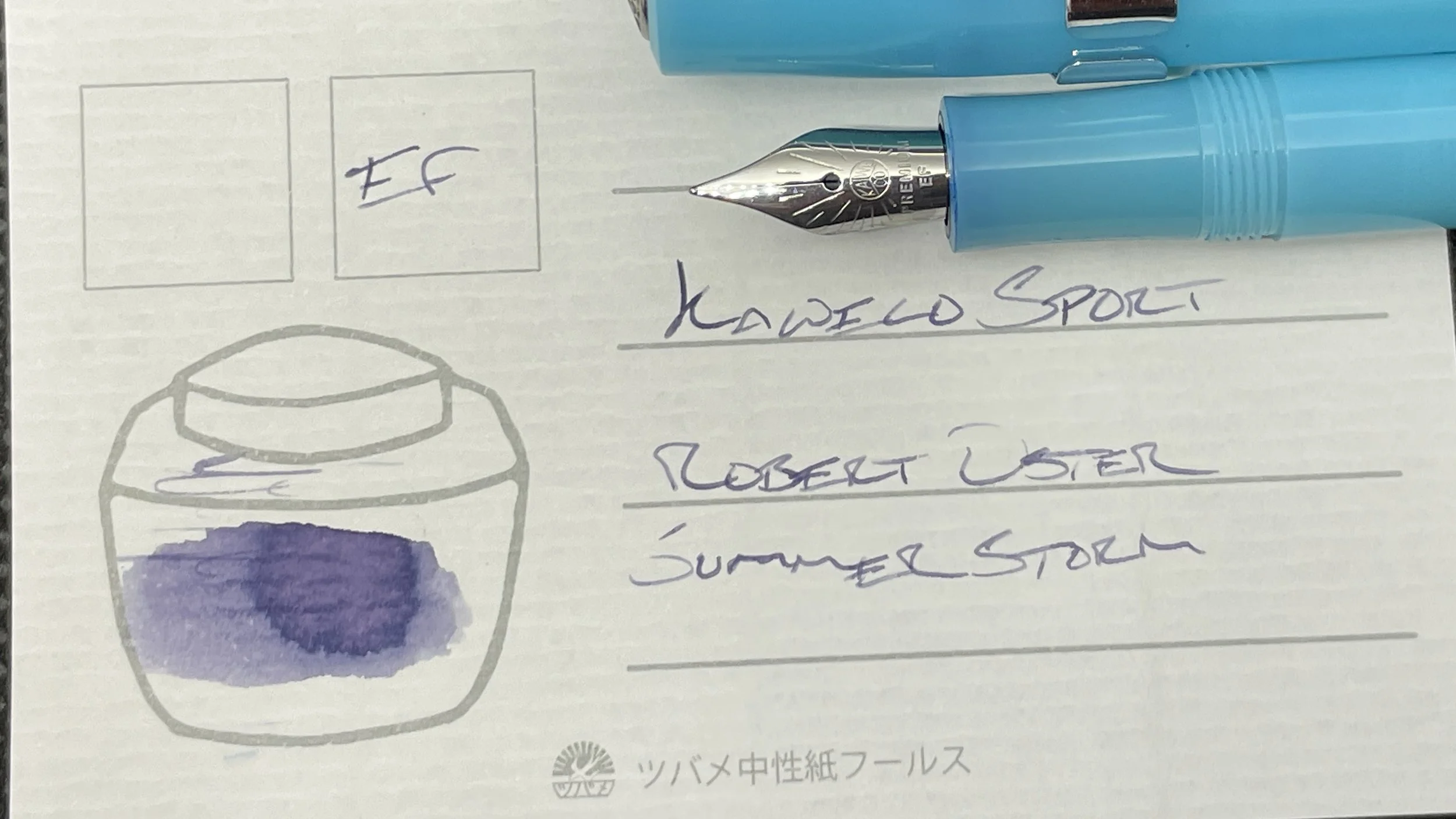
Kaweco Frosted Sport Light Blueberry (EF). Robert Oster Summer Storm. A compact, sturdy plastic pen. A moderately dry ink in a dry feed. These characteristics add up to my pocket carry for the week. The lavendar-grey ink is a lovely accompaniment to every other ink in this week’s palette. So this quick-drying combo also makes for excellent detailed accent notes — especially in my planner and work weekly.
