2022 state of the scholar, tray one
The recent proliferation of thoughtful reflections on folks’ pen collections inspires me to take a similar inventory. A sincere hat tip to The Gentleman Stationer and The Pen Addict (from Mr. Dowdy’s great newsletter) for planting the idea.
I like to take an inventory of my pen collection now and again. A check-in with myself as to which pens are working for me and which would be better housed with more eager owners.
I hold the same rule for my collection as I do for technology (new apps and the like): each pen should work for me, not me for it. As the kinds of projects I take on change, the pens and inks that serve me best also change. Moving targets.
With respect to my writing, this means sifting each pen from my trays through three filters.
Do I regularly use the pen?
Does the pen spark joy when I ink it up?
Is it well-suited to the kinds of writing I most commonly take up?
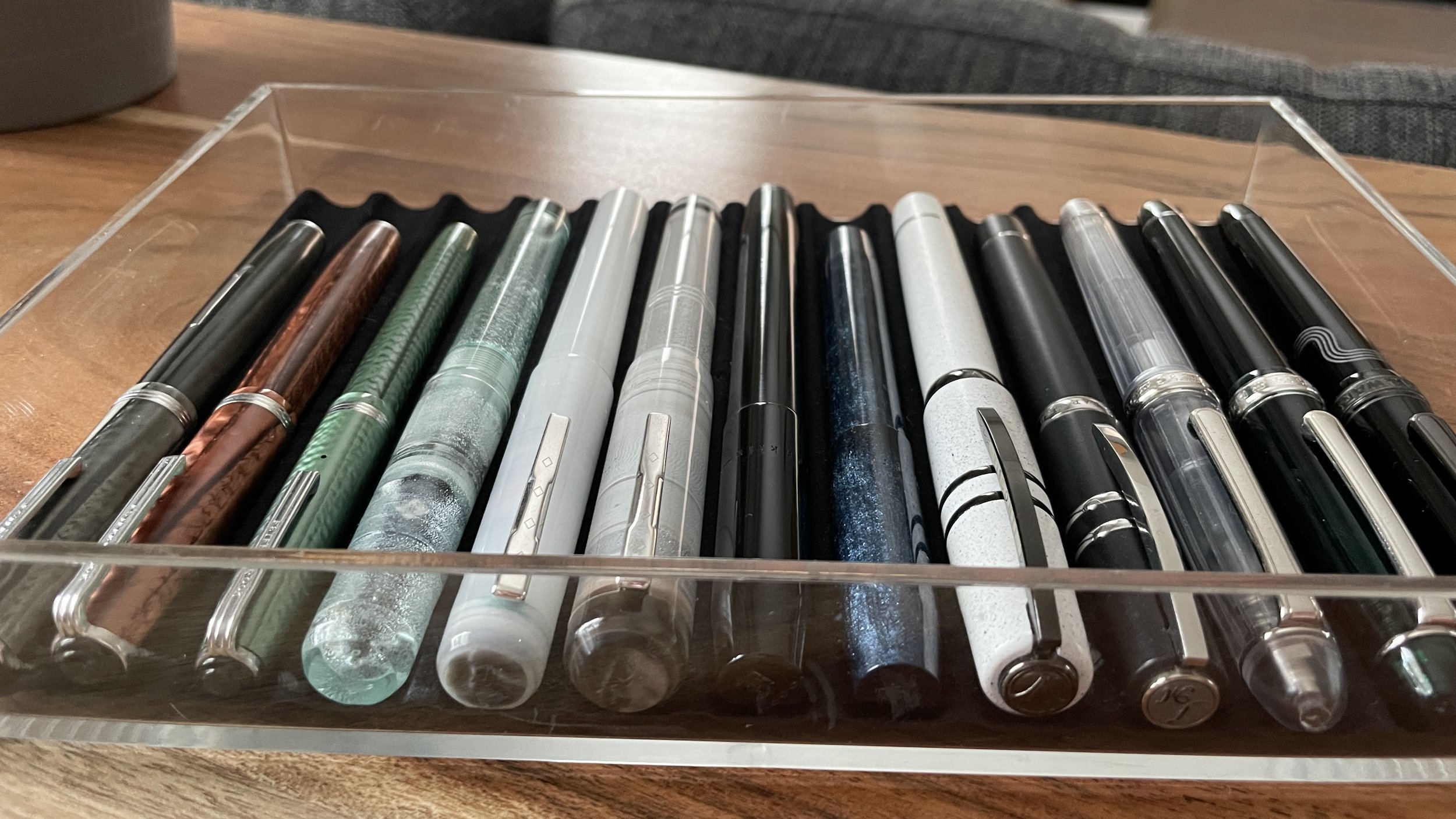
I keep my collection limited to four trays. Each tray contains a self-cut liner with 13 storage grooves. 52 grooves in total. I investigated one tray this week. The pen tray of all ages.
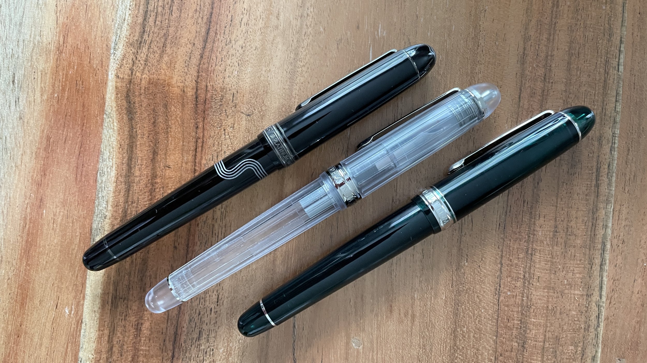
Platinum 3776: Star Wars Kylo Ren, Laurel Green, and Nice Pur. I enjoy the 3776. It’s moderately narrow and light. Moderately wet, disciplined lines. Consistency I’ve learned to trust for detailed notes. All three offer understated colorways that won’t derail meetings.
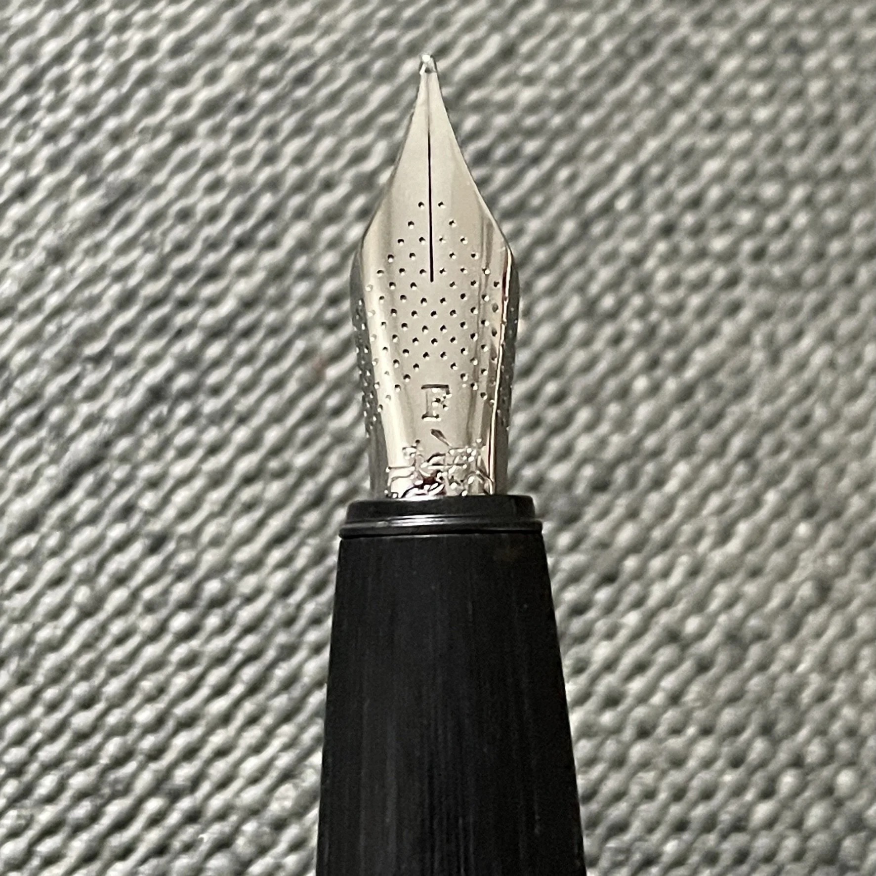
The Kylo Ren edition gets regular use as a daily driver. Star Wars was my first “world” as a kid. The F nib is one of the top three round nibs in my collection. Smiles on faces.
The Laurel and Pur both offer subtle neutral colors. I reach for them less often than the Kylo Ren, but quite frequently. And they adapt easily to different writing tasks given Platinum’s easily swappable century nibs.
Flexible use-cases and comfortable sizing encourage me to use all three often. The Nice was inked last April. Both the Laurel Green and Kylo Ren were inked just this June. Perhaps the Pur is subconsciously my least favorite?
Visconti Homo Sapiens: Silver Age (Midi) and Blizzard. The design of the Homo Sapiens hits a sweet spot for me. The pens’ profiles alone are aesthetically pleasing enough to start me writing. Further, black and white are subdued enough to keep meetings flowing when I take out either for notes.
Add the pleasing tactile feel of Visconti’s inventive lava-rock-infused material, which helps me to focus during long meetings and long working sessions. Rubbing the somewhat-grippy material makes for a wonderful (and silent) concentration device. A must for someone with ADD.
I have a balanced offering of small Midi size and full size which suits writing of all sorts. Both were inked recently, just this past May. Keepers.
Franklin-Christoph 03: Ghost and Antique Glass. The 03 sports a narrow section with cap threading along the bottommost edge. The tailored-fit of my Franklin-Christoph collection. The slim profile helps me to control very small writing. An excellent option for when I know I’m record-keeping — like near the ends of marking periods.
The Antique Glass colorway has been my go-to edition since it’s recent arrival this past April. The Ghost has been uninked since last December. Telling.
Perhaps I should re-home the Ghost version of this model as I infrequently reach for it?
Franklin-Christoph 31 Smoke & Ice. The 31 is one of my favorite body types. Nib units screw in for easy swapping. The fun frosted glass finish takes on the color of whichever ink I choose. And the wide section extends low to the page. This last part is key during long writing sessions.
I recently inked the 31 at the beginning of June. And I ink the 31 often.
This particular model is an experimental demo of the frosted texture finish. The experimental nature of this particular pen makes for a distraction for me. This pen’s threading encourages the nib to air out in-between writing sessions. The cap threading is large and shallow, which produces only a weak seal.
I should substitute this particular pen for a full-production version of the 31.
Franklin-Christoph 45 Diamondcast Blue. This 45 is the rare exception to my penchant for large-sized pens. A welcome change-up from my usual. And novelty is a great productivity resource.
The blue colorway adds whimsy to my writing. I’ve come to appreciate the B-SIG installed in this pen. A wonderful longform writing nib: journaling, teaching reflections, and even manuscript drafting. Plus: sparkles.
Unsurprising that this pen is inked often. Most recently last month.
Franklin-Christoph 46 Diamondcast Blue. Clever use of materials lends a pop of fun blue color to an otherwise demure black colorway. A great pen for meetings as the pen is unassuming to everyone more than one seat away. And the easily swappable nibs ensures I can retro-fit this pen to suit any sort of writing. Demure and flexible.
This said, I was surprised to learn that I haven’t reached for the pen lately. Last inked back in February of 2022. Either I should reach for this pen more often or pass it along to someone who will. Interesting realization.
Esterbrook J: Copper and Grey. These are my first vintage pens. I actually found the Grey in a local antique shop and fixed it up myself. A new j-bar (the bent-metal mechanism comprising the lever-filler’s internals) and a new sac. Sentimental value.
The vintage bodies are uncomfortably narrow (in my hand). So: these are best-suited for short writing sessions.
I’ve learned that I prefer the cleaning process for a converter to the process needed to clean a sac. Combined with the old-style dimensions, these J’s do far more sitting than writing. The Grey was last inked in June of 2021. The Copper this past March (due to the fun EF Flex nib installed).
My instinct is to keep the excellent vintage nibs — which I adore — and pass the bodies along to another collector.
Esterbrook SJ Green. This green SJ was a gift from my parents. They also found the pen in an antique shop. I cleaned and re-sac-ed (spelling?) the pen only to crack the section. This pen writes but will gently weep ink from between the collar and section over time. Short notes only for clean fingers.
As such, this lovely vintage green pen has sat in-tray since the summer of 2020. Time to offer this to a home interested in a little George Harrison.
Note — You can check out my entire collection over at my pen database. This Google Sheet is how I track details about each pen in my collection. And it updates live to mnmlscholar. Take that, entropy.
Toolset
Pens The Decograph stands tall this week. The Bock feed is generous enough to shepherd ample shimmer particles without clogging. The white chatoyant color way is subtle with bountiful personality. And the fun Art Deco nib art makes me smile. Trifecta. 1/2 full.
Sailor Pro Gear (Z Architect) — Feed. A floodwater combination of feed and ink. Indien stands out clearly on the page — excellent for accent notes. And the wet pairing ensure Indien remains dark enough for each reading. Dig it.
Sailor Pro Gear (F) — 1/5. One of my favorite nib and ink pairings. Consistent European EF lines. Fun shading. Quick drying that avoids smearing. Victories on all fronts. Daily driver.
Pelikan m805 (F CI) — 1/2. The Pelikan feed brings out Hisoku’s dark side. Murky teals with healthy shading. An excellent journaling and reading notes combo.
Lamy Safari (Cv) — 4/5. Yozakura is moderately dry in this Lamy feed. The result is healthy feedback while writing. The side effects: noticeable line variation and fun shading. The experiment is working.
Kaweco Sport (BB) — Full. The week’s pocket carry. The BB nib is surprisingly well behaved on pocket notebook paper — especially while reverse writing. Consistent writing, even in 100 degree weather. Duly impressed.
Notebooks. Journal. LIFE Kleid Noble Note (B6). I added nineteen additional pages of writing to my LIFE Noble Note journal last week.
In truth, I showed rare journaling form last week, adding a new journal entry every day. Every pen met paper over the course of the week’s writing.
Journaling daily is not a personal goal. I skew towards journaling when I feel comforted by the process of thinking through my feelings on paper. The stars most definitely aligned last week to see me scribbling — and I’m quite happy at the feat.
Aquarium bujo. LIFE Noble Note N28 (B6). Another three pages of daily check-ins are now housed in my aquarium bullet journal.
All of my work in this notebook takes place with my primary task management pen: the Sailor Pro Gear, inked with Diamine Earl Grey. The lack of color keeps my tracking clean and simple. Plus, future major changes will then clearly stand out when written in a colorful ink.
For the sake of fishes
Written dry. The Sailor Pro Gear with a generous architect grind wandered its way to feed-only by Sunday morning. Steady use as an accent notetaker and journaling writer led to drained the ink level quickly.
Worth it
Newly inked. A well-rounded gaggle of inked pens keeps me interested in writing. My eyes wander to new ink and nib combinations mid-week when I grow used to the inked pairings I already have on my desk.
Last week sported a solid sextet. No new pairings desired.
A charming group indeed
The collection
Incoming / new orders. A generous Pen Addict Slacker hosted a giveaway last week. She offered up a Lamy Safari in the lovely Dark Lilac. A pen design I trust in a color I deeply like. Grateful.
My partner also journeyed into a Pineider store in NYC last weekend. Looking across the selection of pens and inks, they chose an ink color I don’t have.
Blur - pull
Pineider’s blue is a classic blurple. It writes consistently with a medium-dry flow. I, of course, inked it in a blue Kaweco Sport that my partner also gifted me back when we had first begun dating.
Outgoing / trades or sales. I loaned my Faber-Castell Ondoro to one of my local pen group friends. They are still in the “try everything” phase of their collecting as they narrow down what, specifically, they like in a fountain pen.
Faber-Castell makes firm, reliable steel nibs. They write without give. As such, Firm steel nibs will readily withstand abuse from heavy-handed writers — an inky asset for those who are still experimenting with their writing pressure.
Beastly and chiq. Sheek? Sheik?
And so a great option for loaning fountain pens to new writers.
Currently reading and listening
Fiction. I have arrived at Chapter 18 of Liu’s Three Body Problem. Wang, the main character, is working out the physics and political motivations behind a virtual reality video game.
Strong science fiction is thoughtful around a clear philosophical question. Check.
Great science fiction is character driven, technological fictionalism aside. Check.
Truly excellent science fiction does both with magnetic pacing. Liu lands all three. Loving this book.
Nonfiction. I have been inattentive the past two weeks.
Still sporting that new book smell
Music. My music consumption grows more eclectic as I shift towards reading fiction. More so when I read fiction exclusively.
I explored Upstate’s record Healing last week, on Spotify’s recommendation. They’re more country-infused than I typically gravitate toward. However, Upstate is willing to have fun with their subject matter and lyrics.
Sophisticated vocal harmonies and musical arrangements that refuse to take themselves seriously. Summer listening while reading sciency science fiction.
A quick note: while Upstate’s lyrics are not explicit in vocabulary, they most definitely discuss the more … fun … aspects of being in a relationship. All in good fun from the sound of it.


