Inking for planning, in grey triplicate
This week is my teaching bullet journal setup week. My pen-to-paper time will be dominated by setting up headings, laying out columns and sections, and migrating reference information into my new teaching notebook: a 400 page dot grid Odyssey.
All three genres of information need to be direct and sans distraction. So this week’s palette includes three grey inks. Two EF line widths for columns and detailed reference information. And one B line width for facilitating scannable headings.
All of last week’s currently inked stays on my desk. The I’m finding joy in my ink choices and nib options.
Eight inked pens this week. However, the three grey inks will see most of my attention.
Change what you must. Build on what’s working. Write on.
Grey/Black
Pilot Custom 74 Forest Green (EF). Bungukan Kobayashi Sohayanotsuruki. Hairline thin and consistent lines. Perfect for recording detailed information in the many reference lists that dominate the beginning of a teaching bullet journal. The soft Pilot 5 nib also affords European-width EF lines when I write with gentle pressure — for emphasizing important notes. Sohayanotsuruki is wet, dries quickly, and shades — even in such narrow lines. Perfect.
Visconti Homo Sapiens Blizzard (EF). KOBE Kaigan Stone Gray. My first time writing with my newly tuned EF nib, care of Ms. Salorino at Custom Nib Studio. The pen-and-ink pairing produces European-width EF lines that sit dark with inconsistent shading. Lines dark enough to stand out on the page against the Pilot’s razor thin writing. My structure writer: column dividers, threading notes, and section boxes.
TWSBI 580-AL Turquoise (B). Pilot Iroshizuku Fukugawa-nezu. Fukugawa’s silver-grey leaves minimal shading and some haloing along the outside of true-to-size B letter forms. Clearly viewable, easily readable bold writing — well-suited to major headings. And perhaps some longform writing: curriculum reflections, commonplace notes, and journaling.
Blue/Teal
Franklin-Christoph 03 Ghost (F SIG, by Franklin-Christoph). Franklin-Christoph Ink ‘20. The combination of Ink ‘20’s murky denim blue and the narrow F SIG nib make this a whimsical detailed notetaker. Well-suited to tasks I anticipate this week: reference lists, meeting prep, reading notes, meeting notes, and such. A wet pairing that also makes longer writing sessions like journaling fun.
Carolina Pen Co. Charlotte Dragon Scales (B). Sailor Manyo Yomogi. Mr. Brooks tuned this B nib to write generous, smooth lines. Yomogi pools into neat domes of liquid as lines dry — letter-shaped hamster tubes of wet ink for 20-30 seconds. Yomogi’s heavy sheen relegates this pairing to personal writing: journaling, reading notes, and commonplace reflections.
Earth Tones
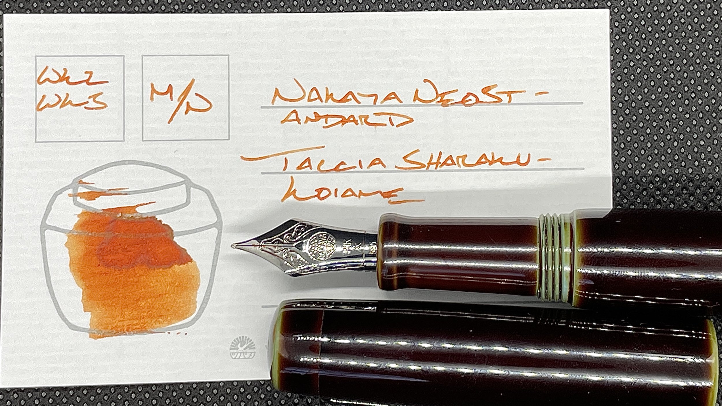
Nakaya Neostandard Heki-tamenuri (Mini Naginata, by Tokyo Station Pens). Taccia Ukiyo-e Sharaku-Koiame. Koiame’s bright, earthy orange makes easily-skimmable accent notes. Important for highlighting meeting prep notes that I want to remember in-the-moment. The EF and F lines from Naginata grind are also wonderful for reading notes and commonplace notes. The M line has quickly become a favorite for longform writing like journal entries and curriculum reflections.
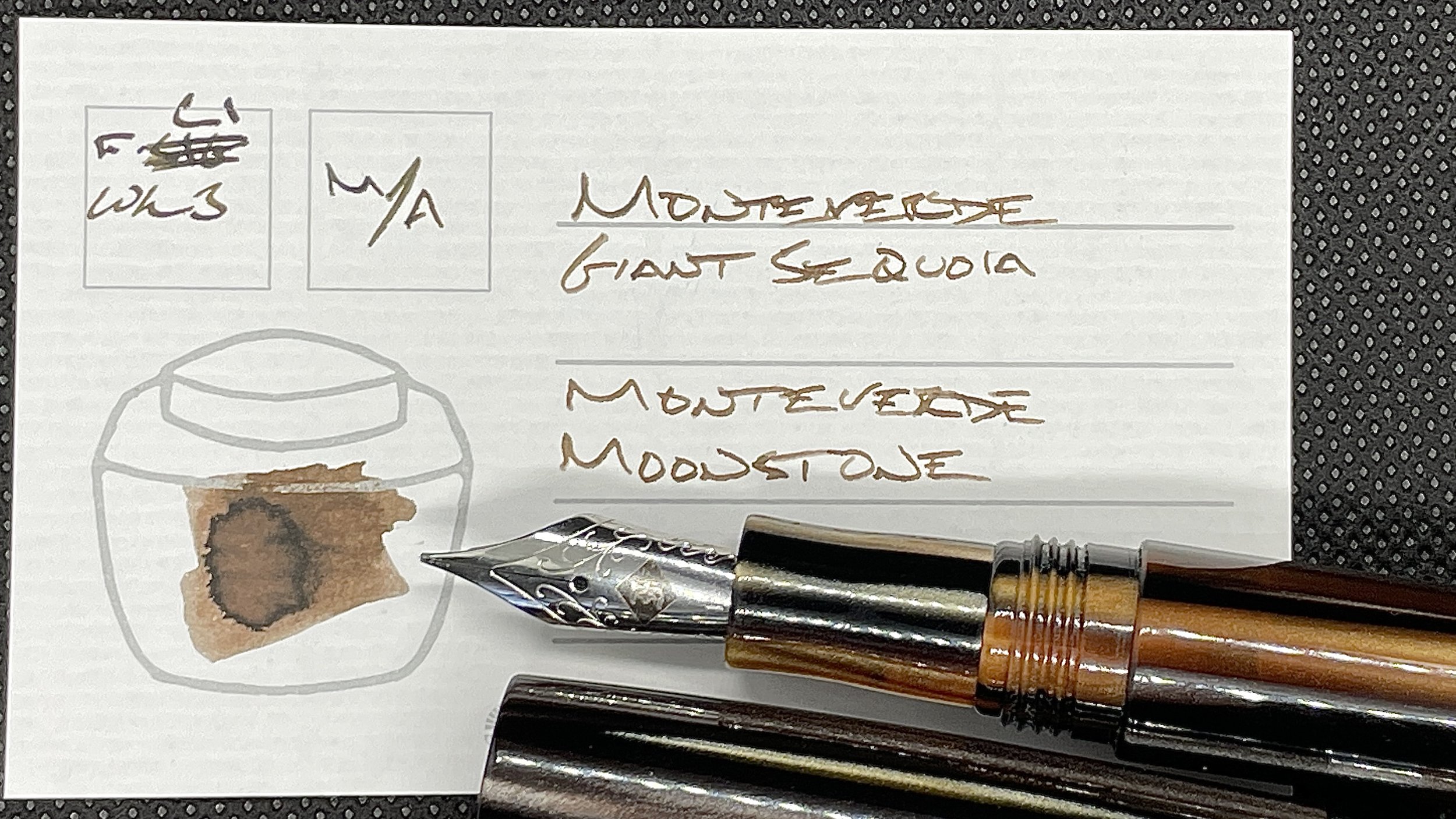
Monteverde Giant Sequoia Brown (F CI, by Mike It Work). Monteverde Gemstone Moonstone. This pair enters the week nearly empty — its ink level sitting just visible above the metal band at the bottom of the converter. A combo of extremes with dusty brown lines in the centers of words and towards the end of a written page and dark, moody browns at the edges. A nib and ink pairing that encourages me to pick this combo up over and again. For journaling, and scratch notes, and brainstorming, and lists.
Wild Cards
Sailor Pro Gear Blue Train (Z). Kyo-no-oto Sakuranezumi. The pear-shaped Z nib provides my favorite kind of feedback: texture without drag. As such, this is my primary longform writing combo for the week. Journaling, reading reflections, curriculum reflections, and some meeting prep.


