Fall-ing for five inked pens (puns are cool)
I enter the week with my lesson plans already done — with last week’s currently inked. A full 20% of my anticipated writing is taken care of prior to any tweaks to last week’s rotation. So I only need enough inked pens to carry me through meetings, marking, and journaling.
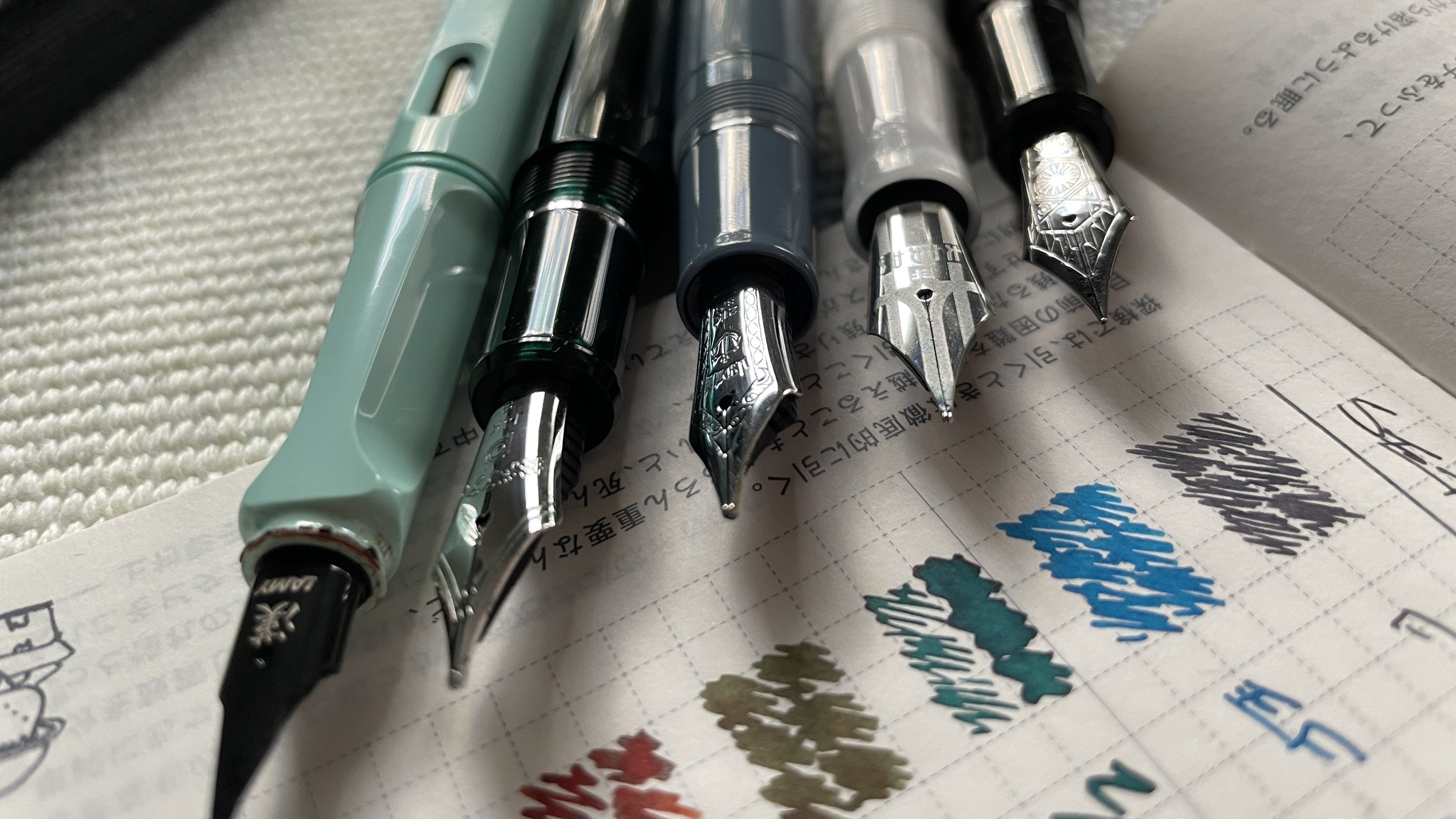
Five inked pens should serve my needs well. One grey ink as my typical core. And four options to keep me excitedly writing throughout the week.
Attila’s lovely fall color palette inspired me to choose inks that take on similar earthy-neutral tones. Aurora Borealis’ green-leaning teal, Rikyu-cha’s tea green-brown and Ancient Copper’s terracotta brown.
With Ming Kong Que Blue as a decided palette-breaker. Rule broken.
The fancy and un-fancy of bottles
I added two pastel pens to compliment the week’s neutral fall-inspired ink colors. On both the dark (Sailor’s Slate Blue) and light (Lamy’s Blue Macaron) ends.
Fall-ing hard over here.
Grey/Black
Platinum 3776 Star Wars Kylo Ren (F). Sailor Ink Studio 223. Kylo Ren continues on as my daily driver the week. The Platinum F nib is my perfect blend of line narrowness and ink flow. Detailed task details and progress tracking. Reading notes and lesson plan outlines. This pair also works well for meeting notes as the black colorway blends right in during meetings.
Blue/Teal
Karas Kustoms Decograph Winter Wonderland (EF). Yoseka Ceramics Ming Kong Que Blue. The Karas also continues on into a second consecutive week. Yoseka’s bright blue has been a hit with my students when reading feedback on their paper drafts. Any ink that gets students to read my comments is a win. Marking papers, accent reading notes, accent meeting notes, and journaling.
Sailor Pro Gear Slate Blue (Z Architect, by Custom Nib Studio). Diamine Aurora Borealis. The architect grind offers a wet line that sloshes ink onto my paper and a hairline EF line on the nib’s reverse side. Broad lines work well for slow moving meetings that allow time for lines to dry and for journaling. The EF lines are excellent for detailed notes on any paper type I come across at school. Meeting notes, journaling, reading notes, scratch notes.
Earth Tones
Lamy Safari Blue Macaron (Cv). Diamine Ancient Copper. Lamy’s cursive nib was a stroke of genius. Paired with Ancient Copper, the Cv nib offers line variation, moderately wet lines, and a soft writing experience. A perfect combination for taking pocket notes while holding a notebook in one hand and the Lamy in the other. Also: reading notes, meeting notes, discussion notes and journaling. I’m excited about this pairing.
Platinum 3776 Laurel Green (B). Sailor Shikiori Rikyu-cha. This particular B nib is dry enough to spark two personalities from Rikyu-cha. The beginnings and ends of lines are darkly, noticeably brown. The middles of letters are clearly green. Yes. Very yes. A great balance to the B nib’s uniform B lines. My fast-writing pairing for the week: teaching reflections, fast-paced meetings, free-wheeling journal entires, and manuscript drafting.
Wild Cards
So quiet in here. Quiet and appreciated.


